Event landing pages are digital tools focused on turning passive browsers into excited attendees – these pages effectively grab attention and turn “maybe” into “I’m in!” by serving up all the juicy details and irresistible reasons to join the event.
Event landing pages can be useful when you want to promote:
- business meetings and conferences,
- expos,
- training and courses,
- concerts and festivals,
- exhibitions and art events,
- trips,
- and any other event, from official ones to celebrations.
Seeking inspiration for your next event’s landing page? Check out our list landing page examples, and uncover the essential components that make them effective. Cases from the article will show you the know-how to craft your successful event landing page.
- SoDA Conference
- The Wedding Planner School
- Beer Warsaw Expo
- Oslo Konserthus
- Fotografiska
- Mystic 2024
- TheTravelBus
- Tribeca X 2025
- Caravan, 4×4 & Outdoor Adventure Expo
- Sandcastle Classic
- CPID Scotland Annual Conference 2025
- MCM Comic Con London
- Bayside
- Derma & Beauty Conference
- Disney on Ice
- Web Summit
- SMX Advanced
- NP Digital Webinar
- BitterSweet Festival
- EEC

What Should Event Landing Page Include?
Each event landing page should include a catchy headline, full information about the upcoming event, attractive visuals, an encouraging CTA (optionally a frictionless registration form), trust–building elements, and those creating urgency, like countdown timers.
To craft a successful event landing page, first understand its key components: it should prominently showcase details such as the event name, date, and location. The essentials of a converting event landing page should also include the following:
- clear schedule,
- detailed speaker information,
- compelling event description.
These components inform and entice potential attendees effectively. But remember, a great event landing page is not just about cramming in all the details; it’s about presenting them in a visually appealing and easy-to-navigate layout.
The design and visuals of your event landing page play a crucial role in enhancing user experience.
Here’s how to make the most of it:
- Use high-quality, relevant visuals.
- Keep the design clean and simple.
- Stick to a limited color scheme that matches your brand identity.
- Incorporate elements to create a fear of missing out (FOMO).
- Use testimonials for social proof.
- Include engaging content such as interviews or video highlights from past events.
Still, the goal is not just to attract potential attendees but to convert them into actual attendees. Without contact options and compelling CTAs, an event landing page is incomplete. Offering direct support through contact options like a phone number can reassure visitors. A powerful call-to-action is a must, as it aids in event registration, simplifies the process, and enhances the landing page experience.
Create a stunning event landing page—get inspired by top examples with Landingi!
20 Examples of Event Landing Pages
Explore some real-world event landing page examples that have successfully implemented strategies. These examples cover a variety of event types, from conferences and training sessions to art exhibitions or concerts. Each one showcases a unique approach to design and content, providing valuable insights and inspiration for creating your own event landing pages.
1. SoDA Conference – Conference Example:
In the realm of conference landing pages, details reign supreme. The SoDA Conference 2023 page is a great example of a high-converting event page. It combines a bold visual narrative with purposeful layout design to drive attention toward key event details. The page uses striking imagery to reflect the conference theme. The headline and the prominent conference title create immediate relevance and urgency for visitors, while the date and location are placed in a visible section that’s easy to find without scrolling.

Such conference landing pages are tailored to specific audiences and provide networking opportunities. The SoDA Conference event landing page does this exceptionally well. They showcase the value of attending by providing information about past events, including testimonials, video highlights, and speaker line-ups. This not only builds credibility but also generates interest among potential attendees.
Key Takeaways:
From the example above, you can notice that the successful event landing page for conferences should include a couple of specific components that affect its effectiveness:
- agenda,
- speakers list,
- value of attending.

Use the Business Conference template within the landing page builder and adapt it for your purposes. Customize every part of the template and add a countdown widget to create your own high-converting conference landing page.
2. The Wedding Planner School – Training Example:
The Wedding Planner School’s landing page sets a high standard for course and training event pages with its elegant, goal-driven design. The layout effectively combines visual storytelling with clear and persuasive content. This page skillfully blends professionalism and warmth, mirroring the tone expected in the wedding planning industry. The strategic placement of the “Book a place” CTA button, centered and colored in a calming green, guides the visitor’s eye and encourages sign-ups.

Trust elements paired with attractive imagery and user-friendly navigation build confidence and drive conversions for prospective students. Wedding Planner School’s example shows how to include all necessary information and engage visitors with a perfect layout at the same time.
Key Takeaways:
Taking a look at the example above, you can observe what’s essential to create a robust training landing page. Some specific components that make it convert are:
- event highlights,
- section about the instructor,
- clear, alternative CTAs.

Pick Landingi’s Register for a Course template to create an attractive landing page and promote your course. Using built-in AI tools will help you create compelling content that converts visitors.
3. Beer Warsaw Expo – Expo Example:
The immersive design and clear information architecture of the Beer Warsaw Expo landing page contribute significantly to creating a positive first impression and encouraging visitor engagement. However, the success of a fair extends beyond just attracting visitors. Another critical element in fostering a thriving event ecosystem is the strategic showcasing of its exhibitors, as they represent a significant draw and source of value for many attendees.
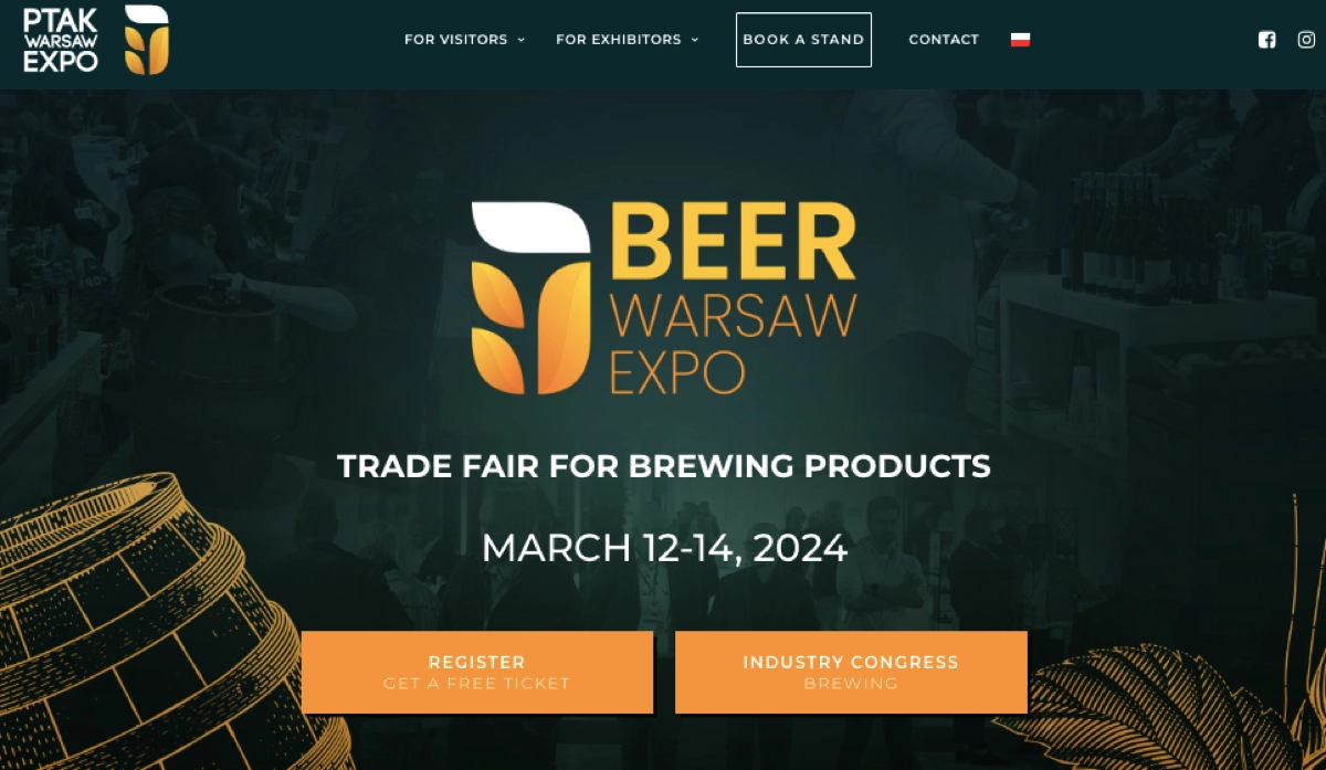
Exhibitors are a key part of fairs, and their effective showcase is crucial. This can be done by implementing a list of participating companies, their names, and their sponsorship or exhibitor levels. Good practices also include showcasing past events and the success of previous exhibitors, which can help to build credibility and generate interest among both potential event participants and potential exhibitors.
Key Takeaways:
The example of the expo event landing page above shows specific elements that affect its higher conversion, such as:
- section with the list of exhibitors,
- event organizers section,
- contact and location sections,
- distinctive CTAs.

If you decide to use Landingi in your expo event landing page creation process, be sure it will go effortlessly. Pick the Festival template from the Landingi library and customize it to align with your brand and event theme.
4. Oslo Konserthus – Concert Example:
When it comes to concert event landing pages, the key is to create a sense of excitement and anticipation. The page should be vibrant, energetic, and reflect the atmosphere of the concert. Essential elements of an event landing page for a concert that you should use in your project are the following:
- A clear, bold headline announcing the concert name and the performing artists or bands,
- High-quality, engaging visuals such as artist photos, past concert images, or promotional videos.
- Detailed information about the concert, including date, time, venue, and ticket prices.
- A clear and compelling single CTA, like “Reserve Your Spot.”
A concert landing page should be clear for visitors, as in the example of Oslo Konserthus, which promotes all concerts in a similar way. The CTA is clear and compelling, encouraging visitors to buy tickets. The page also includes adequate content to encourage potential attendees to purchase tickets.

Last but not least are elements that increase user experience, such as the contact section, location map buttons, or the concert hall map, which simplify the actions most of the event attendees will take.
Key Takeaways:
Characteristics that you can notice in the example above should be a pattern for your own concert landing page. Those are the following:
- clear headline with artists’ names,
- outstanding CTAs,
- high-quality visuals,
- concert hall map section.
Promote your event effectively—create a high-converting landing page with Landingi!
5. Fotografiska – Art Exhibition Example:
Art exhibition landing pages need to capture the essence of the artwork and the atmosphere of the event. The page should be visually appealing, mirroring the aesthetics of the exhibition itself and, at the same time, showing the style of a gallery or museum. The key components of an effective art exhibition landing page include a headline announcing the exhibition name and the featured artists or artworks, high-quality, engaging visuals, and detailed information about the exhibition.
The example of the Fotografiska landing page for their exhibition Shirin Neshat – The Fury provides great inspiration. The CTA is clear and compelling, encouraging visitors to buy tickets. The page also includes adequate content to encourage potential attendees to visit.
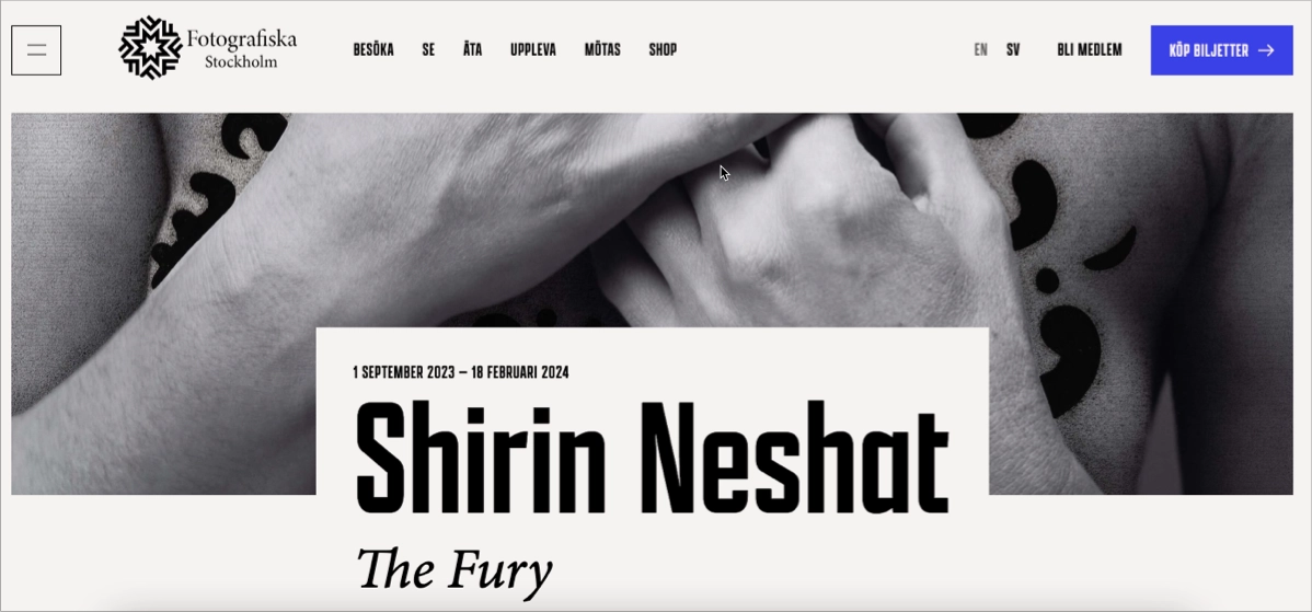
The page is minimalistic and straightforward, allowing the art to take center stage. It also includes additional information about the exhibition.
Key Takeaways:
Looking at the example above, the essential components to create a high-converting art exhibition landing page include:
- clear headline with exhibition and artist names,
- outstanding CTAs,
- high-quality visuals,
- additional information about the exhibition.
See the best event landing pages—design yours with Landingi’s tools!
6. Mystic 2024 – Festival Example:
When creating a festival event landing page, the goal is to capture the energy, excitement, and unique vibe of the event. Mystic Festival’s page can be your inspiration – it captures attention with vivid, high-quality visuals and engaging content, and encourages visitors to take action with a persuasive CTA button.
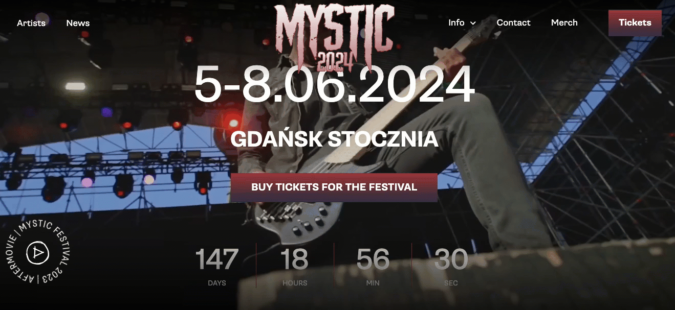
It also includes a section dedicated to Frequently Asked Questions (FAQs), which addresses common inquiries about parking, accommodation, amenities, and more, thereby reducing the need for potential attendees to reach out to festival organizers directly.
Key Takeaways:
The example of Mystic Festival shows the structure of components that build the effective festival event landing page. Your page should consist of the following:
- engaging visuals,
- outstanding CTAs,
- festival schedule and basic information about date and location,
- FAQs section.
Make your event unforgettable—build a standout landing page with Landingi!
7. TheTravelBus – Trip Example:
Creating a landing page for a trip or travel event requires a strategic approach to entice potential attendees. The goal is to capture the excitement, adventure, and unique experiences that the trip offers. TheTravelBus landing page does this exceptionally well. It blends visual storytelling with functionality, using stunning destination imagery and a bold countdown timer (“40 DNI”) to build anticipation. The layout is clean and informative, showcasing exactly what’s included in the trip cost, making it easy for potential travelers to see the value at a glance.

What makes this page truly effective is its ability to balance inspiration with logistics. The imagery sparks a sense of wanderlust, while the content answers all the practical questions. It speaks to both the heart and the head – an essential combination for converting curious browsers into committed adventurers.
Key Takeaways:
The example of TheTravelBus “Around Iceland” trip landing page shows the structure of components that increase effectiveness:
- engaging visuals,
- outstanding CTAs,
- trip schedule and basic information about date and location,
- FAQs section.

If you want to create an engaging trip event landing page, try out the Landingi Travely template
8. Tribeca X 2025 – Industry Event Example:
The Tribeca X landing page really nails the design for a high-profile industry event. It’s sleek, dynamic, and doesn’t skimp on content, immediately communicating the event’s prestige. The bold typography and the dark modern theme give it a cinematic flair. The page effectively positions Tribeca X as the key gathering for leaders in marketing, media, advertising, and branded storytelling, and the “connect, collaborate, and be inspired” tagline perfectly resonates with industry professionals seeking growth and connection.

Everything about this page is built for conversion and credibility. It highlights top-tier speakers and showcases the value-packed Tribeca X Pass, which includes exclusive panels, screenings, and even access to the new Storytelling Summit. Clear CTAs like “Get a Pass” are repeated in strategic places, while details on awards, community events, and thought leadership sessions create a compelling reason to attend. The layout is intuitive, mobile-responsive, and designed to lead visitors through a rich narrative that mirrors the energy and innovation of the event itself. All these elements together create a perfect industry event page that truly converts.
Key Takeaways:
The Tribeca X landing page exemplifies how to craft an industry event page that combines bold branding, compelling content, and clear value propositions to capture attention and drive professional engagement. The core components that make it so effective include:
- strong brand integration,
- clear event benefits,
- high-profile speaker lineup,
- thoughtful visual hierarchy.
However, to ensure high conversion on your own page, you should also add a dynamic video preview, like a reel from past events, which boosts engagement and impacts decision-making.
Turn ideas into action—build your event landing page with Landingi!
9. Caravan, 4×4 & Outdoor Adventure Expo – Expo Example:
The Caravan, 4X4 & Outdoor Adventure Expo’s landing page immediately sets the tone with bold, adventure-themed visuals and a prominent headline that clearly communicates the event’s focus. This page also creates a strong sense of place and community, while the embedded call-to-action buttons like “Save 20%” and “Win a Free Pass” capture attention and drive ticket sales effectively.

Source: townsvilleexpo.com.au
You know what really works about the Townsville Expo page? It’s designed with visitors in mind, first and foremost. You can find everything you need without any hassle – exhibitor info, visitor guides, tickets, all easy to navigate. Plus, they’ve got sponsor logos, ways for exhibitors to get in touch, and live social media links, which makes the whole thing feel really trustworthy and connected. It’s the kind of page that would appeal to everyone from families to serious enthusiasts and even industry folks.
Key Takeaways:
The example of the expo event landing page above shows specific elements that affect its higher conversion, such as:
- strong headline and event clarity,
- prominent action buttons,
- clear navigation,
- mobile-optimized, user-friendly layout.
Plan your event with impact—design an inspiring landing page with Landingi!
10. Sandcastle Classic – Competition Event Example:
Competition & fundraising event landing pages thrive when they combine excitement, clarity, and purpose, inviting users not only to participate but to feel part of something meaningful. The Sandcastle Classic page captures this spirit beautifully through its vibrant visuals and nostalgic beach-day theme, instantly conveying fun, teamwork, and a worthy cause: supporting arts in education.

This page definitely grabs your attention right away with its visual style and strong branding. You immediately see the event date, time, location, and even this fun “Level Up!” theme. It’s got a really energetic and community feel to it. However, it could be a little easier to use. The main thing is, you don’t immediately see a button to actually sign up or get involved, which might be a bit confusing for people visiting for the first time. If they made the sign-up process more obvious, more of that excitement would turn into actual participation and donations.
Key Takeaways:
The example of the competition and fundraising event page above shows key engagement drivers such as:
- bold theming,
- clear cause messaging,
- appealing visuals.
11. CPID Scotland Annual Conference 2025 – Conference Example:
You land on the CIPD Scotland Annual Conference 2025 page and immediately know it’s a serious, professional event. It’s clear, authoritative, and smoothly guides you through the information. Designed to attract HR professionals and business leaders, the page opens with a compelling message about shaping the future of work and building inclusive cultures. Right away, visitors are introduced to powerful reasons to attend: skill-building workshops, real-world case studies, and deep-dive masterclasses designed to help organizations thrive.

This page is exceptional because it nails the balance between giving you all the details and still being easy to use. You’ve got clear “Book my ticket” buttons, and then everything else – the agenda, speaker info, where it is, the sponsors – is laid out really well. Seeing speakers from CIPD, NHS, or BBC definitely adds a lot of weight and makes you trust the event. And visually, it’s sharp and modern, with clean sections, bold headlines, and nice details that give the whole thing a sophisticated feel – perfect for a leading conference.
Key Takeaways:
The example of the conference event landing page above shows structure and content elements that improve its effectiveness, such as:
- strong, mission-led opening message,
- clear CTAs,
- speaker profiles,
- professional layout,
- practical info on venue, travel, and accessibility.

Check out the Virtual Summit template. By adding several widgets available in the intuitive toolbar of the Landingi editor and customizing visuals and colors, you can change this template into an effective conference landing page in minutes.
12. MCM Comic Con London – Convention Example:
The MCM Comic Con London landing page is an exceptional example of how to build a high-energy, fan-focused convention page that instantly pulls visitors into the world of pop culture. With its bold branding, vibrant hero image, and prominent dates, the page makes it clear that this is a must-attend celebration for anime, gaming, comics, and film fans. The headline “MCM London Returns” and the enthusiastic subheading set the tone, inviting users to “nerd out” and be part of a community where self-expression is celebrated.

This page really shines because of its smooth layout and how they’ve prioritized what’s important. The navigation is super comprehensive, with sections for tickets, guests, show info, and schedule, so everyone can easily find what they need. Plus, that bright orange CTA button really grabs your attention and makes it clear what they want you to do. This landing page does more than tell you about the event – it builds up the hype and gives you a taste of the convention’s atmosphere.
Key Takeaways:
The convention event landing page above shows how clarity, fan-focused content, and strong design can boost conversions, with standout features like:
- A bold, energetic header,
- High-contrast, action-driven CTAs,
- Authentic tone,
- Immersive visuals.
Attract attendees with a compelling event landing page—start with Landingi!
13. Bayside – Festival Example:
Each festival landing page needs to spark excitement, deliver clear event information, and visually reflect the energy of the experience – and the Bayside Festival page does exactly that. With its bold green background, playful smiley icons, and the vibrant tagline “Where Summer Peaks!”, it captures the essence of summer celebration at first glance. The key event details are displayed prominently, leaving no guesswork for potential attendees.

This landing page really nails it with its design – it’s so upbeat and cheerful, you can tell it’s perfect for a young, fun audience. The “Köp biljett” button is right in your face, making it easy to grab a ticket, and the clean but bold layout makes you want to explore the rest of the page. It’s like stepping into the festival online – bright, easy to understand, and full of potential.
Key Takeaways:
The festival landing page above shows how to combine the following elements to create a high-converting and memorable experience for visitors:
- energetic design,
- clear event info,
- bold call to action,
- high-quality visuals.

14. Derma & Beauty Conference – Conference Example:
Another conference page that really gets it right is the Derma & Beauty Conference 2025 one. The soft peach colors and high-quality images give it this really refined but also friendly vibe. The layout is polished, and they clearly present the event info along with a quick explanation of what’s in it for you. It definitely speaks directly to dermatology pros, skincare experts, and innovators in the beauty world.

A major win for this page is the well-positioned registration form – you can’t miss it. And by combining that with an early-bird discount and mentioning the DHA accreditation, they create this feeling of “I should sign up now” while also building confidence. They give you the details about the sessions, workshops, and demos without being overwhelming. Overall, this landing page really nails it by being both visually appealing and functional, making it a great model for health and beauty events.
Key Takeaways:
You can achieve a similar effect and create a high-converting page for your conference by blending together:
- clarity,
- elegant design,
- trust elements,
- integrated registration form.
Plan your event with impact—design an inspiring landing page with Landingi!
15. Disney on Ice – Show Example:
A great show starts with its promotion – the landing page is where the magic begins, setting the tone and anticipation for what’s to come. The Disney On Ice official page is a shining example of how to craft a page that’s both enchanting and highly functional. From the moment you arrive, it immerses you in the magic of Disney storytelling with a full-screen video, bold visuals, and engaging messages that reflect the world-class ice performances and beloved characters the tour is known for.

The site balances entertainment with practicality, offering seamless access to tour locations, ticket sales, and multilingual navigation for a global audience. Features like local event listings and vibrant promotional banners keep visitors engaged while guiding them toward quick, confident action. It’s a masterfully branded experience that makes every visitor feel part of the story before they even arrive at the rink.
Key Takeaways:
Creating a stunning landing page to promote a show requires strategic implementation of the following elements:
- cinematic visuals,
- multilingual structure,
- clear ticketing CTAs.
Explore event landing page ideas—build your own with Landingi today!
16. Web Summit – Conference Example:
The next event landing page – The Web Summit 2025, is a gold standard for global tech conference promotion: clear, engaging, and designed for conversion. With bold headlines and strategic urgency messaging (“This is your last chance”), the page immediately captures interest. The layout is clean and modern, with dark typography, high-impact visuals, and prominent CTAs that invite visitors to pre-register or secure their spot.

Everything about this landing page is optimized for the user experience: fast loading, easy mobile navigation, and a consistent tone that appeals to founders, investors, and tech enthusiasts alike. Details like speaker spotlights, sneak peek videos, and community calls-to-action (like newsletter sign-ups) are seamlessly woven into the design. It communicates not only what Web Summit is, but why attending matters, making it a perfect blend of brand authority and accessibility.
Key Takeaways:
This page builds engagement and drives conversions thanks to:
- urgency messaging,
- sleek design,
- compelling visuals,
- strategic CTAs.
Turn ideas into action—build your event landing page with Landingi!
17. SMX Advanced – Conference Example:
Another inspiration on how to design a professional conference page for a niche, expert-level audience is the SMX Advanced page. Aimed specifically at advanced SEO and PPC marketers, the page uses strong messaging and focused visuals to immediately communicate value. The event details are clearly highlighted, and an Early Bird callout creates urgency with a booking deadline. The inclusion of pre-conference workshops adds additional depth.

Pay attention to this page’s comprehensive yet intuitive structure. The navigation gives quick access to the agenda, speaker lineup, venue details, and ticket registration. Each section is cleanly organized and visually balanced, creating a seamless experience for busy professionals. Highlighted speakers from top tech and marketing firms reinforce the conference’s authority, while repeated CTAs like “Tickets” and “Agenda” ensure no opportunity for conversion is missed.
Key Takeaways:
To create a similar page, focus on:
- advanced targeting,
- trust-building content,
- well-structured layout,
- strong CTAs.

Use the Business Event template from Landingi and customize it to promote a professional conference.
18. NP Digital Webinar – Live Webinar Example:
Landing pages for online events, like live webinars, must capture attention quickly, clearly communicate value, and remove all friction from registration—and this webinar page by NP Digital does it brilliantly. It opens with a bold title and subheading that immediately speaks to a marketer’s goals: discovering what actually works based on data. The concise description lays out the benefits with authority and focus, making it clear this event is tailored to professionals seeking actionable, results-driven insights.

This webinar page is exceptional because it just feels credible and clear right away. Seeing names like Neil Patel builds instant trust. The clean design, with all the text on the left and that bold CTA button, really cuts out any distractions and makes you want to click. The speaker’s professional photo also adds a nice personal element and makes the page look more balanced. It’s direct, persuasive, and exactly the kind of landing page that gets people to register for a webinar.
Key Takeaways:
The example of the live webinar landing page above shows how combining clarity, authority, and simplicity can lead to a high-performing registration experience. Key elements that contribute to its effectiveness include:
- strong headline and topic relevance,
- clear event details,
- expert speaker lineup,
- focused layout,
- bold call to action,
- professional visuals.
Explore event landing page ideas—build your own with Landingi today!
19. BitterSweet Festival – Festival Example:
The BitterSweet Festival landing page is a stunning example of how to promote a huge music festival, both visually and emotionally. As soon as you land on it, the bold text, the moving background, and the immersive video create a feeling like you’re already there. The page instantly tells you what the festival is, where it’s located, and what makes it special.

The design merges artistry with usability: sections are cleanly organized, mobile-ready, and infused with personality. The lineup is interactive and visually enticing. Animated marquees and floating graphics keep the experience engaging without being overwhelming. Whether you’re there for music, vibes, or meaning, the BitterSweet Festival page makes it clear – this is more than an event, it’s a feeling.
Key Takeaways:
Immersive design and emotional storytelling can elevate user engagement and drive ticket sales. Key elements contributing to this festival page’s success include:
- striking hero section,
- clear event details,
- interactive lineup presentation,
- mobile-friendly layout,
- dynamic visuals and animations,
- strong call-to-action buttons.
20. EEC – Congress Example:
The last example illustrates how a congress landing page can command authority and deliver depth without overwhelming the visitor. The European Economic Congress 2025 page effectively balances its reputation with modern visuals and structured navigation. With clear dates and location highlighted upfront, the page immediately sets expectations for scale and significance.

You can tell this site is really well-designed, thinking about both new and returning attendees. It’s got easy access to everything you’d need, from what’s being discussed and who’s speaking, to signing up, media materials, and even looking back at previous years. The clean layout, the fact that it supports multiple languages, and the way they’ve integrated videos and recordings of past sessions make it both easy to navigate and really engaging. It’s a professional and organized page that reflects the significance of the congress while still being user-friendly.
Key Takeaways:
This congress page shows how credibility, structured content, and digital accessibility work together to serve a global audience and support high-level participation. Its key elements include:
- clear event positioning,
- prominent date and location display,
- multilingual support,
- embedded video content and recaps,
- professional branding and layout,
- historical continuity.
Attract attendees with a compelling event landing page—start with Landingi!
How To Create an Event Landing Page?
To create an event landing page, choose the best landing page automation platform –Landingi, select the way you‘d like to build your page, customize the copy, add stunning visuals and urgency elements, and publish your page – it’s that simple! Check out the whole process in detailed steps below:
1. Create New Page
Landingi enables effortless landing page creation – you can choose the way you like to build pages the most. Through Composer, you leverage AI capabilities to generate a page tailored to your brand, event, and the target audience. By using the Figma Plugin, you can transfer projects designed with the dedicated Landingi Design System in Figma. You can also start with a template, selecting one of over 400 pre-designed pages – no matter which way you choose, Landingi’s no-code builder allows you to customize your page in every aspect, from its structure to design.

2. Customize Your Page
Use the drag-and-drop editor to align the page with your event style. You can add sections, text, images, videos, and other elements. Then, click any element you want to customize and use the menu on the right to change its settings.

3. Adjust Copy to the Target Audience
Your page must resonate with the target audience. When you lack ideas or seek unique inspiration for copy, use AI Text Assistant to automatically generate content for the entire page or its selected sections.

4. Add Countdown Timer
Using a countdown timer to create urgency and encourage visitors to sign up for the event or purchase tickets will do the trick – nothing motivates people to act faster than seeing time running out.

5. Create a Strong CTA Button
To make your page highly converting, create a stunning CTA button with irresistible messaging. Make it bold and contrasting, and place it prominently in the strategic page sections.

6. Add a Registration Form
Add a simple form to your page to simplify the registration process, but remember about user experience – high-converting forms are concise and frictionless. Landingi’s built-in Form Builder makes form creation effortless.

7. Optimize for SEO
Don’t forget to optimize your page for visibility in search engines. AI SEO Assistant helps you generate titles and descriptions, ensuring your page is SEO-friendly.

In the end, use the preview feature to ensure that your landing page looks exactly as you want it to. Once you’re satisfied with it, click Publish to make your event landing page live.
While crafting an event landing page might seem challenging, it becomes quite manageable with the right tools. Landingi provides a user-friendly interface and drag-and-drop functionality that makes the process much easier.
FAQ About Event Landing Pages
Given the numerous factors involved in creating an event landing page, having questions is quite understandable. In the following sections, we’ll address some of the most frequently asked questions about event landing pages. We’ll cover everything from the key elements of a landing page, through common mistakes to avoid, to the primary purpose of a call-to-action.
What Are the Key Elements of an Event Landing Page?
An event landing page for an upcoming event should include key elements such as the following:
- The event name
- Date and location
- Schedule and activities
- Speakers
- Registration or ticketing form
- FAQs
- Social proof
- Contact information
Of course, a compelling CTA button is a must. Incorporating these elements into your event landing page contributes to a perfect event page design that effectively captures the attention of potential attendees and encourages them to register.
The layout of your event landing page is crucial for engagement and conversions, necessitating a mobile-optimized design and a seamless registration process. Using a tool like Landingi can simplify the creation of an effective landing page.
What To Avoid While Creating an Event Landing Page?
While creating your page, you should avoid a cluttered design, hidden or weak CTAs, and a lack of essential event info. Knowing what to avoid is equally important as knowing what to include in an event landing page.
The most common mistakes include the following:
- Unclear or confusing CTAs
- Overuse of text, leading to cluttered and overwhelming page design
- Ignoring the importance of high-quality, relevant visuals
- Failing to highlight key event details prominently
- Neglecting social proof like testimonials or endorsements
- Inadequate contact information or support for potential attendees
- Lack of mobile responsiveness
Next to layout and content pitfalls, one common mistake is having unclear calls-to-action. These can clutter the page, cause indecision among users, make it difficult to locate relevant CTAs, and increase the bounce rate.
Poor mobile responsiveness is another pitfall to avoid. Slow load times, an unresponsive design, and difficulties in reading or interacting with the web page on mobile devices can all result in lower engagement and conversion rates.
Is It Essential To Include Speaker Bios On an Event Landing Page?
Speaker bios on an event landing page are not a mere addition; they are a necessity. Speaker or performer bios introduce the individuals involved and establish credibility and excitement.
It should effectively showcase the speaker’s expertise, credentials, achievements, and relevant experience, which provide insight into their personality.
Can a Well-designed Event Landing Page Significantly Increase Event Attendance?
Yes, a well-designed dedicated event landing page can significantly influence event attendance. By improving engagement and conversions, a meticulously crafted landing page can significantly increase the number of attendees. To achieve this, it’s essential to create event landing pages that capture the interest of potential attendees.
According to Eventbrite reports, incorporating social proof on landing pages can result in a 34% increase in conversions.
A well-structured layout can contribute to an increase in event attendance by:
- Creating an engaging, visually appealing page with high-quality visuals
- Using striking headlines to grab attention
- Instilling a sense of urgency through features like countdowns
What Is the Primary Purpose of a Call-to-action On an Event Landing Page?
The primary purpose of a CTA on an event landing page is to motivate visitors to engage in a specific action, such as registering for the event or purchasing tickets. The impact of a CTA on the conversion rate of an event landing page can be significant.
CTAs are the secret way to increase conversions on a landing page. This was proven in a report by Unbounce, in which a conversion optimization consultant increased the conversion rate by 304% on a long landing page simply by adding a compelling call to action. That’s the power of a well-crafted call to action!
Therefore, the design and messaging of the CTA button play a critical role in influencing the conversion rate. Examples of effective CTAs for event landing pages include the following:
- ‘Get Your Tickets’
- ‘Reserve Your Spot’
- ‘Get Early Access’
- ‘Book Your Seat’
- ‘Don’t Miss Out’
Each of these CTAs is action-packed and compels the visitor to act, thereby increasing the chances of conversion.
Create Immersive Event Pages with Landingi
In this blog post, you’ve explored the fundamentals of creating event landing pages, including what they should consist of, examples of successful landing pages, and common questions about event landing pages. It’s clear that a well-designed landing page can significantly impact the success of your event, from increasing attendance to boosting conversions.
Remember, the key to a successful event landing page lies in the following:
- clear and concise presentation of event details,
- visually appealing design,
- easy registration process,
- compelling call-to-action.
As you embark on creating your own event landing page, choose the best landing page builder – Landingi, search for the best template and keep the principles mentioned within this blog post in mind, and you’ll be well on your way to hosting a successful event. Try it now!