A sign-up landing page is a focused web page designed to get visitors to register. These pages, also known as registration or subscription pages, are where potential leads turn into active participants in your services.
Sign-up pages are everywhere: for newsletters, product launches, SaaS trials, courses, events, and more. According to Unbounce, the average conversion rate for this type of landing page is around 4.02%, but the best ones go well above 10%. What sets them apart? Clean design, strong messaging, and just the right amount of motivation to hit that “sign up” button.
In this post, you’ll see 20 sharp examples of sign-up landing pages that get it right—from smart layouts to clever CTAs. You’ll also find a few ready-to-use templates to help you build your own high-converting page, fast.

What is a Sign-up Landing Page?
A sign-up landing page is a dedicated web page designed specifically to capture leads by encouraging visitors to register or subscribe, typically in exchange for access to content, services, or product trials. Unlike general homepages or product pages, sign-up landing pages focus solely on lead generation, making them a critical tool in digital marketing strategies.
Why do I Need a Sign-up Landing Page?
You may need a sign-up landing page because it streamlines the user journey towards a specific action – signing up, which results in acquiring new leads. This singular focus on sign-up eliminates distractions and guides visitors directly towards providing their contact information, thus enhancing the efficiency of your conversion process. In Omnisend’s research, landing pages reached the highest CR (23%) among other sign-up forms like pop-ups, e-mails, etc. (B. Meyer, The best signup forms for high conversions, 2022).
Here are some reasons why a sign-up landing page is indispensable in your digital marketing:
- Focused Conversion Strategy: Landing pages are designed with one goal in mind, making them more effective at guiding users to take a specific action compared to a general website page.
- Effective Data Collection: They are key for gathering valuable user information, which is essential for lead nurturing and developing personalized marketing campaigns.
- Increased User Engagement: Offering something of value in exchange for user information, like a free resource or trial, can significantly boost engagement. A sign-up landing page is a perfect place to bring this idea to life.
Create a high-converting sign-up page—start with Landingi today!
How to Create a Sign-up Landing Page?
To create a sign-up landing page, start with a clear message, simple form, and strong call to action. Choose a landing page builder like Landingi to make the process quick and intuitive—no coding needed.
Good sign-up pages are clean, focused, and built around one action. Add a headline that grabs attention, visuals that support your offer, and just enough copy to explain why it’s worth signing up. Keep it mobile-friendly and easy to use.
Follow the 7 steps below to build a sign-up landing page that turns visitors into subscribers.
Step 1. Set a Clear Goal
Start by getting clear on what you want your sign-up page to do. Are you building an email list, collecting pre-launch interest, or growing a subscriber base for a specific offer? Your goal shapes everything—from the layout to the copy.
Just as important is knowing who you’re talking to. What do they expect? What would make them stop, read, and leave their email? The better you understand your audience, the easier it is to write something that connects and converts.
Step 2. Pick a High-Converting Template
Landingi offers over 400 templates designed to help you convert—many of them perfect for collecting sign-ups.
To get started, click Create new landing page and browse the library for a layout that fits your offer. You can also build your page from scratch, upload a .landingpage file, generate one with Composer, or import a design from Figma.

Once you’ve picked your template, make it your own using Landingi’s drag-and-drop editor. Adjust the layout, add your content, and fine-tune every section. Use Smart Sections to keep your design consistent across different versions or campaigns.
Step 3. Write a Headline That Gets Clicks
Your headline is the first thing people see. It should clearly say what users are signing up for and why it’s worth their time. Think short, direct, and benefit-focused. Phrases like “Get Early Access,” “Join 5,000+ Creators,” or “Be the First to Know” work because they’re clear and action-oriented.

Use Landingi’s AI Assistant to help brainstorm or polish your copy. Once you have a strong headline, support it with one or two lines that explain the value of signing up. Keep the message simple and easy to scan—short paragraphs, bold subheads, and no fluff.
Every word on the page should bring the visitor closer to clicking that sign-up button.
Step 4. Use Visuals That Support Your Message
Even simple sign-up pages benefit from strong visuals. A clean product mockup, teaser video, or branded image can help grab attention and reinforce what users are signing up for.
In Landingi, you can upload your own visuals, use free images from Unsplash, or clean them up with the background remover to keep things distraction-free. Just make sure everything loads fast—slow images are a fast way to lose a lead.

And don’t skip video. Nearly 40% of marketers say it’s the most effective element for driving conversions on landing pages (HubSpot). A short intro or teaser can make a big difference.
Step 5. Add a Simple Form and a Clear CTA
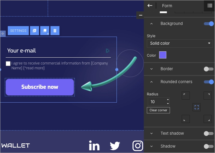
Your form is where the magic happens—it’s the moment someone says “yes.” Use Landingi’s form builder to create a clean, user-friendly form. Most of the time, just an email address is all you need. If you ask for more, make sure it adds real value.
Then, pair that form with a CTA that makes people want to click. Try phrases like “Get Early Access,” “Join the List,” or “Send Me Updates.” Keep the button bold, easy to find, and placed where people don’t have to scroll to see it.
Less friction = more sign-ups.
Step 6. Build Trust and Keep Visitors Engaged
People are more likely to sign up when they trust what they see. Add simple trust signals like testimonials, number of current subscribers, or a short line about data privacy—“No spam. Ever.” Small details like these help reassure visitors they’re in good hands.

Want to make things more dynamic? Add a countdown timer to build urgency or a pop-up with a special bonus for signing up. You can also link to your social media profiles so visitors can explore your brand before committing.
Ready to grow your sign-ups? Build a custom landing page with Landingi!
Step 7. Make It Mobile-Friendly and Go Live
Most people will visit your sign-up page on their phone, so make sure it looks great on small screens. Use Landingi’s mobile editor to fine-tune spacing, text size, and button placement—so everything feels smooth and easy to tap.

Before publishing, connect your custom domain to keep things professional and on-brand.

Once your page is live, keep an eye on performance using Landingi’s built-in analytics and A/B testing tools. Track what’s working, tweak what’s not, and keep improving your conversion rate.
10 Sign-up Landing Page Best Practices
Though they look super simple, there are plenty of rules to follow in creating high-converting landing pages for registration. Some of the core principles are listed below.
Start with Clear and Concise Headline like Unbounce
Use a headline that immediately communicates the value proposition of what you’re offering. Remind the user briefly what they will gain by registering. For example, Unbounce teases users with a promise to create landing pages “as you like it”, which means ease and user-friendliness.

Learn how to create an effective sign-up page—design yours with Landingi!
Craft Compelling Call-to-Action (CTA) like Calendly
Your CTA should be prominent, clear, and action-oriented, encouraging users to sign up. Bet on short form instead of long ones. “Sign-up” sounds far better than “Register on the platform”.
For inspiration, check out how Calendly does it. The wide blue button with the simple “Get Started” standing out from the white background is actually all they need.

Turn visitors into subscribers—create a sign-up landing page with Landingi!
Bet on Minimalist Design like Geckoboard
Keep the design simple and distraction-free, focusing the user’s attention on the sign-up process. If the user is charmed with too many visuals, he may forget to… click “sign-up”!
A good idea is to enrich your sign-up form a bit with some icons like in the below Geckoboard example. It’s really minimal landing page, even if it doesn’t look so!

Lure with Engaging Visuals like Localize
Regardless of the above, every successful landing page should be visually appealing. If you need visuals, use only high-quality images or graphics that are relevant to your product or service and resonate with your target audience, but, at the same time, remember not to overwhelm the user.
The example below would be perfect if the image was closely related to the company type. Localize offers an automated translation solution, and it’s not clear how the picture on their sign up landing page corresponds with their DNA. Nevertheless, it’s well-placed and gives the page some visual appeal.

Follow the best sign-up page examples—build yours with Landingi!s.
Make use of Urgency and Scarcity like Landingi
If applicable, use elements of urgency or scarcity, like a countdown timer, to encourage immediate sign-ups. Landingi implemented it well in their landing page for End of Year Sale:

Boost your sign-up rate—design a landing page that converts with Landingi!
Optimize Forms like Disney
Make the sign-up form as simple as possible. Only ask for essential information to reduce friction. Keep in mind the purpose of your sign-up page, which is to provide easy and quick access to the platform or resources.
Disney is aware of the above. Their form starts with one field requiring minimal effort from the users. More information is required in the next steps when they are more engaged after filling in the previous one. Desire for getting access is still increasing with each step. Good job!

Ensure Mobile Responsiveness like Omnisend
Make sure your landing page is fully responsive on all devices, especially mobiles. Too many visuals may cause page loading issues and affect form readability. This is why Omnisend goes with such a simple layout:

Maximize your sign-up page’s performance—start building with Landingi!
Assure Privacy Protection like Grammarly
Include privacy statements or links to your privacy policy to reassure users about the security and confidentiality of their data. Links to necessary documents below the form are fully sufficient. As an illustration, the landing page by Grammarly:

Utilize Social Proof like Zapier
If possible, include testimonials, reviews, or logos of well-known customers to build trust and credibility. It may strengthen the motivation for signing up.
Zapier incorporated it in their headline. It states that the platform is used by millions of people around the world, which means it’s credible and worth signing up.

Benefit from A/B Testing like Landingi
Regularly test different elements (like headlines, forms, CTAs, images) and site versions to see what works best with your audience. Scroll down to the first of our examples and see which landing page variant turned out to be the best-converting one for Landingi.
According to MetricHQ, the average SAAS sign-up CR is 2-5% (P. Arora, Sign Up Rate, 2022), and this score is similar to a few other highly competitive industries. It may not be bad if you have tons of traffic, but you should aim higher. The above tips should help you to convert more visitors and get more leads for your business.
Create an engaging sign-up page that converts—get started with Landingi!
20 Examples of Best Sign-up Landing Pages
Below you can find 20 best examples of sign-up landing pages in 2025. If you spot one ideal for your company, keep in mind that you can easily build very similar pages with Landingi. Just a quick look at two random sign-up landing page templates available in the platform:


Now, let’s go ahead with the examples!
Ready to increase sign-ups? Design your landing page with Landingi now!
#1 Landingi
Landingi is not only a no-code landing page builder but also a digital marketing platform for creating content with AI, tracking conversions and microconversions with built-in analytics, and performing A/B testing.
Landingi’s sign-up page takes advantage of the lion’s share of best practices we’ve discussed earlier.
Pros:
- Well-structured landing page design with action buttons on the left and persuasive elements on the right.
- Sign-up alternatives (Google and LinkedIn) to bypass form completion, which shortens the process to the max.
- Trust badges, big names and numbers visible at first glance to ease the last step for those who are still on the fence.
- Language of benefits (more leads, maximize sales) used in the headline instead of a features list that speaks nothing (e.g., create a landing page)
Cons:
- A bit too much bolding – it would be better to bold only one or two key values to make sure potential customers won’t overlook them.

#2 MaintainX
MaintainX is a company offering a mobile-first platform for industrial and frontline teams to digitize work orders and procedures, enhancing maintenance operations and compliance management.
Their registration page is well-balanced in all aspects.
Pros:
- Optimized, properly exposed form with only necessary fields.
- Layout remains clean without going crazy with white surroundings.
- Stars and trust badges subtly build credibility and nudge towards a registration decision.
- No top-bar menu = no links to distract visitors.
Cons:
- Constant contact widget (live chat?) would be beneficial for those having issues or additional questions during registration.
- No unique value proposition is emphasized all around.

#3 Google
This example could not be omitted. No need to introduce the company, so we can jump right to the nitty-gritty. Note that registering on the platform opens the door to signing up for a range of Google’s services (Google Analytics, Google Keyword Planner, etc.), so this step is really important.
This sign-up landing page isn’t a piece of art, but I’m sure that in the case of Google, it gets the job done.
Pros:
- Simplicity is the key: one button and only two necessary fields in the first step, encircled with enough white space. Everyone knows what to do.
- Subtle logo placement above the headline fully suffices to evoke the strength of the brand.
Cons:
- The form’s neighborhood is too empty. It almost begs on a bit of visuals to ignite some positive vibes and emotions.

#4 Discord
Discord is a communication platform primarily designed for gamers, offering text, voice, and video chat, as well as community-building tools, allowing users to create or join servers for various topics and interests. For example, it is used by the well-known Midjourney, as its primary platform for interaction and operation, where users can access and use its AI tools, particularly for generating advanced AI art.
Compared to the other landing pages presented in this article, this one is for sure the most creative.
Pros:
- Page structure is obvious for newcomers. Key elements are centered, and there are no distractions around (except for the one mentioned below).
- Background animated drawings are indisputably a masterpiece, but…
Cons:
- … this may divert visitors’ attention from the key point, which is the signup form!
- Form fields should be limited so as not to discourage the impatient (or not very determined to join the platform right now).

#5 ClientSuccess
ClientSuccess is a company that develops a customer success management platform designed to enhance customer retention and growth for organizations.
Their sign-up landing page looks so fresh and vivid, but is it really effective one?
Pros:
- Powerful background color results in great first impression.
- Eye-catching, shining-green buttons make CTAs superbly visible.
- Personalized testimonial encourages visitors to fill in the form.
- Product values listed clearly on the left.
Cons:
- Long-winded form with…
- …the main CTA tucked away beneath the fold.
- Overload of links obstructs focus on the target action.

#6 Semrush
Semrush is a comprehensive digital marketing tool suite that provides analytics and insights for SEO, PPC, social media, and content marketing strategies.
Their landing page could be a winner in the category “Simple Form”, as they limited not only a number of fields but also copy and disclaimers below the CTA.
Pros:
- Easy-looking straightforward form with fields limited to the max.
- Zero distractions in the neighborhood.
- Design enriched with a bit of color looks warm and more inviting.
Cons:
- Unused space around is ideal for some copy, UVPs, or testimonials.
- One or two compelling images could have a positive effect on those potential customers who are still unsure whether to sign up or not.

#7 ActiveCollab
ActiveCollab is a project management and collaboration tool designed to help teams organize tasks, track work progress, and manage projects effectively.
This is the first landing page in our overview with an image blended into the background. In contrast to a few others, it appears quite intriguing, doesn’t it?
Pros:
- The image integrated into the background, as well as the vivid violet on the form, catches the eyes in seconds.
- One button and one clear CTA – minimalism at its finest.
- A well-employed header emphasizing the core value (work control) of the solution.
Cons:
- Product features on the left should be more specific and bear values they convey to the target audience.
- Thin font for the above may cause overlooking listed features.

#8 GetResponse
GetResponse is an online marketing platform that provides tools for email marketing, landing page creation, webinar hosting, and marketing automation.
Undoubtedly, one of the best sign-up landing page examples that makes the most out of a variety of elements (headline, features listing, icons, etc.).
Pros:
- Form restricted to essential fields.
- Bright-yellow CTA nearly shouts “Click me!”
- Headline covering UVP highlights that GR is a versatile marketing platform to grow business, not a one-purpose e-mail marketing tool with limited functions.
- Features list emphasizing integrated website or landing page builder, funnel editor, analytics, and automations, reinforces the above-mentioned messaging.
Cons:
- Some features seem not worth mentioning, as they steal the attention from the most crucial ones. I would rather limit the list to no more than four or six items.
- Feature names could be extended to briefly mention marketing or business benefits they add to users.

#9 Macy’s
Another case where landing page design is almost… absent. And honestly, another big player who needs no introduction. So, what are the advantages and weak spots of their landing page?
Pros:
- Core registration benefits listed on the right.
- Discreet yet powerful company logos in the top section remind users of everything they associate with the brand.
- No links and no top menu enable clear focus on the signup form.
Cons:
- Lead capture form with so many fields looks like a beast for those who value their time.
- CTA hidden below the fold can’t play its role effectively.
- Too much messaging (additional offers, disclaimers, data statements, etc.) may cause confusion. It’s not so clear if the user signs up for the Macy’s store or only joins the Macy’s Star Reward program.

#10 eToro
eToro offers a platform for trading stocks, cryptocurrencies, and other assets, with a unique feature of copy trading, allowing beginners to mimic the moves of experienced traders.
As you can see somewhat below, their landing page is another strong player in the “minimalism” category.
Pros:
- Clear CTA standing out from the background. No space for confusion.
- Only necessary fields included + additional buttons for sign-up via Google or Facebook. Everything is as easy as possible.
- Though the layout may seem spartan, it works (and looks) perfectly on mobile devices.
Cons:
- Too many fonts mixed up, along with various formatting (colors, bolds, etc.), make the overall design a bit inconsistent.
- Highlighting UVP through visuals may convince visitors more effectively than the form itself (even if it would be a repetition of what they saw on the source landing page).

#11 Zen Planner
Zen Planner’s sign-up landing page gets straight to the point—and that’s what makes it work. The form is the hero of the page: well-framed, easy to spot, and impossible to ignore. With only four basic fields, it feels quick and manageable, lowering the barrier to entry.
The CTA button is a smart touch too. It’s green (and nothing else on the page is), so it stands out. Plus, the word “Free” instantly adds value—but switching to first-person copy (like “Send me my free demo”) could make it even more convincing. Minimal copy keeps things clean, while visual cues like icons and bold fonts help users scan the key benefits fast.

Pros:
- Clear form layout that naturally draws attention
- Short form with only essential fields
- Eye-catching CTA button with the word “Free”
- Minimal distractions and clean layout
- Benefits are scannable thanks to smart icon use
- Social proof builds instant trust
Cons:
- The Contact Us link is oddly placed—it’s easy to click and leave the page
- No visible privacy policy, which might make users hesitate before submitting their info
#12 Typeform
Typeform’s sign-up page keeps things smooth and intuitive. Right at the start, users can sign up with their Google or Microsoft account—which saves time and reduces drop-offs. Prefer email? That option’s there too, along with a simple password field. No clutter, no confusion.
A nice bonus: Typeform uses product visuals right inside the form. It breaks up the layout and subtly shows off what the platform can do, even before you finish signing up.

Pros:
- Quick access with Google or Microsoft login
- Clean form with just the right amount of options
- Email alternative keeps it flexible
- Product visuals make the page more engaging
- UX feels light, modern, and user-first
Cons:
- No clear trust signals (like privacy info or social proof)
- Visuals are eye-catching but don’t clearly explain the value
- CTA button could be more action-oriented and personal
#13 Wise
Signing up for financial tools usually means friction—but Wise does a solid job at keeping things smooth. The multi-step form is simple and clean, and users can start with just one click using Google, Apple, or Facebook. The platform leans on familiar icons to guide the process, making the form feel lighter and more user-friendly right from the start.

Pros:
- Multiple sign-up options reduce friction
- Social login buttons (with icons) make the flow fast and visual
- Multi-step form keeps the process from feeling overwhelming
- Clean, trustworthy layout—important in fintech
Cons:
- No clear explanation of what happens after signing up
- The form feels generic—adding small human touches could improve engagement
14. Ruby
Ruby nails the above-the-fold experience. The headline is direct, the body copy hits a real pain point (“Missed calls are costing you customers”), and the hero image is anything but generic. Everything here is built to connect quickly and get sign-ups, not just clicks.

Pros:
- Strong, pain-based headline tied to a clear benefit
- Clean, punchy copy with zero fluff
- Bold, branded hero image that feels intentional
- Focused layout with minimal distractions
Cons:
- Two CTAs might split attention—worth A/B testing against one
- No clear trust element or social proof near the form
15. Marley Spoon
Marley Spoon’s sign-up page breaks a few landing page “rules” but does it with purpose. For a food delivery service, giving users a peek at the menu before signing up makes total sense. Add in clear steps, bold CTAs, and tasty copy, and you’ve got a recipe for conversion.

Pros:
- Menu in the nav builds trust and answers key questions upfront
- Color-coded buttons make each action clear at a glance
- Main CTA is benefit-driven: “Save $80 in 4 weeks”
Cons:
- No visible social proof or trust badge near the form
16. Quora
Quora puts its sign-up form front and center—because most of its value is locked until you create an account. They make that process as smooth as possible. Sign-up and login options sit side by side, so there’s zero confusion. You can also skip the form entirely and use Google or Facebook to get in fast.

Pros:
- Signup and login on one screen—no extra clicks
- Social login options reduce friction
- Clean, no-nonsense layout focused on the action
Cons:
- No clear value proposition or reason to sign up upfront
- Lacks visual engagement—it’s functional, but not inspiring
17. Primal Pet Foods
This sign-up page stands out with charm. Instead of a plain form, Primal Pet Foods adds two adorable pets watching over the sign-up process. The form itself asks for more than just an email, but thanks to smart UI elements like clickable options, it doesn’t feel like a chore.

Pros:
- Fun, on-brand visuals make the page more engaging
- Clickable answers (vs. typing) make filling it out faster and easier
- The extra fields show they’re serious about sending relevant info
Cons:
- Subheadlines are placed too close together, making the layout feel cramped
- Heavy use of bold text creates visual noise and pulls attention away from the form
18. Trends.vc
Trends.vc skips the flashy visuals and gets straight to the point. The page leads with a bold, benefit-driven headline and follows it up with a powerful value proposition: save over 2,000 hours with short, focused reports. For busy founders, that’s a pitch that lands fast.

Pros:
- Ultra-clear value prop right at the top
- One strong CTA (“Get Started →”) keeps the focus sharp
- Social proof (65,289 subscribers) adds instant credibility
- Minimalist layout puts all the attention on the message
- Short, punchy copy that reflects the product’s core promise
Cons:
- No visible privacy policy, which might make users hesitate before submitting their info
19. Netflix
Netflix keeps things simple, clear, and hard to resist. The value prop hits you right away: “Watch unlimited movies, TV shows, and more.” One field, one action—just enter your email to get started.

Pros:
- Clear and direct value proposition
- Single-field sign-up lowers friction
- Friendly, empathetic microcopy enhances user experience
- Background visuals subtly showcase product value
- Consistent tone from first click to final step
Cons:
- No upfront explanation of pricing or trial terms
- Some users may want more info before entering their email
20. Bamboo HR
BambooHR makes signing up feel simple, thanks to a clear 3-step layout. The design is clean and welcoming, with visuals and copy that feel reassuring—perfect for small business owners who want clarity, not complexity.

Pros:
- 3-step structure helps manage expectations and reduce friction
- Value-based headline paired with a free trial offer
- Form stays focused—asks only for what’s needed
- CTA nudges users toward the next step without pressure
- Client logos add instant credibility and trust
Cons:
- Slightly generic copy—adding more personality could make it stronger
Ready to increase sign-ups? Design your landing page with Landingi now!
What to Avoid while Creating Sign-up Landing Pages?
While creating sign-up landing pages avoid excess of information, vague CTA, lack of mobile optimization, ignoring trust signals, and abandoning analytics and A/B testing stage. Let’s discuss it a bit more.
- Overloading with Information: A clean and focused design is crucial. Some studies indicate that pages with too much visual complexity can overwhelm visitors, leading to higher bounce rates, as they are perceived as less visually appealing (K. Reinecke et al., Predicting Users’ First Impressions of Website Aesthetics With a Quantification of Perceived Visual Complexity and Colorfulness, 2013).
- Complicated Forms: Long or complex sign-up forms can deter users from completing the registration process.
- Excessive Landing Page Design: Landing pages are known for their simplicity, and sign-up pages should be even simpler. Animated background or one image are OK, but don’t go crazy with visuals to keep visitors focused on the key action with is completing a registration form or clicking a sign-up button.
- Unclear Call-to-Action (CTA): Clear CTA can dramatically increase engagement, with a 371% boost in clicks and a 1617% increase in sales (A. Vara, 15 Call-to-Action Statistics You Need to Know About to Increase Your Conversion Rate, 2023). With this in mind, ensure your CTA is prominent and compelling.
- Neglecting Mobile Optimization: As Statista reports, over half of global web traffic comes from mobile devices (T. Bianchi, Percentage of mobile device website traffic worldwide from 1st quarter 2015 to 4th quarter 2022). A mobile-friendly design is not just beneficial, it’s essential.
- Using Excessive Jargon: While targeting non-experts, it’s important to maintain clarity. Overuse of industry-specific language can be off-putting. Aim for simplicity and directness in your messaging.
- Skipping A/B Testing: Regular testing is key to understanding what resonates with your audience. Sometimes our presupositions are wrong advisor – don’t take it for granted, verify!
- Ignoring Trust Signals: Trust elements such as customer testimonials and security badges are crucial for credibility. These elements can significantly enhance consumer trust in a business, especially in difficult niches with large cash flows like finance or real-estate.
- Failing to Utilize Analytics: Tools like Google Analytics are indispensable for tracking user behavior and refining your strategy. Without analytics, optimizing your landing page becomes guesswork. Before you try to convert visitors, you should first know who they are and how they behave on your landing pages. Only that way you can meet their expectations.
- Overlooking Page Load Speed: A fast-loading page is vital for retaining visitors. Google notes that pages taking more than 3 seconds to load have a significantly higher bounce rate (2016). Streamlining your site’s code and optimizing images are effective ways to improve load times.
Boost your brand with a professionally designed landing page tailored to your needs.
Creating Landing Pages with Landingi
Can’t wait to build your own landing page for sign-up but you don’t know how to start? The process is more easy-going than you ever might have thought. Find the recipe below.
First, choose your landing page editor. Don’t buy pig in a poke, opt for proven solutions. You may choose one of the builders tested and recommended by Zapier, like ConvertKit or Landingi (H. Guinness, The 7 best landing page builders in 2023). These platforms are quite popular for a reason. They are reliable and equipped with all the features you need to streamline the creation process and accomplish your business or marketing goals.
Second, decide whether you want to create your new landing page from scratch or save time and utilize pre-made templates. Landingi has on board over 300 conversion-driven landing page templates and additional ones for sections and pop-ups. After choosing a kit that fits your needs the most, you may personalize it in every detail. No obstacle to making creations similar to those great landing page examples covered in this article.
Third, fill your landing pages with all the necessary elements. In Landingi, you can:
- generate content and basic SEO for your pages with AI Assistant, which accelerates the process as much as possible,
- make use of the abundance of free images available in the integrated Unsplash gallery and,
- refine your pages with forms, buttons, and widgets like counters, sliders, calendars, etc.
Finally, ensure you’ve created a great landing page not only in terms of design but at the same time generating leads or/and revenue for your business. In Landingi, you can optimize published landing pages based on detailed user behavior data (including clicks, views, scrolls, etc.) acquired from built-in EventTracker, which serves as a Google Analytics alternative for landing pages. You may also check with A/B testing which variant of your page (or which element) performs better. This way, you’ll be able to identify the most efficient solutions for your business niche.