An insurance landing page is a dedicated page designed to convert visitors into leads or customers by focusing on a single action—getting a quote, signing up for coverage, or scheduling a call. It’s not there to impress—it’s there to convert. Every headline, form field, and button is designed to do one thing: move visitors forward. And it’s a proven approach—companies using landing pages generate 55% more leads than those that don’t (HubSpot).
You can run the best ad campaign in the world, but if your landing page is cluttered, confusing, or hard to navigate, people will leave. A landing page removes the friction, answers objections, and makes conversion a no-brainer. It also helps build an email list, so visitors stay in your world even if they’re not ready to buy.
Let’s break down some of the smartest insurance landing pages out there—and the strategies that make them convert.

What is an Insurance Landing Page?
An insurance landing page is a focused, conversion-driven page that simplifies the process of exploring and purchasing insurance. Its goal is to make signing up for a policy, requesting a quote, or booking a consultation as easy as possible. Every element on the page works toward that goal—clear messaging, a simple form, and a strong call to action.
Here’s what you won’t find: unnecessary distractions, endless links, or confusing jargon. Instead, a great insurance landing page answers key questions upfront. What’s the offer? Why is it worth considering? What’s the next step? When visitors get those answers quickly, they’re more likely to take action.
It’s all about trust and clarity. The best pages use straightforward copy, real customer testimonials, and transparent pricing details to help people feel confident in their choices. Whether it’s car, health, home, or life insurance, a landing page should make the process feel easy and worthwhile.
Turn clicks into customers with an insurance landing page that does the selling for you
11 Best Practices for Insurance Landing Pages
Not all insurance landing pages are equally effective. Some manage to convince more visitors than others. A lot depends on the specifics of your offer, but there are other things you can do, too. Let’s look at some of the best practices for the insurance business that will help you create a high-converting landing page.
#1 Use Funnels in Questionnaires
Most insurance companies use landing pages to generate a tailor-made quote for the visitor. Without all the necessary information, it might be impossible to make that happen, and there are lots of fields the visitor needs to complete to get the quote.
That’s why it’s effective to divide the form into smaller parts. The first part can contain only the primary piece of information, such as the zip code for home insurance. The other parts of the questionnaire can go more in-depth.
This gives the visitor a feeling it doesn’t take that much time to complete the form at once. Once they are in the later stages of the questionnaire, they are less likely to abandon it since they have invested time already.
#2 Focus on Easily Achievable Goals
A homepage is where visitors find lots of information about your insurance business, but a landing page is where they take action. It’s vital for insurance landing pages to have engaging goals and don’t require extensive commitment.
One of the most popular goals is getting a free quote. It doesn’t require any upfront payment from visitors and they are free to keep searching for other deals. Furthermore, it’s a quick process, resulting in high conversion rates.
#3 Create a Landing Page for Every Insurance Type
Each type of insurance is different, so your landing pages should reflect that. That way, you can adjust each page to the specifics of your offer and measure which one earns the best results.
Depending on the insurance, your potential clients might be persuaded by varying points. Not to mention the fact that if you use landing pages in paid ads, you can match them to particular campaigns and keywords rather than use one page for all kinds of insurance.
Originality is essential in landing pages, but staying on top of the competition and getting inspired by what others have done right is ingrained in the creation process.
#4 Optimize for Mobile
Most people aren’t shopping for insurance from a desktop—they’re scrolling on their phones between errands. A mobile-friendly landing page loads fast, looks good on any screen, and keeps things easy to read and tap. Buttons should be big enough to click without zooming in, and forms should be quick and painless to fill out. If a page is clunky on mobile, potential customers won’t stick around to figure it out.
Ready to engage mobile users? Design your mobile insurance landing page with Landingi!
#5 Use Social Proof and Trust Signals
Insurance is all about trust. Visitors won’t take the next step if they don’t feel confident in the company. Customer reviews, ratings, testimonials, and recognizable security badges all help build credibility. Featuring real stories from happy policyholders or displaying industry awards can turn skepticism into confidence. A “4.8-star rating from 10,000+ customers” can be more persuasive than paragraphs of sales copy.
#6 Simplify Forms
No one enjoys filling out long, complicated forms—especially when they just want a quick quote. The best insurance landing pages keep forms short and ask only for the essentials. Multi-step forms can also help, breaking the process into bite-sized questions so visitors don’t feel overwhelmed. If a form looks like it’ll take too much effort, many people will bounce before even starting.
#7 Deliver on the Ad Promise
If someone clicks an ad for “Instant Car Insurance Quotes,” the landing page better deliver. Nothing kills trust faster than bait-and-switch tactics. The messaging, offer, and design should match what was promised in the ad or email that brought the visitor there. Consistency keeps users engaged and makes them more likely to follow through.
A high-performing insurance landing page shouldn’t be complicated. Landingi gives you the tools to create pages that grab attention, build trust, and drive conversions—fast. Get started today!

#8 Clear and Transparent Coverage Information
Insurance can be confusing, but a landing page shouldn’t be. People want to know what’s covered, what’s not, and how much they’ll pay without digging through fine print. Simple language, bullet points, and easy-to-spot pricing details help visitors understand their options and feel comfortable moving forward.
#9 Personalize Content
A landing page feels more relevant when it speaks directly to the visitor’s needs. Dynamic content that adjusts based on location, browsing behavior, or ad source can make a big difference. Someone looking for auto insurance in Texas shouldn’t see the same message as someone shopping for home insurance in New York. Small touches, like addressing visitors by name after they enter their info, can make the experience feel more personal and engaging.
Build an insurance landing page that keeps visitors engaged and ready to convert
#10 Strong Visual Hierarchy
People don’t read landing pages like a book—they scan. A clear visual structure guides visitors to the most important details first. Headlines should stand out, key benefits should be easy to spot, and the call-to-action button should be impossible to miss. White space, contrasting colors, and structured layouts help prevent information overload. Visitors won’t know where to focus—and they’ll leave if a page looks cluttered.
#11 A/B Testing and Analytics
Even the best landing pages can get better. A/B testing different headlines, button colors, or form layouts helps find what works best. Analytics tools track user behavior, showing where visitors drop off or what grabs their attention. The best insurance landing pages are never set in stone—they evolve based on real data to improve performance over time.
One small change could mean more leads. Test, tweak, and optimize your landing page with Landingi’s easy A/B testing. See what works best!

20 Insurance Landing Page Examples
When a landing page answers questions and builds trust, visitors are more likely to get insured. These 20 examples prove how effective that approach can be.
#1 Credit Karma

Credit Karma’s landing page is clear in what it wants visitors to do. This auto insurance landing page is simple, both in design and content. Simplicity is admirable, but this example might just be a victim of a “too much of a good thing” mentality.
- The form only requires a ZIP code and answering two yes/no questions. From the UX standpoint, it’s a solid choice.
- The landing page is bland in terms of colors. An all-white background with a header, a form, and nothing else except for the footer.
- Speaking of the footer, it takes up too much space. It shouldn’t be on a landing page in the first place, but if it has to be there, it would be wise to make it smaller.
#2 Progressive
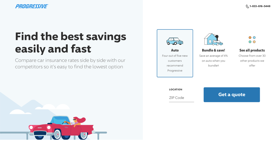
Progressive’s landing page has a clear goal of getting a quote for auto insurance. The form is the clear star here, and the rest of the page plays a supporting role.
- The form asks for a ZIP code and a type of insurance, with optional additional buttons.
- The use of tabs that correspond to different parts of the copy is a good solution for saving space.
- The copy is related to auto insurance, so there will be no confusion here.
- The background is mostly white and boring. However, the colors work well together. There is enough contrast to make the copy legible.
- The “#1 Insurance Website” section takes too much space and offers little helpful information.
#3 Liberty Mutual

The page promoting Liberty Mutual’s car insurance starts like a landing page, but the more you scroll, the more of a typical product page it becomes.
- The hero section of this landing page example is well done. A short and enticing header, a fitting image, and a quick form to fill out.
- Subsequent sections contain lots of links that redirect to other pages in the same domain.
- The sections themselves are informative and written succinctly, but some could be removed to save space.
- The addition of recent testimonials is a solid choice, but they lack real names, which reduces their credibility.
#4 Bupa Private Client

This particular healthcare landing page made by Bupa Private Services has a well-defined target group and messaging. It targets people who expect a full suite of health-related services and the copy has a luxurious angle to it.
- Design-wise, it attempts to evoke feelings of luxury and exclusivity. The colors of gold and brown, the images, the animations – all of that create an opulent composition.
- The template isn’t too complicated, making it easy to follow.
- The entire page focuses on its goal, with a handful of links taking visitors elsewhere.
- The contact form is too long for the goal of getting a callback. If someone is interested in the service, they can discuss all the required information over the phone. Asking for it upfront might discourage visitors from filling it out.
#5 Axa

The health insurance landing page made by Axa Global Healthcare is comprehensive, and it contains sections that help visitors get the full picture of the offer. Some of the notable elements include:
- A detailed table with a comparison of cover levels
- An explainer of the steps from the landing page to getting coverage
- A drop-down FAQ section
- Additional, tailor-made options are presented neatly
- Customer rating
A few parts of the page might be distracting, and some links should be removed for that very reason. Overall, though, it’s a solid landing page.
Get a high-performing insurance landing page that’s built to engage, convert, and grow your business
#6 Allianz Care

Just like the example above, the Allianz landing page features a lot of useful information. In fact, there are a few similarities between Axa and Allianz, but the latter is more in-depth.
- There are links in the top bar that improve navigation on the page by scrolling down to the chosen section.
- A list of costs of common occurrences in various countries shows how much visitors can save by choosing an international insurance plan.
- The “Why Allianz Care” section showcases the unique benefits of the business.
- A great example of social proof: recent testimonials with names and star ratings.
- The landing page design includes a few images; the focus is on the copy instead.
The great aspect of this landing page is it allows visitors to learn about the offer and get a quote quickly. The informational approach can help increase the conversion rate.
#7 Global Rescue

This is a landing page through and through, but it does have one problem that can negatively impact the conversion rate. Here is what Global Rescue’s page does right:
- The Unique Selling Points are explained clearly.
- The page itself is short but has enough information to convince visitors to get an estimate.
- The personal memberships section shows a variety of benefits.
However, the CTA is the elephant in the room. The “Get a Price Estimate” box does not stand out enough, especially if you consider the red “Visit Our Blog” CTA on the bottom of the page. Focusing on one CTA and making it more visible is a great start for the optimization process.
#8 Insubuy

The landing page Insubuy uses in paid campaigns is a product page. While the insurance company does a lot to show a value proposition and help the visitors stay on the page and fill out a form, there are a few things to work on.
- The form has multiple fields and requires various personal information, which might not be comfortable for first-time visitors.
- The section called “What does travel insurance include?” has all of the main elements, but some of them have a link to another page.
- The “Insurance Guide” is a list of links for popular inquiries. It can be replaced with an FAQ section.
- Design-wise, it looks a bit dated. A nice, modern travel-focused template would do a much better job here.
#9 Travelinsured

Travelinsured went for minimalism in the design along with structure simplicity, and indeed, in most cases, it does the job smoothly. What makes it work?
- A clever trick to replace copy with an outstanding background picture carrying a promise of dream travel.
- A form with a CTA button is centered to catch the eyes in a flash.
- The absence of distracting elements enables a clear focus on the target action.
Nevertheless, such an attitude has two weak spots:
- It may be hard to convince hesitant to this offer without a piece of copy underlying its strengths.
- Some fields in the form might be moved to the second step to avoid discouraging the impatient.
#10 Amplify

This is an excellent example of an insurance landing page that does more with less. Amplify’s page is short, but all the main elements are contained inside.
- The hero section has a persuasive copy.
- The testimonial is presented up top to make sure it’s visible quickly.
- Adding an animation of the process of getting a quote next to benefits saves space.
- The design is simple without being too dull.
Of course, no landing page is perfect. Here are some ways it could improve:
- Adding more testimonials would make a better impression.
- Linking to Trustpilot takes visitors away from the landing page, which poses a risk of them not coming back.
Other than that, this is a good example of a life insurance landing page.
#11 Geico

The insurance company with a gecko as its mascot has a landing page dedicated to its life insurance offers. Here are some things Geico did right:
- There is a CTA button and a short form in every section.
- Multiple parts of the landing page offer general tips without being too sales-oriented.
- The page layout is clear, making it easy to read and digest all the information.
As for the optimization, this caught my attention:
- External links might ruin visitors’ concentration.
- The FAQ boxes have one-sentence answers with links, so their potential is unfulfilled.
All in all, it’s more of a product page than a landing page, but with a few simple tweaks, the page can become more focused, making it easier to convert.
#12 SoFI

SoFI and Ladder use their landing page as a click-through page to take visitors through multiple conversion funnel steps. The page has a clear layout, with each section easily distinguishable thanks to different background colors. What else is there to know about this page?
- The use of the “Get my quote” CTA button is consistent across the page.
- It’s not adjusted to larger screens, but it works great on smaller-resolution devices.
- Showing the steps on the landing page is a solid choice.
- The main benefits are presented right below the hero section, so people will see them while scrolling through the page.
- One part of the page (the estate plan) speaks to a different target audience, so it might be a good idea to remove it.
#13 Guardianlife

Guardianlife landing page is sparing with colors and easy-readable. What is worth noting:
- Dark and deep blue fonts standing out from the background look clear, inviting visitors to read through and be persuaded.
- Copy bearing well-explained “why’s” (Why does a customer need the product? Why should he choose this offer specifically?).
- Intuitive and thoughtful navigation with a primary CTA button in the hero section and the more complex form hidden below (as well as a more detailed offer presentation and FAQ).
- It looks like nothing here is redundant – every element plays its designated role.
While the first impression that comes to mind is “well done!”, this landing page may be too simple and found unattractive by visitors. It is important to the extent that some of them tend to transfer their ratings from one object to another. In this case: from the landing page to the product quality, what may cause they will jump ship to GL competitors.
#14 Zensurance
Zensurance’s business liability insurance landing page lets trust, transparency, and a clear value proposition do the heavy lifting instead of pushing a hard sell.

Winning points:
- Trust signals front and center – Right at the top, Zensurance highlights key achievements with sharp, icon-based stats. These numbers instantly establish credibility before visitors even scroll.
- Reviews that back up the claims – Further down, the page doubles down on trust with testimonials. Instead of just saying they’re the best, they show real people who believe it.
- A compelling savings hook – “Save up to 35% on insurance products” is a simple but powerful incentive. It’s clear, specific, and gives visitors a reason to stick around and explore their options.
Zensurance nails the balance between information and persuasion, making this landing page a perfect example of how to convert visitors without overwhelming them.
Join thousands of marketers using Landingi to build, test, and optimize landing pages that convert
#15 Blue Cross Health
Blue Cross Health’s landing page does a great job of making insurance feel approachable. Instead of overwhelming visitors with dense information, it uses smart visuals and a clean layout to naturally lead them to the next step.

What works?
- Clever visual cues – The hero image isn’t just to set a warm, family-friendly tone. The father’s eyelines naturally lead visitors straight to the “Find a plan” button, subtly reinforcing the call to action without being pushy.
- Clear, to-the-point copy – No fluff, no confusion. The page lays out the essentials in a way that’s easy to scan, so visitors know exactly what’s being offered and why it’s worth their time.

With a mix of smart design choices and a friction-free experience, this landing page makes taking the next step feel easy and natural.
#16 Unum Insurance
Unum Insurance delivers a stress-free browsing experience with a clean design and plenty of helpful tools to guide visitors.

Smart moves:
- Clear, easy-to-follow design – The blue and white content blocks create a natural flow, making it easy to explore different insurance options.
- A learning-first approach – Instead of pushing a sale, Unum encourages visitors to explore, learn, and even join a webinar before making a decision.
- Helpful resources – Coverage calculators and FAQs are right where you need them, answering common questions without the hassle.
- Trust-building numbers – Unum highlights key stats, like the number of customers they serve, reinforcing their credibility.

With a welcoming design, useful tools, and a focus on clarity, Unum Insurance makes finding the right coverage feel refreshingly easy.
#17 Allstate
Allstate’s landing page gets straight to business, making it easy for visitors to request a quote without unnecessary steps or distractions. It’s clean, minimal, and focused on usability.

Smart moves:
- Quick insurance selection – Visitors can easily choose multiple insurance types in one go, streamlining the process and saving time.
- Straightforward copy – The messaging is clear, making it easy to understand the next steps.
By keeping things simple and action-oriented, Allstate ensures visitors can get what they need—fast.
#18 Ladder Insurance
Ladder Insurance nails the first impression with a strong, no-fuss headline that instantly tells visitors what they offer. Their modern, intuitive website makes exploring life insurance options feel effortless, with a layout designed for clarity and ease.
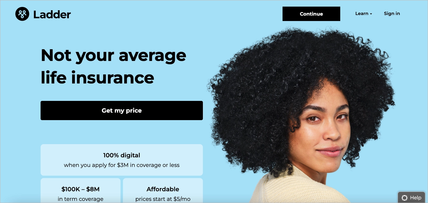
What works?
- Bold, catchy headline – Visitors know exactly what Ladder Insurance specializes in from the moment they land on the page.
- Sticky header for easy action – The “Get My Price” button stays visible as users scroll, keeping the call to action within reach at all times.
- Minimalist, well-balanced design – Just the right mix of text and visuals makes the page clean, engaging, and easy to navigate.
- Helpful tools & support – Coverage calculators, FAQs, and a live chat option ensure visitors get the answers they need without frustration.
With its sharp design and seamless experience, Ladder Insurance makes life insurance feel like a simple, straightforward decision.
#19 Loop Insurance
The Loop Insurance landing page keeps things simple, fair, and easy to navigate.

Worth to appreciate:
- Clean, easy-to-read layout – The horizontal sections of text and images create a natural reading flow, making information easy to absorb.
- Soft, eye-friendly color scheme – The warm yellow background and brown text keep the site visually appealing.
- Strong customer support options – A chatbot, FAQs, and a blog provide multiple ways for visitors to get answers, whether they prefer self-service or direct assistance.
Loop Insurance blends style, clarity, and customer-first features to create a website that feels as welcoming as it is functional.
#20 Omaha Insurance
Omaha Insurance makes the process effortless with clear navigation and an intuitive layout that gets visitors where they need to go—fast. From the moment you land on the page, everything feels designed for convenience.

Smart elements:
- Simple, clear navigation – Well-labeled menu options make it easy to find the right coverage without unnecessary clicks.
- Helpful resources – Coverage calculators and FAQs provide quick answers, keeping potential customers informed and confident in their choices.
Omaha Insurance keeps things simple and stress-free, making it easy to get a quote or find the right coverage without any hassle.
Turn clicks into customers with powerful, easy-to-use landing page tools
Build Successful Landing Pages for Your Insurance Company with Landingi
If you’ve looked at the examples closely, you’ll know landing pages are the ones that have a more focused feeling compared to regular service pages. Instead of repeating the mistakes of others, you can get ahead of the competition and connect your ads to landing pages.
Thanks to the landing page builder made by Landingi, you have the freedom to design the perfect insurance landing page without any coding skills. Just pick a template, make the appropriate changes (like adding your own logo and copy), and click “publish”.
Not enough? If you’d like to go pro, build pages at scale with smart sections, generate SEO and copy with AI, A/B test and track events to ground your decisions deeply on data.
Along with the best practices listed in the post, you will be able to build high-converting landing pages and get more conversions than your competitors.