An automotive landing page is a strategically crafted, standalone webpage designed with a singular, focused objective related to vehicles or automotive services. In this niche, where decision-making is often delayed by price sensitivity or logistical concerns, an optimized landing page becomes essential for accelerating user actions like test drive bookings, service scheduling, or inventory inquiries.
Businesses in the industry often turn to paid advertising. However, the ad campaigns aren’t cheap, and what happens after the visitor clicks the ad is paramount. Using landing pages instead of traditional websites allows dealers to control the customer journey more effectively since landing pages have a single focus.
Explore some of the best high-converting automotive page examples and templates. Landing page examples will highlight proven strategies that engage potential buyers, build trust, and drive conversions. Whether you’re looking to promote a specific car model, boost overall sales, or promote your services, these landing page designs offer valuable insights into what works and provide inspiration for your future strategies.
- Ford F-150
- Tesla Model 3
- BMW of Beverly Hills
- Hertz
- Defined Auto Restyling
- Auto Monkey
- New York Auto Show
- A+ Auto Detailing
- SafeAuto
- Progressive
- Mobile Mechanic Bristol
- Auto Intel Summit
- Express Car Wash
- Interstate Fleet Services
- Third Coast Customs
- CUDL
- Kingz Custom
- Liberty Mutual
- AFC
- A Mobile Mechanic

What Is an Automotive Landing Page?
An automotive landing page is a specialized web page designed to promote specific automotive products, services, or offers. Unlike a full website, it’s a standalone page focused on a single goal. Depending on the business type, it can encourage visitors to schedule a test drive, request a quote, or learn more about a particular vehicle or service. These pages are typically used in marketing campaigns to capture leads and direct potential customers toward a specific action.
Key elements that build an effective automotive webpage are typically a compelling headline, high-quality images or videos of vehicles, detailed descriptions of the offer, and strong call-to-action (CTA) buttons. It might also feature customer testimonials, pricing information, or special deals to persuade visitors to take the next step. The page’s design often aligns with the brand’s identity and aims to create a sense of urgency or exclusivity to drive conversions.
Overall, automotive landing pages are crucial for dealerships and automotive brands as they serve as a targeted tool to convert online traffic into potential customers by focusing on specific promotions or offerings. These pages help streamline the customer journey, making it easier for visitors to find the information they need and take action quickly.
Drive more leads like a pro! Build your automotive landing page with Landingi today.
How Do I Create an Automotive Landing Page?
To create a landing page for your automotive business, define your goals and target audience, choose the best landing page platform – Landingi, pick the template and start customizing it in a user–friendly editor. Create a compelling headline, use immersive visuals, write persuasive copy, craft an outstanding CTA button, use a simple form, and add trust-building elements. Remember to optimize your page for mobile, and once it’s life, conduct A/B tests to find the best-performing page version.
Whether for a car dealership, car rental, or any automotive business, your landing page shouldn’t be missing any of these components to convert effectively. Use the following guide to ensure your page captures leads and drives engagement:
1. Define the goal and target audience
Firstly, clearly define your landing page’s goal, such as booking test drives, promoting a special deal, or collecting leads. To effectively target your audience, understand their needs, preferences, and challenges. This knowledge will help you create a message that resonates with them.
2. Start building your page
Secondly, access Landingi and start crafting your page the way you want – either through Composer, which generates professional landing pages based on your requirements, by using Figma Plugin, which allows transform projects into live landing pages, or by choosing an adequate template from Landingi’s library and customizing it in a drag-and-drop builder.

3. Create a compelling headline and write persuasive copy
Thirdly, create a clear, concise headline that emphasizes the value you offer. It could highlight a special deal or focus on the benefits of the vehicle or service you’re promoting, immediately capturing the visitor’s attention.
Then, craft benefit-driven text clearly stating what sets your offer apart from competitors. Use concise language and bullet points to detail key features of the vehicle or service. Address common customer concerns and highlight unique selling points like price, performance, or limited-time offers.
Use AI Text Assistant to speed up the content creation process – provide all details about your offer, describe your target audience, and let it generate SEO-optimized copy for the entire page or its selected sections.

4. Include high-quality visuals
Fourthly, use high-resolution images or videos of the car or automotive services you are promoting. Visuals help visitors visualize the product and engage more with the content. An interactive 360-degree view of a vehicle or short test-drive clips can make the page more immersive.

5. Add strong CTAs
Fifthly, place visible and compelling CTAs throughout the page. Make the action buttons easy to spot, and ensure they direct visitors to a simple next step (such as filling out a short form).

6. Incorporate trust elements
Sixthly, build credibility by including customer testimonials, awards, or certifications. Including customer reviews or testimonials can help potential buyers feel more confident in their decision.

7. Optimize for mobile
Seventhly, ensure the landing page is mobile-friendly, with tappable buttons and an intuitive layout., as many visitors will access the page from their smartphones. A responsive design that adapts to different devices is essential for keeping visitors engaged and increasing mobile conversions.

8. Simplify the form
Ninthly, keep the form concise and only ask for necessary information. A long form can discourage visitors from completing it, while a simple form increases completion rates.

9. Test and refine
Lastly, continuously A/B test elements like the headline, visuals, CTA placement, and form length to determine what works best. Analyzing user behavior will help you improve the page’s performance over time.

Shift your lead gen into high gear! Run A/B tests and start optimizing your pages for maximum impact!
20 Best Examples of Automotive Landing Pages
Meet the 20 best examples of real-life automotive landing pages and check out their designs to get inspiration on crafting your own high-converting page. Pay attention to details and find out how to effectively incorporate automotive landing page key elements to achieve the best results. Check out automotive landing page templates from Landingi and pick one to start crafting a professional page for your digital marketing campaign.
1. Ford F-150
This landing page for a Ford F-150 follows the rule of having one goal. There are only two sections there – yes, that’s the entire page you’re looking at. The video is made by an impartial YouTube channel, which adds to its credibility. It clearly showcases the power and towing capacity compared to the competition. The page immediately captures attention, delivering an immersive visual experience. The “Contact Us” button is strategically positioned, driving visitors toward immediate action.

The use of a clean layout, paired with clear CTAs, ensures that users can easily navigate the page and explore the vehicle’s features. While too much of a good thing is not what you want, especially on a landing page, not enough of a good thing can produce the same effect. This automotive dealership landing page is way too simple. There is no enticing, original copy. Using a video is a great idea, but it needs to be accompanied by more information, which is not the case here.
Key takeaways to learn from this example:
- Visually engaging content,
- Strong CTA,
- Well-organized layout,
- Contact information.
Improvement areas:
- The page should include one or two more text sections with persuasive content and social proof elements, such as testimonials. This would engage visitors further and increase brand credibility.
Don’t just show cars—sell them! Create optimized automotive pages on Landingi today.
2. Tesla Model 3
The Tesla Model 3 landing page showcases an example of a high-performance automotive landing page designed to emphasize Tesla’s cutting-edge technology and sleek design. The page is visually striking, with clean, minimalist layouts and high-quality images of the Model 3, instantly attracting attention. The headlines highlight key features that resonate well with environmentally conscious buyers and those seeking innovation in electric vehicles.

The use of images, videos, and animations showcases the car’s design and tech features better than any copy would. Also, including the numbers and animated map widget speaks better to clients’ imaginations than long pieces of text. What sets this page apart is the streamlined user experience, featuring well-placed call-to-action (CTA) buttons like “Order Now” and “Experience Model 3”, which are prominently displayed to encourage immediate engagement.
Key takeaways to learn from this example:
- Sleek, minimal design,
- Clear and strategic CTAs,
- Focus on performance,
- Professional images, videos, and animations.
Improvement areas:
- Given the extensive use of high-quality visuals and multimedia, improving the page’s loading time could enhance mobile accessibility.
Choose the Car Offer template from Landingi and leverage its modern design to attract your target audience. Use strong CTAs, create a user-friendly, simple form, and capture leads effectively.

3. BMW of Beverly Hills
The Beverly Hills BMW page is another exceptional automotive landing page offering luxury and elegance. The design prominently highlights Beverly Hills BMW’s prestigious reputation through high-quality images and content emphasizing its world-class customer service. From showcasing new models to offering customizable pre-owned options, the page provides an immersive experience for luxury car enthusiasts.

The structure is clean, with intuitive navigation and clear call-to-action (CTA) buttons like “Schedule Service”, making it easy for users to engage. The copy is easy to read — white fonts ideally resonate with dark or deep-blue backgrounds. The page balances visuals and content to drive visitors toward specific actions while highlighting the dealership’s global presence.
Key takeaways from this landing page:
- Luxurious imagery,
- Clear CTAs,
- Search bar,
- Contact information,
- Map plugin.
Improvement areas:
- Overloading this landing page with many elements like buttons, links, offer bars, widgets, and fields is a highway to decrease the conversion rate. A landing page should be action-oriented without so many distractions.
Turn online visitors into test drives! Start generating leads for your automotive business with Landingi.
4. Hertz
The Hertz page is a prime example of a highly effective automotive landing page, designed to entice users with its luxurious appeal and smooth user experience. The page immediately impacts users with a sleek, high-quality video background showcasing their premium fleet, setting an aspirational tone. Colors are selected so that the most important elements may contrast with the background. It also uses interactive elements like car class sliders, allowing users to explore other vehicles, adding a personalized touch to the browsing experience.
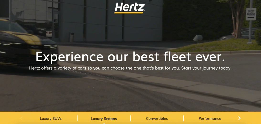
What sets this page apart is its well-structured, visually appealing design, which is fully responsive and adjusts to various screen sizes, ensuring a seamless experience across devices. The strategic use of the Hertz brand’s iconic yellow color for key sections enhances visibility and brand consistency. Additionally, a 360-degree view allows users to explore various car models in detail, further increasing engagement. Although the site is very engaging and well structured, it is missing a key element – the CTA button, without which it simply won’t convert.
Key takeaways from this landing page:
- High-quality visuals,
- Clear headline,
- Responsive design,
- Interactive car selection.
Improvement areas:
- The page lacks a highly visible and encouraging immediate action CTA button.
Pick the Car Rental template from Landingi and craft a perfect page that truly converts. Add high-quality images, promote special offers to build engagement, and use a simple form to boost the conversion rate.

5. Defined Auto Restyling
The Defined Auto Restyling landing page stands out as a top-tier automotive service landing page thanks to its sleek, modern design and strong branding. It opens with a clear, compelling value proposition immediately speaking to car enthusiasts looking to enhance their vehicles. This headline is supported by well-organized sections that explain key services like vehicle wraps, ceramic coating, and brake caliper painting.

The layout is intuitive and mobile-responsive, with the call-to-action button “Contact Us!” prominently placed in the top right corner. Integrating social proof through Instagram boosts credibility, and the minimalist color scheme combined with high-contrast text helps guide the user’s eye toward conversion.
Key takeaways to learn from this example:
- Clear and bold value proposition,
- Smart CTA placement,
- Strong branding.
Improvement areas:
- Incorporating real customer feedback would significantly increase trust and help convert skeptical visitors.
6. Auto Monkey
The Auto Monkey landing page represents one of the most effective examples of high-converting landing pages in the automotive industry. It offers an app for booking mechanic services. The headline immediately establishes credibility and authority. The value proposition is direct and speaks to the convenience of the offer, which resonates well with busy users looking for on-demand solutions.
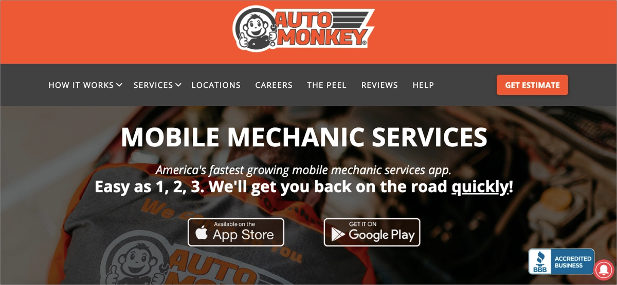
The design is modern, responsive, and user-friendly across devices, offering seamless navigation and a professional aesthetic. Social media links and social proof elements add credibility, impacting decision-making. The use of bold colors like bright orange and clean whites creates a memorable visual experience while keeping calls to action visible and compelling.
Key takeaways to learn from this example:
- Clean, mobile-responsive design,
- Clear service promise,
- Strong brand positioning,
- SEO-optimized structure.
Improvement areas:
- The page could be shorter, with fewer descriptions, to keep users focused on the CTA.
7. New York Auto Show
The New York Auto Show landing page is an effective automotive event landing page due to its commanding visual presence and clear communication. Promoted as the “oldest and largest-attended Auto Show in North America”, it immediately establishes credibility and prestige. Visitors are greeted with key information about the show (dates, location, and history), along with easy navigation to purchase tickets or explore event highlights. Sponsor logos, press information, and news updates further solidify its authoritative tone.

The page’s success lies in balancing event excitement and practical utility. There is a strong focus on accessibility – key information sections are straightforward and easy to find. Integrating real-time updates and a modern aesthetic helps maintain user interest. Additionally, the page includes social media links, allowing users to dive into the event’s online buzz and see what people say.
Key takeaways to learn from this example:
- Powerful headline,
- Easy-to-navigate event structure,
- Strong visuals and branding,
- Outstanding CTA.
Improvement areas:
- While functional, enhancing mobile navigation and scaling media assets could make it more user-friendly for on-the-go users.
8. A+ Auto Detailing
A+ Auto Detailing landing page makes a great first impression with its bold, high-contrast visual design and compelling call to action. Right from the headline, they speak directly to customer desires. The hero image showcases a clean, polished vehicle, reinforcing the quality of service, while the simplified navigation and booking options make it easy for users to take action. Whether it’s scheduling a detailing session or exploring service packages, the experience is streamlined and intuitive.

The use of vibrant color accents against a dark background creates a premium feel, aligning with the high-end service promise. The landing page also integrates location-based SEO cues, which helps build trust and improves local search visibility. Mobile responsiveness is well-executed, ensuring that users on phones and tablets can easily access contact info, service details, and booking forms.
Key takeaways to learn from this example:
- Strong first-glance UVP,
- Visual hierarchy,
- Quick navigation and booking,
- Local trust signals.
Improvement areas:
- Offering at least a starting price or package overview could help visitors make quicker decisions.
Your next sale starts with a great landing page! Take control of your brand’s online presence.
9. SafeAuto
The SafeAuto page is a great example of a high-performing automotive insurance landing page. It combines trust, accessibility, and conversion-driven design. The page introduces the brand with a strong, authoritative headline, immediately setting user expectations and reinforcing credibility. The hero section is clear, offering a quote CTA that guides users toward getting a personalized insurance rate with minimal effort.

The page uses a clean layout, bold headings, and visually distinct icons to explain key features. Additionally, it includes sections that walk users through simple steps to get started – helping eliminate confusion and making the insurance process feel approachable and streamlined.
Key takeaways to learn from this example:
- Strong trust signal in a headline,
- Simple user journey,
- Value-driven icons and text,
- Well-integrated quote CTA.
Improvement areas:
- Adding trust elements from real customers would strengthen the emotional appeal and credibility of the service.
10. Progressive
The Progressive landing page positions the brand as a reliable partner in the automotive insurance space, making a bold statement with the headline “Make All Your Insurance Easy”. This message immediately resonates with users looking for simplicity and reliability. The layout focuses on an intuitive experience where users can easily start a quote using basic, “offhand” information. The call to action is strong, paired with clean design elements, trust-building language, and user-friendly navigation.

Its strengths lie in its high usability, product bundling options (such as combining auto with home or renters insurance), and the clear incentive of savings. The consistent branding, use of recognizable icons, and fast-loading design provide a smooth journey, especially for users seeking quick answers.
Key takeaways to learn from this example:
- Simple, benefit-driven messaging,
- Effective call-to-action,
- Bundling incentives,
- Clean, mobile-optimized layout.
Improvement areas:
- Integrating user reviews or trust badges could further increase conversions.
11. Mobile Mechanic Bristol
The Mobile Mechanic Bristol landing page shows how a local automotive service can effectively build trust, engage visitors, and drive conversions. From the moment users land, they’re greeted with a clear headline, which immediately answers core customers’ pain point – service availability. The background image of a mechanic at work paired with bright, branded CTA buttons creates a strong first impression that’s both professional and inviting.

Emphasis on location relevance, clear services offered, and the simplicity of getting a quote impact the page’s efficiency. The quote form is short and user-friendly, optimized for both desktop and mobile. The layout is structured to guide users through the services, benefits, and booking process without overwhelming them. Additionally, contrasting tones draw attention to key sections like the form and contact area, while softer shades maintain readability.
Key takeaways to learn from this example:
- Eye-catching design,
- Strong CTA,
- Easy-to-use quote form,
- Local focus.
Improvement areas:
- Integrating testimonials or star ratings would boost trust and drive conversions.
Use the Motorization template from Landingi to attract your target audience with a special offer. Add high-quality, professional visuals, and use bold headlines to convey your unique selling proposition effectively.

12. Auto Intel Summit
The Auto Intel Summit (AIS & NRC 2025) landing page exemplifies excellence in automotive event promotion through its dynamic design, industry authority, and user-focused structure. It opens with a commanding visual banner and bold typography announcing the event’s name, dates, and location. The tagline “Intelligence. Innovation. Inspiration.” sets a forward-thinking tone that aligns perfectly with the summit’s focus on automotive retail, technology, and finance innovation.

This landing page shines through its structured content, offering a mix of high-level event information, testimonials, and registration options without overwhelming the visitor. Clear CTA “REGISTER TODAY!” is prominently featured, making event registration process easy. Additionally, embedded testimonials from industry leaders provide authenticity and social proof, further enhancing engagement and credibility. Overall, the Auto Intel Summit landing page effectively blends style with substance, delivering a modern, engaging experience that reflects the forward-looking nature of the automotive tech industry.
Key takeaways to learn from this example:
- Event-driven branding,
- Smooth navigation,
- Strategic CTAs,
- Map plugin,
- Use of social proof.
Improvement areas:
- While the desktop layout is robust, some elements (like testimonial blocks and location info) could be better streamlined for mobile devices.
13. Express Car Wash
Express Car Wash’s landing page succeeds in conveying professionalism and building trust while providing a frictionless experience for users looking for dependable car cleaning services in Dublin. The brand introduces itself as a leading service provider in Dublin, immediately establishing trust and authority. The page also highlights that the business is family-owned, professional, and friendly, with a focus on word-of-mouth referrals rather than gimmicks – a message that resonates well with local customers looking for reliable service.

The layout is clean and well-structured, offering easy access to services like car valeting and detailing through the top navigation. Contact details are clearly displayed in the header, including a phone number and email, which encourages instant customer engagement. The presence of location-specific language enhances SEO and targets the local audience effectively. Additionally, real facility images and straightforward service descriptions add authenticity and transparency to the brand.
Key takeaways to learn from this example:
- Strong local branding,
- Clear contact access,
- Focus on customer satisfaction,
- Easy navigation.
Improvement areas:
- Adding customer feedback would further validate the quality claims and increase credibility.
Drive more leads like a pro! Build your automotive landing page with Landingi today.
14. Interstate Fleet Services
The Interstate Fleet Services landing page effectively blends the promise of speed, clarity, and trust, making it a prime model for service providers in the emergency vehicle repair niche. At first glance, the headline “24/7 Mobile Truck Repair” makes the value proposition clear: around-the-clock, reliable support for commercial trucks, trailers, buses, and RVs. The page’s bold red and black color scheme, strong branding, and urgency-driven tone are designed to convey trust and speed – critical factors for users facing breakdowns on the road.

One of the page’s key strengths is its mobile-first usability and direct call-to-action structure. The “Call Now” prompt is instantly visible, encouraging fast decisions. It’s SEO-optimized, with relevant keywords woven into metadata and descriptions. Additionally, the inclusion of service area listings, vehicle types served, and emergency claims adds depth and assurance for fleet managers and drivers in need of immediate help.
Key takeaways to learn from this example:
- Instant clarity,
- Emergency-focused CTA,
- Local SEO strategy,
- Simple navigation.
Improvement areas:
- Including real-time chat or a dispatch availability feature would further enhance response confidence.
15. Third Coast Customs
The Third Coast Customs landing page delivers a confident, no-frills message with a strong visual identity and clear conversion paths – ideal for automotive enthusiasts looking for standout, professional car wraps. Right from the start, it makes a bold visual impact with clean branding and a prominent service message. This immediately positions the business as a specialist in quality-driven automotive customization, drawing in its target audience – car enthusiasts who want unique, professional results.

One of this landing page’s core strengths is its clarity and simplicity. The navigation is minimal, helping users focus on the main offer. Contact-oriented CTAs are outstanding, with intense color, enhancing conversion. The integration with Instagram builds credibility and showcases the brand’s work visually. The use of location cues and strong visuals tied to the Texas car scene also supports local SEO and appeals to a niche audience that values personalization and reputation.
Key takeaways to learn from this example:
- Clear headline with strong positioning,
- Contact-first design,
- Social proof integration.
Improvement areas:
- CTA buttons could be more graphically refined to fit into the page design.
16. CUDL
The CUDL landing page for the eBook titled Five Ways Credit Unions Hold the Key to Dealer Success is an outstanding example of an automotive B2B content marketing asset designed to capture leads while offering genuine value to dealership professionals. Its hero section is instantly engaging with a large headline, bold design, and clear description of the eBook’s value. Visitors are told exactly what they’ll gain – insight into credit unions’ role in dealership financing success – which creates a strong incentive to fill out the form and download the content.

Key strengths of the page include its simple yet authoritative structure, mobile-responsive layout, and conversion-focused design. The form is embedded above the fold, minimizing friction in the user journey. The visual contrast between black, white, and yellow creates a clean, premium feel that reflects the professionalism of the CUDL brand. Supporting text clearly communicates that the eBook addresses current market challenges, enhancing its relevance to auto industry professionals.
Key takeaways to learn from this example:
- Strong, informative headline,
- Conversion-focused layout,
- Consistent brand identity,
- Clear, benefit-driven copy,
- Simple form.
Improvement areas:
- A short summary or sample page could increase perceived value and encourage more form submissions.
17. Kingz Custom
The Kingz Custom’s landing page is a sleek, high-impact example of automotive customization marketing done right, with strong branding and a refined user journey. The page immediately captures attention with immersive background video and quality promise, setting a high-end, specialized tone for car enthusiasts and luxury vehicle owners alike. Its hero section is visually strong, supported by clean navigation and a modern dark-themed design that screams style and craftsmanship.

Key strengths include a well-structured layout that keeps focus on key actions, a visible phone number for quick contact, and strong SEO cues tied to Houston and Sugar Land, Texas. The branding extends through fonts, button styles, and visual hierarchy, helping maintain a polished, consistent feel. Social media links to Instagram and Facebook provide proof of active engagement and visual work samples, adding credibility and encouraging users to explore the brand’s portfolio.
Key takeaways to learn from this example:
- Strong value proposition,
- Consistent visual identity,
- Localized SEO,
- Outstanding CTA buttons,
- Pricing information,
- Social presence.
Improvement areas:
- The page could be shorter, with less distracting elements. As well, there should be fewer CTA buttons – a few placed in strategic sections would be enough.
Pick a professionally designed template and create personalized page to capture more leads!
18. Liberty Mutual
The Liberty Mutual page is a benchmark example of a user-first, high-converting car insurance page. From the outset, it features crystal-clear, value-driven headlines promising savings and speed. This immediately answers the two most common user needs: cost-effectiveness and convenience. The design is simple yet effective, with a clear path to the quote form, optimized for both desktop and mobile users.

One of its strongest features is the prominent, frictionless quote call-to-action that invites users to begin their journey right away. The page supports this with visual trust cues, like the Liberty Mutual logo and familiar color scheme. Additional features like coverage explanations, FAQs, and savings tips provide educational value and reduce buyer hesitation. Accessibility and load performance are optimized, enhancing usability for a broad audience.
Key takeaways to learn from this example:
- Fast and simple quote process,
- Trustworthy branding,
- Educational support.
Improvement areas:
- Real customer feedback would reinforce trust and provide social proof.
19. AFC
The AFC (Automotive Finance Corporation) page is a model of clarity and credibility in the automotive financing industry. It immediately captures attention with a bold hero statement. The branding is strong, and the use of imagery, motion effects, and call-to-action buttons help streamline the user journey.

What sets this landing page apart is its depth of content paired with a user-friendly structure. AFC does a great job showcasing the variety of customers it serves (from independent used car dealers to rental operators) and highlights its flexible financing for various vehicle types. With detailed service explanations and engaging visuals, the page builds trust while guiding the user through key offerings. Overall, AFC’s landing page delivers a robust, well-structured experience that aligns professionalism with real dealer needs, making it one of the top-performing B2B automotive finance pages.
Key takeaways to learn from this example:
- Strong, mission-driven messaging,
- Service clarity,
- Compelling CTAs,
- Brand consistency.
Improvement areas:
- Adding client testimonials or dealership success stories could increase authenticity and emotional engagement.
20. A Mobile Mechanic
A Mobile Mechanic’s landing page succeeds by being sharp, honest, and action-oriented – ideal for local users needing fast, reliable car repairs on the go. The page hits the core concerns of its target audience, effectively promoting emergency services. The landing page delivers a clean, mobile-friendly design with easy navigation and a quote form right where users expect it. The vibrant red accent color draws attention to key call-to-action buttons, encouraging instant engagement.

This page effectively builds local trust and service clarity. It emphasizes Bristol as the service area multiple times, boosting both SEO and user confidence. The form is short and simple, helping potential customers reach out without friction. The use of an authentic background image showing an actual mechanic at work adds authenticity, while minimal distractions ensure that users stay focused on converting.
Key takeaways to learn from this example:
- Location-targeted messaging,
- User-first design,
- Authentic visuals,
- Simplified quote form.
Improvement areas:
- Social proof like testimonials or Google review badges could greatly enhance trust and conversion.
Pick the Car Discount template from Landingi and leverage this perfectly structured pre-designed page to promote your car service business. Use social proof elements to build trust among potential customers and highlight your USP to encourage users to take action.

4 Automotive Landing Page Best Practices
Check out the 4 automotive landing page best practices and learn how to craft an effective page for your business by providing availability information, including maps, focusing on one effective CTA button, and using popups. Conversion rate is not just a marketing buzzword. It translates directly to the number of new contacts and, if you nurture them right, customers. That’s why it’s important to keep this metric in mind. In order for your automotive landing page to convert as high as possible, you need to follow certain practices:
#1 Provide Availability Information
The first best practice for automotive landing pages is to provide availability information. Depending on your business type (car dealership, car rental, car services), this information can take various forms. For instance, when you offer cars for rent, show if a particular model is available, or when running a car dealership, show real-time inventory. Potential customers are cross-shopping with different brands, so if they see that their dream model is available at your dealership, they are more likely to call or email to inquire about it.
The key benefits of accurate inventory display are the following:
- Avoids disappointment and builds trust, translating into an enhanced customer experience
- Encourages immediate action when a desired vehicle is available, increasing conversions.
- Reduces time wasted on inquiries for out-of-stock vehicles, speeding up thesales process.
- Affects faster loading times and better user experience, improving page performance.
Check out the example below:

In this case, a landing page designed to promote a specific car model includes a prominent “View Inventory” CTA button, directing to a search tool that can show potential customers the car dealerships where that model is available.

#2 Include Map & Opening Hours
The second automotive landing page best practice is to include a map and opening hours. Regarding your business type, it’s one of the most important elements for boosting user experience. You should include a map plugin that shows your car rental business, car service, or dealership location, as this landing page might be the very first point of contact with your company. That is precisely why you should create a section with a map and opening hours. Even if the visitors don’t convert, they might remember where your dealership is and pop in when they are in the area.
It wouldn’t count on the conversion stats, but as long as you get people in the door, it’s a solid move, especially when you run a local business. Here is an example of what this element could look like:

#3 Limit the Buttons
The third best practice for landing pages in the automotive industry is to limit the buttons. Just like tons of other dealerships and car manufacturers, you might be tempted to provide visitors with all kinds of links. Contact, setting up a test drive, trade-in options, payment plans… it’s a lot.
Landing pages are not supposed to have as many buttons. If you run paid ads that redirect to a landing page, your goal has to be clear, and there should only be one. Make sure you limit the number of various buttons on your automotive landing page to keep the visitors focused on the goal they are supposed to fulfill. Using one clear CTA button is key, but strategic placement also matters. Leverage the hero section, top bar, and other persuasive sections to repeat your CTA. Check out how it’s been done in the following example:

#4 Make Use of Popups
The fourth automotive landing page best practice is to make use of popups. One thing car brands do very well on their landing pages is use pop-ups instead of redirecting to another site. You might have lots of information to convey, and having a pop-up with technical specifications might make the page shorter.
Some of the examples you are about to see actually stick to these (and other) practices quite often.

Build a pop-up like this one with Landingi’s Schedule a Call template, or check out 100+ pre-designed, fully customizable popup templates in our gallery.
What Is the Average Conversion Rate for an Automotive Landing Page?
The average conversion rate for landing pages in the automotive industry isn’t specified, but in general, landing pages across all industries achieve the avg. CVR of 5.89%, according to HubSpot’s newest reports. Well-performing landing pages typically achieve conversion rates of around 10%, but the top-converting pages achieve conversion results of 27% and higher, according to Unbounce’s statistics. These data show that proper conversion optimization strategies can help you adjust your pages to your target audience’s expectations and achieve above-average results.
How Can I Optimize My Automotive Landing Page for Higher Conversion Rates?
To optimize your automotive landing page for higher conversion rates, convey a clear value proposition, use strong CTAs, leverage immersive visuals, create a user-friendly form, and use social proof elements. Remember to optimize page load speed and ensure a seamless experience across all devices. Always use data from analytics tools to adjust your landing page to your target audiences’ expectations and boost its performance.
Learn conversion optimization methods and find out how to incorporate these improvements with the following mini-guide:
1. Focus on a clear, compelling headline
Firstly, focus on creating a clear and compelling headline that grabs attention immediately and communicates the key benefit of your offer. To create a powerful headline for your automotive landing page, focus on being specific and direct. Avoid vague language and highlight the most compelling benefit. Use strong action verbs to create a sense of urgency and emphasize the benefit. Incorporate keywords strategically to optimize for search engines and target your audience. Finally, keep it concise to grab attention quickly and avoid clutter. The headline must be specific and relevant to your audience – it’s essential to clarify the value proposition right from the start.
2. Use strong, action-oriented CTAs
Secondly, use strong, action-oriented CTAs. A strong call to action is crucial for guiding visitors toward the desired action on your automotive landing page. To create effective CTAs, use clear and concise language, create a sense of urgency, use strong action verbs and contrasting colors, and test different CTAs. Ensure that your CTA buttons are easy to locate and visually appealing.
3. Leverage high-quality visuals and video content
Thirdly, leverage high-quality visuals and immersive video content. Car buyers rely heavily on visuals, so use professional images or videos of the vehicles to enhance appeal. Use professional photography that showcases the vehicle‘s or specific service’s features and details. Ensure the visuals align with your brand’s identity and messaging. Immersive video content can highlight the vehicle’s performance, features, and driving experience. 360-degree views allow visitors to explore the vehicle from all angles. Interactive elements like car configurators or virtual test drives can enhance the user experience.
4. Create a user-friendly form
Fourthly, create a user-friendly form. Keep it short and focused. Ask for only essential information, like name, email, and phone number, as too many fields can deter users from completing it. The simpler the form, the more likely visitors are to convert. You can also include auto-fill options to make it even easier.
Turn auto interest into action! Build landing pages with effective lead capture forms.
5. Show social proof and trust elements
Fifthly, show social proof and trust elements. Adding reviews, testimonials, and star ratings from satisfied customers boosts credibility. Customer reviews build trust and credibility, like trust badges, industry certifications, or logos of partners and associations, which confirm the legitimacy, helping to dispel any doubts potential customers may have.
6. Ensure mobile responsiveness
Sixthly, ensure mobile responsiveness and minimize page loading time. In today’s mobile-first world, it’s essential that your automotive landing page is mobile-responsive to provide a seamless user experience across all devices. Ensure the page layout and content adjust to different screen sizes and resolutions. Additionally, optimize your images, use a content delivery network (CDN), and compress files to reduce load times. A fast-loading page improves user satisfaction and can increase conversion rates.
7. Leverage A/B testing
Seventhly, leverage A/B testing to experiment with various landing page versions. A/B testing is a powerful tool for identifying the most effective elements of your automotive landing page. By creating two or more page versions with variations in headlines, visuals, CTAs, or other elements, you can compare their performance and identify which version drives the highest conversion rates.
8. Make data-based adjustments
Lastly, make data-based adjustments. Use a professional analytics tool, such as EventTracker from Landingi, to track events and user behavior, gain valuable insights into how visitors interact with your page, and identify areas for improvement. Identify the metrics that are most important to your business goals. Then, review your analytics data regularly to identify trends and insights. Use the data to make informed decisions and implement improvements. Regular performance tracking allows you to optimize your automotive landing page and maximize its effectiveness in driving conversions.
What Are the Key Elements of an Effective Automotive Landing Page?
The key elements of an effective automotive landing page involve a catchy headline, immersive visuals, strong CTA, engaging copy, lead capture form, and others – listed below. All these components work together to capture attention and convert visitors into leads.
Catchy headline
An attractive headline should grab attention immediately and communicate the page’s primary benefit or unique selling point, highlighting the value of the offer or the vehicle being promoted
Immersive visuals
Sharp, professional images or videos of the vehicle or service being promoted, such as 360-degree car views, interior shots, and videos of the car in action, help visitors visualize the product and engage more deeply.
Strong CTA
When strategically placed, a prominent and action-oriented CTA, such as “Schedule a Test Drive,” “Get a Quote,” or “Claim Offer,” encourages visitors to take the next step. The buttons should stand out with contrasting colors and persuasive language.
Engaging copy
Benefit-driven and concise text highlighting key features, specifications, and offers is key to success. It should focus on what makes the car or service stand out, using bullet points and short paragraphs to keep it easy to read.
Lead capture form
A simple and user-friendly form should be well-designed to collect visitor information effectively. It should be short and intuitive to minimize friction and increase the likelihood of completion.
Trust elements and social proof
Customer testimonials, vehicle awards, dealership ratings, and trust badges, such as manufacturer certifications or dealership partnerships, effectively build credibility and help reinforce the page’s reliability.
Mobile responsiveness
Optimizing pages for mobile is crucial, ensuring they function and look great on smartphones and tablets. Many visitors will access the page from mobile devices, so providing a smooth, mobile-friendly experience is necessary.
Limited-time offers or promotions
Time-sensitive deals, discounts, or special financing options create urgency and effectively motivate visitors to act quickly before the offer expires.
Contact information
Clear, easy-to-find contact details (phone number, email address, and location) and map plugins allow visitors to get in touch easily if needed.
What Is the Best Automotive Landing Page Builder?
The best automotive landing page builder is Landingi, a user–friendly platform designed for beginners and professionals looking to easily create, test, and optimize high–converting landing pages. Landingi offers over 400 fully customizable templates tailored for different industries, including automotive, making it a powerful tool for car dealerships, automotive service providers, or car manufacturers aiming to boost their online presence.
What sets Landingi apart is its intuitive drag-and-drop editor, which allows you to design visually appealing and functional landing pages without needing coding skills. You can choose from a wide range of automotive-specific templates, modify them to fit your brand, and add important features like lead capture forms, images, videos, and call-to-action (CTA) buttons with ease. With AI landing page features, you can generate attractive copy for the entire page or its sections, optimize your page for search engine algorithms, and polish up the visuals. Landingi offers a comprehensive set of tools that can help you craft personalized landing pages, which you can use to reach target audiences efficiently. This makes it an ideal choice for automotive businesses that want to focus on user experience while quickly launching campaigns.

Additionally, Landingi’s A/B testing and analytics features – EventTracker – allow users to optimize landing pages by testing different layouts, headlines, or CTAs to see which ones perform best and by tracking events and user behavior to find areas for improvement. This ensures your automotive landing pages continuously improve for higher conversion rates, making Landingi a comprehensive solution for creating and refining effective pages.
Inspired by the best? Create your own high-converting automotive page with Landingi now!
Create a High-Converting Automotive Landing Page with Landingi
The four high-converting automotive landing pages you’ve seen in this article showcase the essential elements that drive engagement and lead conversions. From visually appealing designs and compelling calls to action to streamlined forms and trustworthy testimonials, these pages are designed to convert visitors into potential customers.
By analyzing these examples, you can see how effective design, clear messaging, and user-friendly layouts significantly impact conversion rates. Using the provided Landingi templates, you can quickly apply these strategies to your own automotive business and optimize your landing pages for success.
As you create or refine your automotive landing page, remember to test different elements and continually optimize for performance. A well-executed landing page can be the deciding factor between a casual browser and a committed buyer. Try the best landing page platform – Landingi, and turn your ideas into a high-converting automotive landing page.