A portfolio landing page is the digital space for showcasing your professional talents and creative works. It serves as the entry point where potential clients and collaborators first encounter the breadth and depth of your skills. This space is where you make a compelling first impression, allowing visitors to explore your work further and verify that your knowledge aligns with their needs.
This article unfolds the intricate elements that elevate portfolio landing pages from merely functional to exceptionally engaging. Dive into the finest portfolio landing page examples, understanding what distinguishes them and how you can draw from these examples to construct your personal portfolio landing page that not only highlights your professional achievements but also makes meaningful contacts and drives career growth.
- Britlyn Simone Floral
- David M. Schwarz Architects
- Dana Osborne Design
- Emerse Design
- Duhon
- Maya Francis
- Eva Sánchez
- SK TANG
- Koichi Takada Architects
- Studio Libeskind
- Jessica Bobince
- HANAZAKI
- Rinko Kawauchi
- Michelle Carroll
- Elisa Miller

What Is a Portfolio Landing Page?
A portfolio landing page is a specialized web page designed to showcase an individual‘s or company‘s work, skills, and expertise in a compelling and organized manner. It acts as a digital portfolio that is accessible to potential clients, employers, or collaborators who are interested in reviewing the work and possibly engaging in professional relationships. This type of landing page is particularly prevalent among creatives, freelancers, and professionals looking to display their projects, designs, artwork, or case studies in a visually appealing and easily navigable format.
Unlike a traditional homepage, a portfolio landing page focuses on a single purpose – presenting work samples and relevant professional information to convince visitors of the owner’s capability and suitability for future projects or employment. It’s a crucial tool for making a strong first impression, highlighting one’s unique selling points, and differentiating from competitors. A well-crafted portfolio landing page showcases the best of one’s work and provides a snapshot of the individual’s or company’s professional narrative, ethos, and approach to potential projects.
Portfolio landing pages are a pivotal touchpoint for professionals to communicate their brand, quality of work, and professional journey to an online audience. They are meticulously designed to engage visitors, convey professionalism, and convert interest into actionable inquiries, collaborations, or job opportunities.
Ready to showcase your best work? Build your portfolio landing page with Landingi!
How Do I Create a Portfolio Landing Page?
To create a landing page that will serve as your portfolio, define your objective and focus on your target audience, create a layout that showcases your talents, add social proof elements, and create a strong CTA button directing visitors to complete the action. Check the 9-step guide below and apply these instructions to create a professional portfolio landing page.
1. Define your objective and target audience
Firstly, define your objective and target audience. Clarify the primary goal of your portfolio landing page, whether it’s to showcase your work, attract potential clients, or highlight your skills for job opportunities. Understanding your target audience’s needs and preferences is crucial in tailoring the content and design of your landing page to meet their expectations.
2. Select a platform and a template
Secondly, select a platform that offers flexibility, ease of use, and design options that align with your aesthetic preferences. Many page builders, like Landingi, offer templates specifically designed for portfolio sites, making it easier to start with a professional-looking layout that you can customize.
When using Landingi, you can craft your page the way you like the most – using templates, crafting your page from scratch in a drag-and-drop builder, leveraging Composer that generates pages based on your requirements, or through the Figma Plugin, transforming Figma design into a live landing page.

3. Showcase your best work
Thirdly, showcase your best work – your portfolio landing page should highlight your best projects or pieces. Curate your work carefully, selecting pieces that display your skills and the diversity of your capabilities. Opt for high-quality images and consider integrating interactive elements such as sliders or galleries to engage visitors.
When you craft your page in the Landingi editor, simply click any picture and choose the Change option to open the Image Gallery. You can now upload your photos, edit them, and optimize.

4. Craft compelling content
Fourthly, craft content that engages. Include a short but storytelling narrative that complements your images. Introduce yourself, describe your photography style, and clearly state how clients can benefit from your services. Use catchy headings, bullet points, and short paragraphs to make the content easily scannable.
Lack of ideas for compelling content? Use AI Text Assistant to generate copy for the entire page and tailor it to your target audience. However, you should consider the generated copy as inspiration – modify it and add your own thoughts to make it feel authentic.

Maximize your portfolio’s impact—create an optimized landing page with Landingi!ngi!
5. Include strong CTA
Fifthly, include a strong CTA. Guide your visitors toward the action you want them to take with clear and compelling CTA buttons. Whether contacting you, viewing more work, downloading your resume, or booking a consultation, your CTAs should be easy to find and enticing enough to encourage engagement.

6. Add testimonials and reviews
Sixthly, add testimonials and reviews. Including social proof in the form of opinions from past happy clients or colleagues can greatly enhance your credibility. Positive feedback builds trust and gives potential clients or employers a sense of the experience and satisfaction others have had with your work.
91% of individuals aged 18-34 place as much trust in online reviews as they do in personal recommendations, as showcased in a BrightLocal study. It means adding reviews can build your brand’s strength, leading to a higher conversion rate.
In the Landingi editor, you can easily add a testimonials section, include reviews, and add an FAQ section – elements that build trust and credibility.

7. Optimize for SEO
Seventhly, optimize your portfolio landing page for SEO to ensure it’s discoverable. Use relevant keywords in your content, optimize image sizes and alt tags, and structure your site with clear, logical navigation. This can help improve your site’s ranking on search engines and attract more organic traffic.
Leverage AI features to automatically generate a title and description for your landing page, ensuring it’s fully optimized for SEO.

8. Ensure mobile responsiveness
Eightgly, ensure mobile responsiveness – with the increasing use of mobile devices to access the web, ensuring your portfolio landing page is mobile-friendly is essential. A responsive design adapts to various screen sizes, providing a seamless experience for all visitors.
86% of leading landing pages are optimized for mobile, according to Website Builder Expert statistics. As 56% of traffic comes from mobile, it’s important to ensure mobile responsiveness to achieve the best conversion results.
Landingi automatically adjusts your page for mobile screens. However, if you want to make some changes or prefer to manually create a mobile version of your page, you can do this leveraging a user-friendly editor.

9. Regularly update your content
Ninthly, regularly update your content. Keep your portfolio landing page fresh and up-to-date by regularly adding new projects, updating your skills, and revising your bio or resume. This keeps your portfolio relevant and shows that you are active and progressing in your field.
By choosing the proper tools and following this 9-step guide, you can create a portfolio landing page that effectively showcases your talents, engages your target audience, and helps you achieve your professional goals.
Highlight your skills and projects—build a compelling portfolio landing page with Landingi!
15 Best Examples of Portfolio Landing Pages
The 15 best examples of portfolio landing pages showcased below can be a great inspiration and a valuable lesson. Find out how to use theoretical knowledge to create a personal portfolio page that converts. Check key takeaways and discover strengths and improvement areas of these examples, find the perfect portfolio template, and start crafting your own landing page to engage new clients.
1. Britlyn Simone Floral
The Britlyn Simone Floral portfolio landing page makes a great first impression on visitors, showcasing the best projects with high-quality visuals. Short but concise written content invites visitors to discover the world of wedding floral arrangements. Horizontal navigation makes the page interesting, resembling a classic photo album. Each creative work project is showcased with a main theme picture tile, signed with a bride and groom’s names, and a localization where the project was realized.

This florist portfolio landing page also includes a contact section with a phone number and e-mail address at the bottom and social media buttons, allowing visitors to dive into the florist world on SM channels. The inquiry button in a strategic top-right corner leads to the clear form, supplemented with testimonials from past happy clients.
Key takeaways to learn from this example:
- Clear layout with horizontal navigation,
- High-quality visuals,
- Concise, storytelling content,
- Contact details,
- Social media buttons,
- Clear inquiry form.
Improvement areas:
- Videos – the page could include short videos, for instance, from project behind-scenes, to showcase the creative process and the florist’s energy. It could engage visitors more, ultimately leading to higher conversion rates.
Pick a Wedding Photography template to create your own portfolio landing page and customize it easily with Landingi – show your unique style and encourage visitors to contact you!

2. David M. Schwarz Architects
The David M. Schwarz Architects portfolio landing page showcases the company’s architectural projects. A well-designed layout with high-quality visuals engages page visitors to know the company’s work better. This extensive portfolio looks great and doesn’t overwhelm visitors, thanks to the choice of thumbnail pictures presenting each project instead of full-size visuals. Short titles and the highlight effect engage to click and get details about each project.

The page also includes contact details, with full company address, e-mail address, and a “Call Now” option. At this portfolio landing page’s bottom section, visitors can also find social media buttons, allowing them to follow the company’s SM channels and find more inspiring information.
Key takeaways to learn from this example:
- Clear layout,
- Extensive, well-designed portfolio,
- High-quality visuals,
- Social media buttons,
- Contact information,
- “Call Now” button.
Improvement areas:
- CTA – the page should include an outstanding CTA button with straightforward messaging, like “Contact us”, leading to a clear inquiry form to increase conversion rates.
3. Dana Osborne Design
The Dana Osborne Design portfolio landing page is a perfect example of how to craft a converting portfolio site. Thumbnail illustrations create a visually attractive showcase of the best designer works, engaging visitors to take the desired action. A concise storytelling narrative is a great introduction that explains an individual approach to each project.

The page also includes previous client testimonials. This portfolio landing page is strategically designed to direct visitors’ focus on completing the call-to-action and contacting the designer. At the bottom, visitors can find social media buttons and contact details, such as the designer’s phone number and e-mail address.
Key takeaways to learn from this example:
- Simple layout,
- Attention-grabbing hero section,
- Concise, engaging written content,
- High-quality visuals,
- Clear CTA,
- Contact section,
- Social media buttons.
Improvement areas:
- Mobile responsiveness – the page should be designed for better responsiveness and performance to reduce bounce rates and maximize conversion.
4. Emerse Design
The Emerse Design portfolio landing page welcomes visitors with its cleverly chosen purple color theme, indicating creativity and innovation. The designers’ team showcases their qualifications and works efficiently with a clear, well-designed portfolio section. Tiles with stunning visuals and customers’ or partners’ logos, after hovering over them with the cursor, highlight with the theme color and showcase the type of project with an outstanding CTA button inviting visitors to view project details.

The page is designed with a clear layout, including the newsletter subscription form, company information with contact details, such as a phone number with a “Call Now” option, e-mail address, and localization. In the footer, visitors can also find social media buttons leading to the company channels where followers can learn more about their work and be up-to-date with the latest projects.
Key takeaways to learn from this example:
- Immersive page design,
- Attractive visuals and animations,
- Portfolio with project details and pictures,
- Minimal written content,
- Contact details,
- Newsletter subscription form,
- Outstanding CTA button,
- Social media links.
Improvement areas:
- Videos – the page could include some short videos showcasing, for instance, the company’s philosophy to boost visitor engagement and, ultimately, boost conversions.
To change your ideas into a real-life, highly converting portfolio landing page, consider hiring design experts from Landingi – trust professionals who will efficiently boost your online visibility!
5. Duhon
The Duhon landing page for a photographer’s work is another great portfolio page, this time focusing on showcasing photo shots. As a minimal landing page based on a simple layout, it’s highly intuitive and engaging. The portfolio includes high-resolution pictures in a gallery with horizontal navigation grouped thematically in separate tabs, simplifying finding the area in which potential customers may be interested.

The footer includes an Instagram link, allowing visitors to follow the photographer’s channel and find more picture samples, and an e-mail address allowing immediate contact. The simple note informing that last-minute bookings are welcome encourages visitors to send a request. The navigation bar includes an “About” section and extended booking options.
Key takeaways to learn from this example:
- Minimal, simple layout,
- No written content,
- Immersive picture samples,
- Social media links,
- Contact details.
Improvement areas:
- CTA – although the page is visually attractive and boosts user engagement, the lack of a clear CTA button can negatively affect conversions.
Don’t forget about a Photographer Company Presentation template, appearing after completing a contact form. It’s a great idea to build engagement among customers at each selling stage and affect their loyalty!

6. Maya Francis
Maya Francis’s portfolio landing page exemplifies a clean, compelling personal brand that immediately positions her as a multi-talented creative professional – copywriter, journalist, editor, and strategist. The minimalist approach ensures the message is crystal clear. The page offers easy access to her work samples. The visual grid of work samples – from clients like Netflix, AARP, Hilton, and Midol – each with vibrant thumbnail images and clickable project links, acts as both a portfolio and a visual resume.

Bold colors in the thumbnail backgrounds draw attention without overwhelming the page, while the typography stays crisp and readable. Each project is well-represented with high-quality imagery and succinct labeling, encouraging deeper exploration. The layout uses space effectively, keeping the interface airy and easy to scan.
Key takeaways to learn from this example:
- Strong branding
- Visual portfolio grid
- Clean navigation
- Focus on credibility
Improvement areas:
- CTA – adding a “Let’s Work Together” or “Book a Call” button could convert interest into direct action
7. Eva Sánchez
Eva Sánchez’s portfolio page is a stunning example of how minimalist design can amplify personal branding and professionalism. Based in Barcelona and working globally, Eva is an interactive designer specializing in translating brands into digital experiences. The page reflects her design philosophy – clean, intuitive, and deeply visual. It avoids clutter and instead uses whitespace, typography, and layout mastery to convey clarity and sophistication.

The page loads fast and leans into modern design with a focus on performance, accessibility, and elegance. A standout feature is the precise attention to UX: the layout adapts seamlessly across devices, and the navigation is subtle yet functional. Each design choice – from color palette to motion elements – is intentional, reflecting Eva’s aesthetic sensibility and reinforcing her expertise in interactive design.
Key takeaways to learn from this example:
- Strong opening statement,
- Sleek, modern visuals,
- Responsiveness,
- Clean SEO structure.
Improvement areas:
- Testimonials – adding some testimonials would add credibility and help build a strong online presence for this personal brand.
8. SK TANG
The landing page of SK TANG is a striking example of editorial sophistication and fashion-forward digital design. This page instantly captivates visitors with full-screen visuals that reflect SK Tang’s aesthetic flair and meticulous attention to detail. The layout is minimalist yet impactful. Users can choose between editorials and commercial work portfolios. Each project is showcased through large, cleanly framed images emphasizing the artistry of wardrobe styling, casting, and composition.

There is a strong emphasis on high-quality photography and visual curation that aligns with top-tier fashion brands and publications. Navigation is intuitive and unobtrusive, so as not to compete with the visual storytelling. This allows users to explore the stylist’s portfolio without distraction. The overall effect is that of a digital lookbook – fluid, immersive, and aspirational.
Key takeaways to learn from this example:
- Bold image-first layout,
- Minimal navigation,
- Editorial polish.
Improvement areas:
- Captions or project descriptions – providing context to visuals could help visitors understand the scope and impact of each project.
9. Koichi Takada Architects
The Koichi Takada Architects project page exemplifies a masterclass in architectural portfolio presentation. From the moment the page loads, users are immersed in a visual experience that blends nature-inspired aesthetics with digital sophistication. The page’s design is clean and immersive, featuring high-resolution images that immediately highlight the project’s organic forms and textural elegance. Each image tells a story, showcasing not only architectural outcomes but also the inspiration behind them, such as natural cave formations and fluidity in design.

Beyond its aesthetics, the page excels in UX. Navigation is intuitive, responsive across devices, and supported by subtle transitions and filtering options. Visitors can explore other projects seamlessly without breaking immersion. The branding stays consistent and minimal, allowing the visuals to carry the emotional and narrative weight. The architecture studio’s focus on reconnecting the built environment with nature is reflected in every design element of this landing page.
Key takeaways to learn from this example:
- Immersive storytelling through visuals,
- Minimalist navigation,
- Consistent branding.
Improvement areas:
- Interactive elements – features like 360° views or video walkthroughs would deepen immersion
10. Studio Libeskind
The Studio Libeskind page is a leading example in architectural page design. It opens with a sophisticated and organized grid layout that showcases a diverse range of international projects – from cultural institutions to high-rise towers. Each project tile features high-resolution visuals with subtle animation, along with project names, locations, and statuses (e.g., “Completed,” “Under Construction”), allowing for both visual appeal and practical filtering.

What elevates this page further is how it balances form and function. The clean navigation and bold photography make it easy to explore, while the minimalist typography and monochrome color palette let the projects shine without distraction. Each project link opens into an in-depth page that details the story, vision, and visual documentation behind the work.
Key takeaways to learn from this example:
- Sophisticated project filtering,
- Editorial-level image quality,
- Grid layout optimization,
- Project detail integration.
Improvement areas:
- Load performance – optimizing image sizes could improve initial page load time for slower connections.
Choose a template that enables you to promote your work effectively and create a portfolio landing page that converts – with Landingi customization takes minutes!

11. Jessica Bobince
Jessica Bobince’s portfolio landing page showcases an elevated editorial aesthetic that perfectly aligns with her profession as a fashion stylist. Upon arrival, users are immediately immersed in large-scale imagery from prominent editorial shoots. These high-quality, full-bleed visuals dominate the layout, communicating her visual storytelling skills without the need for words. The minimalist page structure offers a seamless browsing experience.

The layout is clean and intuitive, providing an elegant scroll experience that feels like flipping through a high-fashion magazine. The absence of clutter ensures that each image receives full attention. Projects are not over-explained, letting the visuals do the heavy lifting – a sophisticated choice that appeals to brands and creatives in the fashion world.
Key takeaways to learn from this example:
- Bold visual curation,
- Clean, minimalist design,
- Seamless user experience,
- Strong brand identity.
Improvement areas:
- CTA – a visible “Work With Me” button would encourage outreach from editors or agencies.
12. HANAZAKI
The HANAZAKI page is a masterclass in elegant architecture presentation. With a refined visual hierarchy and immersive layout, the page showcases residential projects in a magazine-like format. The use of high-quality imagery, natural lighting, and neutral color palettes enhances the luxurious and serene atmosphere that defines the studio’s architectural philosophy. From the first interaction, the viewer experiences a calm, editorial-style narrative that prioritizes visual storytelling over cluttered content.
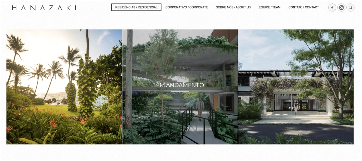
There’s a balanced interplay between space, photography, and intuitive layout, allowing each project to breathe. The page’s responsiveness also ensures an equally impactful experience across all devices, reinforcing its commitment to visual quality and user experience.
Key takeaways to learn from this example:
- Luxurious visual storytelling,
- Intuitive, distraction-free layout,
- High-resolution imagery,
- Harmonious design and typography.
Improvement areas:
- Clear contact or inquiry option – a visible “Get in Touch” could drive client engagement.
To promote your portfolio attractively and effectively turn casual visitors into new clients, choose the Architecture template from Landingi’s gallery and customize it effortlessly with its user-friendly editor.

13. Rinko Kawauchi
Rinko Kawauchi’s page is a poetic, image-driven digital gallery that masterfully mirrors the quiet beauty of photography. As soon as visitors land on the page, they are immersed in a visual archive where each project is represented by a striking photograph accompanied by a minimal caption – just the title and year. This layout creates an almost meditative experience, where every image is allowed space to resonate.

The page is divided into categories like “Works,” “Video Works,” and “Installation Views,” providing clear pathways for exploration without overwhelming the user. The subdued color palette and intuitive navigation make the entire experience feel like a curated photo book brought to life online.
Key takeaways to learn from this example:
- Art-first layout,
- Minimalist design,
- Seamless user flow.
Improvement areas:
- Artist commentary – brief notes on each project could deepen engagement.
14. Michelle Carroll
The next example is Michelle Carroll’s page – a refined and structured showcase of her creative vision as a designer. The page opens with a clean logo header that immediately signals a polished brand identity. The primary focus is on the “Projects” section, laid out in a modern grid highlighting each work with large, editorial-style thumbnail images. This visual-first approach draws visitors into her design world without overwhelming them with text.

The muted color palette, consistent spacing, and minimal animations all work together to give the page a sense of calm professionalism. This design effectively balances aesthetic beauty with functional clarity – ideal for impressing clients, collaborators, or agencies browsing for high-level design talent.
Key takeaways to learn from this example:
- Thoughtful grid layout,
- Minimalist, brand-aligned design,
- Strong image hierarchy.
Improvement areas:
- Visible CTA – a “Work With Me” or “Schedule a Call” button could turn visitors into leads.
15. Elisa Miller
The last example shows a portfolio page of Elisa Miller, which stands out as a premium example of artistic and strategic web design for a fine art photographer. From the moment users land on the page, they’re met with a cinematic and immersive visual experience. Each project is displayed through large-format photography that immediately evokes mood and meaning, perfectly echoing Elisa’s focus on identity, femininity, and contemporary storytelling. The page also uses color, spacing, and subtle hover effects, creating a gallery-like atmosphere that feels both intimate and grand.

Navigation is refined yet functional, allowing visitors to browse a well-organized collections archive. These are grouped within a dropdown menu under “Portfolio,” reinforcing ease of use without compromising elegance. Additional sections such as “Prints,” “Exhibitions,” and “Press” provide credibility and commercial opportunity.
Key takeaways to learn from this example:
- Visually immersive project layout,
- Strong artistic identity,
- Organized navigation,
- Professional structure.
Improvement areas:
- Brief project intros – even one-liners could enhance narrative without interrupting flow.
3 Portfolio Landing Page Best Practices
To craft an exceptional photography landing page, incorporate the 4 best practices that enable you to attract clients, immerse visitors in your photographic journey, and achieve outstanding conversion rates. These practices are tailored to refine your landing page’s effectiveness, turning casual viewers into enthusiastic clients or followers.
#1 Include the outstanding CTA button
The first best practice for a photography landing page is to include the outstanding CTA button. It should be visible yet not overwhelming, so use colors that stand out from the page’s overall design and align with your brand’s visual identity, or try the reverse color. Consider color psychology to match the button design to your target audience profile and their expectations. For instance, purple indicates innovation and creativity, while yellow means joy.
Take a look at the example below:

Your CTA button should be placed in strategic sections – the top-right corner works best, but the button should appear in a hero section and at the bottom of your landing page to bring the best results. Use straightforward, personalized messaging to indicate what visitors should do next and encourage them to take action. Don’t forget about mobile responsiveness – the CTA button on mobile view should take nearly full width to ensure a seamless experience.
70% of small B2B business websites are missing a CTA button, according to Small Business Trends statistics. That’s why their sites are unsuccessful – the CTA button is crucial for conversions.
#2 Use clickable miniatures
The second best practice for a portfolio landing page is to include clickable miniatures of your projects. Incorporating clickable thumbnails is an excellent strategy when designing your portfolio landing page, as it allows you to show more without overwhelming visitors with an extensive, lengthy layout. Visitors can see samples with short descriptions and choose which project details they want to check.
Take a look at the example below:

However, it’s crucial to consider the user experience alongside this feature. Utilizing clickable thumbnails goes beyond just enhancing the visual appeal; it’s about ensuring your page loads quickly and offers a smooth experience for mobile users.
#3 Add social proof
The third best practice for a portfolio landing page is to add social proof in the form of testimonials from previous customers, ratings from popular platforms, reviews from partners, and media mentions. You can also add partner logos and award badges to highlight the quality of your service.
Take a look at the example below:

Implementing social proof gives your visitors solid evidence that your service is their best choice. Social proof elements build credibility and trust among casual visitors, psychologically affecting their decision-making process so that you can expect higher conversion rates – HubSpot case studies prove that businesses incorporating testimonials on their websites experience a 34% uplift in conversion rates.
Data shows that ca. 33% of customers read online reviews when looking for a local business, according to BrightLocal statistics.
Boost your brand with a professionally designed landing page tailored to your needs.
How Can I Optimize My Portfolio Landing Page for Higher Conversion Rates?
To optimize your portfolio landing page for higher conversion rates, streamline navigation, focus on a strong value proposition, use relevant keywords, remember about mobile responsiveness and page loading speed, and regularly experiment with various page versions. Meet the 7 key strategies and incorporate them to enhance the effectiveness of your portfolio landing page:
1. Streamline navigation
Firstly, streamline navigation – ensure your landing page is easy to navigate, with a clear, intuitive layout. Visitors should effortlessly find what they’re looking for, whether it’s your portfolio, about section, or contact information. Simplified navigation reduces bounce rates and keeps potential clients engaged.
2. Emphasize a strong value proposition
Secondly, emphasize a strong value proposition – your landing page should clearly articulate what makes you unique and why a potential client or employer should choose you over others. This value proposition should be prominently displayed and encapsulate your skills, experience, and the benefits of working with you.
3. Optimize for SEO
Thirdly, optimize your portfolio landing page for SEO – incorporate relevant keywords into your page title, headings, and content to improve your search engine ranking. This increases the visibility of your portfolio landing page to potential clients searching for your skills or services. Consider local SEO principles to boost your page’s visibility in local search results.
Boost your brand with a professionally designed landing page tailored to your needs.
4. Implement responsive design
Fourthly, implement responsive design – your portfolio landing page should display perfectly on various screen sizes. Page responsiveness ensures a positive experience for all visitors, regardless of how they access your site.
5. Utilize clear CTAs
Fifthly, utilize clear CTAs – each section of your portfolio landing page should guide visitors toward a desired action. Make sure your CTAs are clear, compelling, and easy to find. Use straightforward, personalized messaging and indicate urgency to achieve the best results.
6. Conduct A/B testing
Sixthly, regularly conduct A/B testing – experiment with different versions of your portfolio landing page to see what works best. Leave no room for guessing and test variations of your headlines, CTAs, images, and other elements to optimize conversion rates based on actual data. You can easily track user behavior with the right tool, like Landingi with its EventTracker feature, to gather essential insights for further optimization.
7. Optimize for page load speed
Seventhly, optimize for page load speed – it’s critical for keeping visitors engaged. Optimize image sizes, leverage browser caching, and minimize the use of heavy scripts to ensure your landing page loads quickly.
8. Provide multiple contact options
Eighthly, provide multiple contact options on your portfolio landing page. Offer several ways for potential clients to contact you, such as a contact form, email address, phone number, and social media links. Making it easy for visitors to reach out increases the chances of conversion.
By implementing these strategies, you can create a more compelling and effective portfolio landing page that showcases your work and converts visitors into clients or collaborators.
Boost your brand with a professionally designed landing page tailored to your needs.
What Are the Key Elements of an Effective Portfolio Landing Page?
An effective portfolio landing page comprises key elements, like engaging visuals, a strong value proposition with an attractive portfolio showcase, and social proof, all designed to direct visitors’ attention to a compelling CTA. A well-structured landing page seamlessly blends aesthetics with functionality, acting as a powerful tool to showcase your work, skills, and professional achievements. Take a look at the detailed description of the portfolio landing page’s essential elements below:
#1 Engaging visual design
The first key element of a portfolio landing page is engaging visual design. It sets the tone for your entire portfolio and should align with your work philosophy and style. Use high-quality images, a cohesive color scheme, and typography that reflects your personal or brand identity. The design should be clean and professional, allowing your work to stand out.
#2 Strong value proposition
The second key element of a portfolio landing page is a strong value proposition. Your landing page should immediately convey your unique value proposition to visitors. This succinct statement highlights what you offer, your expertise, and what sets you apart from competitors. Positioning this prominently ensures that potential clients understand your strengths from the outset.
#3 High-quality portfolio showcase
The third key element of a portfolio landing page is a high-quality portfolio showcase. As the centerpiece of your landing page, it should feature your best work. Opt for a curated selection demonstrating the breadth and depth of your skills and expertise. Including case studies or detailed project descriptions can further illustrate your process and the outcomes achieved.
#4 Compelling CTA
The fourth key element of a portfolio landing page is a compelling CTA. Effective CTAs guide visitors toward specific actions, such as contacting you, viewing more work, or requesting a quote. Your CTAs should be clear, action-oriented, and strategically placed to draw attention without overwhelming the overall design.
Boost your brand with a professionally designed landing page tailored to your needs.
#5 Social proof
The fifth key element of a portfolio landing page is social proof. Including testimonials, client logos, or press mentions can enhance your credibility. Positive feedback from past clients or recognition from reputable sources proves your skills and professionalism.
#6 Contact information
The sixth key element of a portfolio landing page is contact information. Make it easy for potential clients to contact you by providing precise and accessible contact details. Options such as a contact form, email address, phone number, and links to social media profiles encourage communication and make it simple for visitors to connect with you.
#7 Clear contact form
The seventh key element of a portfolio landing page is a clear contact form. Your portfolio landing page is incomplete without an inquiry form but focus on its functionality while creating one. It should require only essential information, like name and e-mail address. The form design should align with the overall page layout, and the form fields should be reduced to a minimum to achieve the best conversion rates.
When thoughtfully integrated into your portfolio landing page, these elements create a compelling digital presence that effectively showcases your work, communicates your value, and engages your target audience.
Boost your brand with a professionally designed landing page tailored to your needs.
What Is the Best Portfolio Landing Page Builder?
The best photography landing page builder is Landingi, a platform meticulously crafted to cater to the specific needs of individuals aiming to showcase their diverse projects and skills while capturing the interest of prospective clients or employers. Identifiable for its user-friendly landing page creation tools and a broad array of digital marketing features, Landingi distinguishes itself as the go-to choice for emerging talents keen on establishing a compelling online portfolio and experienced professionals seeking to amplify their digital footprint.
Landingi lays the foundation for your professional showcase with a rich library of page templates, each thoughtfully designed to emphasize your portfolio’s range and engage your audience effectively. These templates are optimized to enhance visitor interaction and lead conversion, freeing you to concentrate on customizing the design details and filling your page with the impressive work that best represents your capabilities and speaks directly to your desired audience.
Beyond mere page creation, Landingi offers a suite of functionalities that evolve your landing page into an interactive portfolio hub. The platform’s A/B testing feature allows for meticulous page refinement by experimenting with different layouts and content arrangements to identify the most impactful presentation for your audience.
Tools such as EventTracker offer valuable insights into how visitors interact with your page, offering data-driven guidance on optimizing your portfolio for maximum engagement. Furthermore, Landingi equips you with AI Assistance, diverse forms, popups, and widgets, all designed to enhance your page’s search engine visibility, exceed visitor expectations, and cultivate leads that support your career growth.
With Landingi, creative professionals acquire a comprehensive toolkit that merges straightforward design capabilities with sophisticated optimization features. This balance makes Landingi not only accessible for those on a budget but also a robust platform for implementing advanced digital marketing tactics. Consequently, Landingi is the foremost choice among portfolio landing page builders, perfectly blending ease of use with the depth of functionality needed to stand out in any creative business field.
Boost your brand with a professionally designed landing page tailored to your needs.
Build a Portfolio Landing Page in Landingi
A well-constructed portfolio landing page is a pivotal conduit for connecting creatives with their prospective audience or employers. As the essence of your work and talent necessitates a stage that speaks volumes through its presentation, your portfolio landing page must display the diversity and skill within your projects and evoke the passion and dedication behind your craft.
However, the journey doesn’t end with creating a visually compelling page; the real magic lies in its continual optimization. By implementing optimization strategies, you can craft a digital portfolio that mirrors the depth of your professional identity and actively engages and transforms visitors into enthusiastic proponents or potential collaborators.
Equipped with the right tools and fundamental knowledge, inspired by exemplary portfolio landing page instances, start crafting your perfect portfolio landing page today – try Landingi now, and begin the transformation of a conventional page into a dynamic showcase that converts.