An influencer landing page is a dedicated page built to catch the traffic coming from an influencer’s audience — whether it’s a link in bio, a swipe-up, or a “check this out” in a caption. A good one keeps their interest. A great one gets results.
When people land on this kind of page, it better be worth the click. In 2025, influencer marketing is expected to hit $33 billion globally. That’s a huge jump from $24 billion in 2024, and light years ahead of where it started in 2016. With more traffic coming from creators than ever, brands can’t afford to send people to half-baked pages.
In this guide, you’ll find 12 influencer landing page examples that actually deliver — plus quick, practical tips to help you build one that converts clicks into customers.
What Is an Influencer Landing Page?
An influencer landing page is a standalone webpage built for one purpose: turning social media followers into customers, subscribers, or leads. It’s where people land after clicking a link from an influencer’s bio, post, or story — and it’s crafted to match their expectations and the influencer’s voice.
It’s not just any page, though. It’s one that feels like the influencer. Same tone, same vibe, same energy. It should be instantly familiar to the people who landed there, like they’ve just stepped into the influencer’s digital living room. That comfort, that’s what builds trust. And trust, that’s what gets people to click.
So what makes a landing page influencer-style?
- It feels like a natural extension of the influencer’s social media.
- It’s visually and verbally “on brand” for their audience.
- It’s smartly designed to guide people toward a next step (without feeling pushy).
Of course, there are a few must-haves. Think: an email signup, maybe a short video, a testimonial or two, a limited-time freebie — little things that add big value. Not just pretty extras, but actual conversion power tools.
When it’s done right, an influencer landing page tells a story, gives people a reason to trust what’s being offered, and makes it super easy to take the next step. Every example you’ll see in this article has its own style, but they all follow the same golden rule: keep it clean, keep it clear, and stay true to the brand.
Build your personal brand—create a stunning influencer landing page with Landingi!
How Do I Create an Influencer Landing Page?
To create an influencer landing page, start with the right builder — one that lets you design fast, stay on brand, and keep full control without touching code. Platforms like Landingi make it easy to build beautiful, high-converting pages that match the influencer’s style and speak directly to their audience.
Scroll on for a step-by-step guide to building a landing page that looks great, feels on-brand, and actually delivers.
Step 1. Set One Clear Goal
Before you drag and drop a single element, get crystal clear on what you want this page to do. Are you selling a product, sharing a free resource, or collecting emails with a signup form? Choose one goal and keep it front and center. Your goal will shape everything — from the layout to the signup form, CTA, copy, and content flow.
Then, think about the people landing on the page. They’re not random — they’re coming from someone they follow and trust. So your message should feel familiar, easy to understand, and right for that crowd. When your page speaks to the right people, it’s way more likely to work.
Step 2. Choose a Template
A good template can save you hours — and set you up for better results from the start. In Landingi, you’ll find over 400 professionally designed templates made to convert, not just look nice.
Click Create new landing page and browse the library for one that fits your goal and feels like a natural match for the influencer’s brand. Clean layout? Check. Strong structure? Check. Easy to customize? Double check. You can also build from scratch, upload your own design, or import straight from Figma — but starting with a smart template usually gives you a solid head start.

From there, it’s just a matter of making it yours. Use the drag-and-drop editor to adjust sections, swap visuals, and tweak the layout until everything feels just right. (It’s smoother than you think.)
And if you’re managing more than one page or campaign, Smart Sections help keep things consistent across the board.
Convert followers into clients—design your influencer landing page with Landingi!
Step 3. Write a Headline That Hooks — and Copy That Connects
Your headline is the first thing people see, and it needs to do two things fast: grab attention and make the offer clear. Think simple, specific, and benefit-focused — something like:
“Get 20% Off [Influencer Name]’s Favorites – Today Only”
“Join [Influencer Name]’s Newsletter – Free Weekly Wellness Tips Inside”
Once the headline hits, your body copy should back it up. Show people what they’ll get and why it matters — in their language, not marketing speak. If the offer includes a free resource, say it. If it’s exclusive to that influencer’s audience, highlight it.
Use subheadings and bullet points to break things up and keep it easy to skim. Each section should gently guide the visitor toward action — whether that’s filling out a signup form, clicking a CTA, or downloading something.

If you need help with the wording, Landingi’s built-in AI Assistant can help you shape your message or try a few variations. Perfect if you want to test what converts better.
Step 4. Make It Look Good
When visitors land on your page, the visuals do the talking before they read a single word. And if they came from Instagram, TikTok, or YouTube, the bar’s even higher.
Use high-quality images that match the influencer’s style — clean, consistent, and scroll-stopping. Show the product in action. Add branded graphics. Use colors and fonts that feel familiar to their audience. It all helps the page feel “right.”
And don’t stop at images — video matters more than ever. Nearly 40% of marketers say video is the most powerful tool for landing page conversions (HubSpot). A short intro, a behind-the-scenes clip, or even a quick product demo can go a long way. Bonus points if it features the influencer directly.

If you’re using Landingi, tools like background remover help create cleaner, distraction-free visuals. Just make sure your media loads fast — slow pages lose people before you even get a chance to convert them.
Strong visuals = higher trust = better results.
Step 5. Add a Lead Capture Form and a CTA That Works
If your goal is to collect emails, don’t overcomplicate it. A simple signup form can be incredibly effective — as long as it’s easy to use and paired with a strong reason to fill it out. Ask for the essentials: name and email. Maybe one extra field, but keep it short to avoid drop-offs.
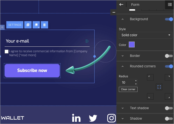
Now the CTA. It should stand out and speak clearly. Instead of “Submit,” go for something more specific, like: “Get the Free Guide”, “Unlock the Discount”, or “Join [Influencer Name]’s Inner Circle.”
Place it where it’s easy to find — not just at the bottom. CTA buttons with bold colors and smart placement help guide visitors without making them think too hard.
Step 6. Add a Little Trust and a Bit of Interaction
People might land on your page because they trust the influencer — but it’s your job to keep that trust going. Simple things help: a testimonial, a quote from the influencer, a few kind words from happy customers, or even a small “As seen in…” section with brand logos.

Want to make the page feel more alive? Add a countdown timer for limited-time offers or a gentle pop-up with a bonus free resource. These interactive touches can boost interest without feeling pushy. And don’t forget to link to the influencer’s social media pages — it reassures visitors they’re in the right place and adds one more layer of connection.
Step 7. Make It Mobile-Friendly and Hit Publish
Most people clicking through from an influencer’s post are on their phone — so your page needs to look great and work smoothly on small screens.

Use Landingi’s mobile view editor to fine-tune how everything shows up: resize text, adjust buttons, and make sure the layout flows. It’s quick, and it makes a big difference. Before you hit publish, connect a custom domain. It adds polish, keeps your branding consistent, and helps the whole page feel more trustworthy.
Once your page is live, track how it’s doing. Landingi’s built-in analytics and A/B testing tools let you see what’s working (and what’s not), so you can keep improving.
Boost your brand with a professionally designed landing page tailored to your needs.
12 Best Examples of Influencer Landing Pages
Now that you know the theory, let’s take a look at some of the best landing page examples in influencer marketing to see how they’re done right.
#1 Chris Burkard
Chris Burkard’s landing page is basically a front-row seat to some of the most jaw-dropping places on Earth. From the moment you land, you’re hit with epic photography that instantly pulls you into his world — think wild coastlines, massive peaks, and remote spots most people only dream of visiting.
The whole page feels like an adventure. Every photo is a story in itself, showing off Burkard’s love for the outdoors and his crazy-good eye for turning nature into art. And while the visuals are clearly the stars of the show, the layout plays a supporting role beautifully — clean, calm, and super easy to get around. The journey is smooth from start to finish Whether you’re browsing galleries, buying a print, or checking out one of his photography workshops.

What’s worth stealing from this page?
- Simple layout with plenty of breathing room
- Gorgeous photos and a background video that sets the vibe
- Clear, consistent messaging
- Trust signals like partner and sponsor logos
- A short, personal note from the author
- Strong, easy-to-spot CTAs
- Social buttons right where you’d expect
What could be better?
The mobile version could use some fine-tuning — it’s great on desktop, but on smaller screens, it feels a bit clunky.

Choose the Company Presentation template from the Landingi library and customize it easily with its drag-and-drop editor to create your perfect influencer landing page.
#2 Jack Morris
Jack Morris keeps it simple — and it works. His landing page puts fitness results front and center, with before-and-after shots that show exactly what his plan can do.
The offer’s clear: lifetime access, different formats, and an easy way to get started. The layout is clean, the headlines pop, and the CTAs are hard to miss. Everything is built for one thing — getting visitors to sign up without getting distracted or lost along the way.

Smart moves that make this page click
- A bold, catchy headline that gets straight to the point
- Clear CTA buttons that stand out
- Hamburger menu in the top-right corner for easy navigation
- Layout that just makes sense — nothing confusing
- A quick, no-fuss signup form with a strong CTA
- High-quality, polished images
- Short, punchy copy that keeps people interested
What could be smoother?
There’s one thing missing: social proof. A few testimonials or success stories from real users would add trust and give visitors that final push to sign up.

Choose the template available on the Landingi platform, customize it, and use your influencer landing page as a great lead generation tool.
#3 Becky G
Becky G’s landing page isn’t just a promo spot — it feels more like a fan hub. From the jump, it invites visitors in with smooth visuals, bold energy, and quick access to her music. It’s built for connection, not just conversion, which makes the whole thing feel more personal and alive.

What works especially well?
- Super intuitive layout — everything’s easy to find
- Bold headline that grabs attention
- Engaging visuals and background video that set the vibe
- Minimal text that keeps things quick and clear
- Strong CTAs that guide visitors naturally
- Social icons placed right where you need them
What could be improved?
The mobile experience needs a little work. Faster load times, smoother navigation, and more touch-friendly elements (like bigger CTA buttons) would go a long way in making the page more effective on phones.
PrPromote your content effectively—design your influencer landing page with Landingi!
#4 Mrwhosetheboss – Arun Maini
Arun Maini, aka Mrwhosetheboss, keeps things sleek and simple. His landing page acts like a digital business card — no clutter, no fluff, just a clear path to who he is and where to find him. It matches the calm, direct tone of his tech reviews and sticks to the idea that less really can be more.

What stands out?
- Minimal, no-distractions design
- Catchy, straight-to-the-point headline
- Clear, concise messaging
- Short signup form with a strong CTA button
- Eye-catching profile photo that adds personality
- Social media icons placed neatly in the top-right corner
What could be better?
A background video would add a bit more life to the page — something subtle to match the tone, but enough to keep visitors engaged and maybe even boost conversions.

Start crafting your own influencer page with the best builder – Landingi, an all-in-one, user-friendly platform. Choose the Business Page template, customize it, and run A/B tests to optimize it for better results.
#5 Simone Giertz
Simone Giertz’s page feels exactly like her — smart, slightly chaotic (in the best way), and full of creative energy. It gives you a front-row seat to her latest inventions and side projects, from robots to workshop snapshots, all wrapped in a layout that’s both easy to follow and fun to scroll through.
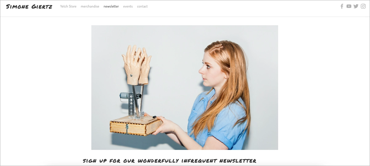
The page also features a behind-the-scenes look at her workshop, offering a peek into the chaos and charm where her ideas come to life. It’s a space that reflects Simone’s personality: a blend of humor, intelligence, and a touch of the unexpected.
What makes it click?
- Clean layout with lots of white space — nothing feels cramped
- Eye-catching visuals that match her personality
- Short, engaging copy that keeps it light
- Easy newsletter signup to stay in the loop
- Strong CTA that stands out
- Social buttons right where you expect them
What could use a tweak?
The form could be simpler. Even if some fields aren’t required, they can still feel like a chore. A basic, one-field opt-in would make signing up way easier and more inviting.

Pick the Newsletter template, add your content, and customize the form easily. Ask only for the visitor’s email address to streamline the sign-up process, and don’t forget about the outstanding CTA button!
#6 UX.MARS
UX.MARS, created by Salim Dabanca is a full-on resource hub for UX/UI designers looking to grow their skills and connect with others. The Mars Design Club stands out with daily design feedback, portfolio reviews, and exclusive tools like the “Learn UI Design from Zero” eBook and the “Interview Presentation Kit.” You’ll also find Dabanca’s portfolio, helpful articles, and links to his Instagram, Dribbble, and Medium — giving a complete look at his work and community presence.

What makes this one stand out?
- A well-rounded content hub full of value — both free and premium
- Clean layout and navigation that keeps things easy to explore
- Great use of multimedia — eBooks, design kits, and more for different learning styles
What could use a little boost?
Some of the resources and community perks could use clearer descriptions to help new visitors understand the benefits faster.
#7 Abi Connick
Another great influencer landing page example comes from Abi Connick — a designer, mentor, and content creator in the creative space. Her page is a masterclass in personal branding: clean layout, soft visuals, and a hero image that instantly puts a face to the name.
Right from the top, the headline introduces who she is and what she offers, with clear paths to explore her design services, mentorship, and digital products. What really works? The balance. It feels personal, but polished. The visual appeal is strong without being loud — calm colors, high-quality photos, and tidy sections make the whole page feel on-brand from top to bottom. There’s social proof too — testimonials and client logos give the page extra credibility without clutter.

What to take away from Abi’s page:
- Her brand shows up in every scroll — tone, visuals, structure, everything
- She promotes multiple offers without overwhelming the user
- The CTAs are placed with purpose and feel natural, not forced
- The design is clean and calming, but still has personality
What could be better?
Since the page is fairly image-heavy, a little speed optimization for mobile wouldn’t hurt.
#8 Lucy Lugi
Another standout influencer landing page example comes from Lugi Design — a creative professional whose page says “premium” without ever having to spell it out. From the first scroll, you get a sense of calm, confidence, and polish. Neutral colors, refined fonts, and plenty of breathing room give the entire page a high-end feel that fits perfectly with her brand.
The layout is simple but smart: visitors can browse her portfolio, learn about her process, or fill out the client application form — all without friction.

What’s worth borrowing from Lugi’s landing page:
- The design feels premium without trying too hard — clean fonts, muted tones, and intentional spacing
- The layout is minimalist but still covers all the right points
- It reinforces her positioning as a high-end creative
- CTAs are gentle, but clear — perfect for a service-based creator
An area to explore:
The desktop version features a creative custom cursor — a fun touch that fits the aesthetic. But it’s a bit sluggish, which slightly hurts the user experience. A snappier cursor would keep things feeling just as stylish, but smoother to navigate.
Grow your influence online—create a custom landing page with Landingi!
#9 Marie Forleo
Marie Forleo’s site feels like an all-in-one toolkit for anyone looking to level up — in business, in life, or both. From her popular programs like B-School and The Copy Cure to free training sessions and MarieTV episodes, it’s packed with content that’s both practical and inspiring.
Everything’s easy to find, the design is polished, and the tone is warm and welcoming — just like Marie herself. Whether you’re in binge mode or just browsing, it’s a place that makes you want to stick around.

What really works here?
- A solid content hub with paid programs and free resources
- Clear, user-friendly navigation that makes exploring easy
- Consistent branding that feels true to her voice
- Strong social proof — testimonials and success stories are everywhere
- Video and podcast content to match different learning styles
Where’s the room to grow?
Adding interactive elements like quizzes or personalized suggestions could make the site feel even more tailored and engaging.
#10 Johnny Harris
Johnny Harris’s site does exactly what you’d expect from a sharp storyteller — it lays everything out clearly, invites you in, and gets you genuinely curious. It acts as both a portfolio and a collaboration hub, showing off his big-name projects (like Borders and work with The New York Times) while also opening the door for new ideas and creative partners through pitch forms and job applications.
You can browse deep-dive videos, explore travel courses from his Bright Trip company, or just click around and get a feel for the kind of work he’s passionate about. The site feels personal, but polished.

What’s done really well?
- A strong, well-organized portfolio that shows range and depth
- Clear ways to get involved
- Clean, easy-to-navigate design that keeps things flowing
- Smart use of multimedia — everything connects smoothly with his YouTube and socials
What could be tighter?
Some elements could use more detail — a quick summary or a few context lines would give new visitors more to dig into.
#11 Julie Solvstrom
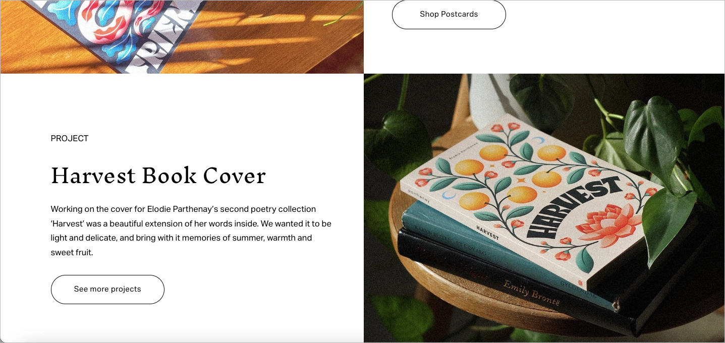
Julie Solvstrom’s site feels like stepping right into her sketchbook — bold colors, expressive lettering, and just the right mix of whimsy and precision. It’s part portfolio, part shop, and all wrapped in her signature style that blends nature, poetry, and emotion into every piece.
You’ll find collaborations with big names like Champion, plus original prints, postcards, and greeting cards available to buy. The whole site is fun to explore and easy to navigate, with a look that perfectly mirrors her art.
What works especially well?
- Bright, colorful design that grabs your attention and matches her vibe
- A strong portfolio that shows both client work and personal projects
- Clear navigation that makes it easy to browse and shop
- Newsletter sign-up and social links that keep the connection going
What could use a little boost?
The mobile version needs a bit of cleanup — some text overlaps in certain sections, and a few CTA buttons have broken or stretched fonts. A bit of layout adjusting would go a long way here.
Turn followers into leads—build your influencer landing page with Landingi!
#12 Hazel Wallace
Dr. Hazel Wallace’s website is a one-stop shop for anyone interested in women’s health, nutrition, and evidence-based wellness. From her one-on-one clinics and health courses to her books and podcast, the site makes it easy to explore everything she offers — with a calm, clean design that feels professional but welcoming.
There’s also a smart integration with her Instagram feed, which adds a human touch through community posts, testimonials, and helpful tips — all right from the source.

What’s working well?
- Instagram feed adds real-world proof and ongoing engagement
- Clean, intuitive layout that’s easy to follow
- Clear breakdown of services, books, and programs
- Consistent branding that flows from site to socials
What could be improved?
The mobile experience could use a little work. While the services and courses are listed clearly, short descriptions with more detail could help users understand what they’re getting and why it matters.
3 Influencer Landing Page Best Practices
Creative flair and personality are key — but even the most eye-catching landing page won’t convert if it’s missing the basics. No matter the niche or style, there are three best practices that every great influencer landing page needs to follow. These are the must-haves that keep things running smoothly and actually get people to take action.
#1 Clear CTA
Your call-to-action is the one thing you really want people to click — so it needs to be obvious, direct, and easy to spot. In fact, Michael Aagaard’s case study showed that just tweaking a CTA boosted conversions by up to 304%.
Whether you’re inviting people to sign up, start a free trial, or check out a new product, the key is clarity. No clever tricks, no salesy jargon — just simple language that matches your tone and tells people exactly what happens next. If it sounds like you and it’s easy to act on, you’re doing it right.
Take a look at the example below:

Having a specific goal in mind for your CTA can guide visitors smoothly through the desired journey, from initial intrigue to final action, such as a purchase or content engagement. Designing a CTA that fosters a sense of urgency without being pushy is a craft; mastering it can trigger significant expansion in follower engagement and conversions.
Think about colors: the red CTA button consistently achieves better results than the green one, according to CXL statistics. If red is not the best choice for you, check the psychology of colors before choosing a button design.
MMaximize your online presence—design a professional landing page with Landingi!
#2 Strategically placed SM buttons
Social media is the lifeblood of influencer marketing, and strategically placing social media links on your landing page can amplify your message. These buttons act as conduits, encouraging visitors to engage by liking, sharing, or commenting, extending your reach. Their placement must be intentional, aligning with the goals of your landing page and ensuring they lead visitors toward the desired interactions.
Take a look at the example below:

Design consistency is key, with social media buttons adopting the official logos of the platforms they represent, seamlessly integrating into the landing page’s overall aesthetic. Moreover, these buttons should be a mainstay across all pages, creating a cohesive experience that encourages visitor interaction.
Monetize your influence—build your influencer landing page with Landingi!
#3 Mobile responsiveness
Given the rapid dynamics of today’s digital realm, mobile responsiveness isn’t merely a feature; it’s a requirement. With most social media interactions happening on mobile devices, your influencer landing page must offer a seamless experience that caters to the immediacy mobile users expect.
Take a look at the example below:

A mobile-responsive design is characterized by a simple layout, a clear headline, and effective white space, focusing the user’s attention on key elements like the CTA. Designing for touchscreens requires consideration for finger tapping, with larger buttons and ample space to prevent accidental clicks.
Ensuring that your mobile landing page provides a frictionless journey from an ad or search result to checkout is crucial for maintaining low bounce and high conversion rates.
Create a landing page that drives brand deals—get started with Landingi!
How Can I Optimize My Influencer Landing Page for Higher Conversion Rates?
To optimize your influencer landing page for higher conversion rates, follow the six-step guide. This multifaceted approach combines strategic content placement, user experience enhancements, and data–driven adjustments.
Step 1. Speed things up
First things first — make sure your page loads fast. Like, really fast. Even a tiny delay can cause people to bounce. Compress your images, clean up your code, and keep your hosting solid so visitors aren’t stuck waiting for things to show up.
Mobile web pages load about 70% slower than desktops, according to a HubSpot reports, so optimizing your page for better loading speed can help you stand out from competitors.
Step 2. Create an irresistible CTA
Your CTA shouldn’t blend in — it should pop. Try different versions of the text, button colors, and placement until you find what works best. Keep it short, clear, and action-driven. Whether it’s “Get the Guide” or “Try It Free,” the goal is to make it feel easy and worth it to click right now.
Step 3. Use visuals that stop the scroll
Photos, videos, behind-the-scenes clips — anything that feels real and true to the influencer’s vibe adds major value. High-quality visuals can build trust fast, especially when paired with personal content like a quick video intro or message. Just make sure everything loads fast and still looks sharp.
Step 4. Show off social proof
People trust people. Reviews, testimonials, and even reposted social mentions can help turn a maybe into a yes. Highlight the best ones right on the page — they back up your claims and show that real people are already loving what you’re offering.
Step 5. Make mobile a priority
Most visitors will come from their phones, so your page needs to look and work great on smaller screens. That means clean layouts, buttons big enough to tap, and fast load times on mobile. If it’s clunky on your own phone, it’s a no-go for your audience too.
Step 6. Test, test, test (then test again)
A/B testing isn’t just for big brands — it’s for anyone who wants to improve. Test different headlines, images, CTAs, and even layouts. Just tweak one thing at a time so you can see exactly what’s making a difference. Tools like Landingi make this super easy, letting you see what works (and what doesn’t) based on real data.
Landingi, the dedicated landing page platform, offers A/B testing functionalities to help you effortlessly identify which variations perform the best and why. Utilizing A/B testing allows you to make data-driven decisions that significantly improve conversion rates.
Roughly 60% of companies perform A/B tests on their landing pages – it’s a proven optimization method for higher conversions, better user experience, and strong brand image.
By focusing on these key landing page optimization areas, you can enhance your influencer landing page’s ability to convert visitors into leads or customers. Regularly reviewing performance analytics and making iterative improvements based on data will ensure your landing page remains optimized for high conversion rates.
Enhance your influencer marketing—design a landing page with Landingi today!
What Are the Key Elements of an Effective Influencer Landing Page?
An effective influencer landing page is designed with the following 7 key elements that affect converting the influencer’s followers into actions such as purchases, sign-ups, or downloads:
- Influencer endorsement – this could be in the form of a video, image, or written testimonial. The content should feel personal and authentic, reflecting the influencer’s genuine recommendation of the product or service.
- Compelling headline – a strong, attention-grabbing headline that communicates the value proposition or main benefit of the offer. It should resonate with the influencer’s audience and encourage them to read on.
- High-quality visuals – images or videos that feature the influencer using the product or service. Visual content should be engaging and professional, helping to visualize the benefits and reinforce the message.
- Clear CTA – the main element of each landing page that can’t be missing on an influencer’s one. The CTA should be prominently displayed, encouraging visitors to take the next step with well-matched messaging and outstanding design.
- Social proof – a list of partners and media mentions that build a person’s credibility. If it’s only possible, an influencer landing page should also include testimonials, user reviews, or case studies that showcase the product’s or service’s effectiveness.
- Exclusive offer – an offer that is exclusive to the influencer’s audience; this could be a discount code, free trial, or bonus content that adds value to the purchase. Offering something valuable for the target audience significantly increases conversion rates.
- FAQ or additional information – this element helps to address common concerns or barriers to conversion, providing visitors with the confidence to take action.
Each of these elements plays a vital role in creating an influencer landing page that effectively converts interest into action, leveraging the trust and authority of the influencer to drive results.

Adding social proof, like video testimonials or client reviews, helps new visitors feel confident and supported. Featuring your best content — think product reviews, blog posts, or community highlights — shows authority and encourages visitors to stick around. And offering something extra, like a free resource or promo code in the same place every time, not only boosts engagement but leaves a strong impression.
When your single landing page is clean, focused, and fully on brand, it becomes more than just another one of many web pages — it becomes a professional landing space that drives real results and improves your conversion rate over time.
Boost your credibility—build a professional influencer landing page with Landingi!
What Is the Best Influencer Landing Page Builder?
The best influencer landing page builder is the one that provides features to create and optimize pages that truly convert – it plays a crucial role in bringing your creative vision to life. Landingi stands out with its user-friendly builder and optimization features, making it a highly trusted choice among the many available tools.
Your journey with the Landingi platform can start with choosing the perfect template among over 400 propositions. You can build a perfect page with its intuitive drag-and-drop editor, ensuring creative freedom. Adding forms, pop-ups, and widgets like a countdown timer lets you turn pretty design into a conversion-driving digital marketing tool.

Built-in optimization features, like the A/B testing tool, allow experimentation with various page versions and finding the most effective one. For measuring page performance, the best side feature is EventTracker, a built-in user behavior tracking tool that allows you to gather significant data in one intuitive dashboard. What makes Landingi an even better choice is the AI Assistance feature, which helps to create compelling content and optimize your page for SEO with minimal effort.
Landingi platform is a high-end quality digital marketing tool invented to simplify the landing page creation process. Its page builder makes a huge difference for those seeking a user-friendly, fully equipped, yet budget-friendly option. This platform, created for both advanced and inexperienced users, is objectively the best one for creating effective landing pages.
Ready to increase your influence? Create a landing page with Landingi
Create Your Influencer Landing Page in Landingi
An influencer landing page doesn’t have to be complicated — but it should feel like you. With the right tools and a few smart moves, you can turn a simple web page into a great landing page that’s clear, helpful, and actually gets people to stick around.
You’ve got everything you need now: tips, page examples, and ideas that boost your conversion rate without the guesswork. So go ahead — get creative, keep it on brand, and use Landingi to build a single landing page that really encourages visitors to take action.
