A photographer landing page is your digital storefront—the place where your visual story begins and where visitors decide whether they want to work with you. It’s your chance to make a strong first impression and connect with the right clients from the very first click.
According to Google, it takes about 50 milliseconds (=0.05 seconds) for users to form an opinion about your site. That means your landing page has to do a lot, fast: show your style, build trust, and make it ridiculously easy to get in touch.
In this article, we’ll explore some of the best photographer landing page examples out there—pages that don’t just look great but convert. You’ll see how the right mix of visuals, messaging, and layout can turn a scroll into a booking.

What Is a Photographer Landing Page?
A photographer landing page is a dedicated webpage, designed to showcase a photographer‘s work, highlight their services, and ultimately convert visitors into clients. This specialized type of landing page serves as the final point for marketing campaigns or advertisements, directing potential clients to a page that captures the essence of the photographer’s brand and style. It’s meticulously crafted to present a compelling narrative through images and text, guiding visitors toward a specific action, such as booking a photo session, signing up for a newsletter, or viewing a portfolio.
Photograper landing pages stand out by their use of high-quality images and a design that complements the photographer’s style, creating an immersive visual experience. The goal is to engage visitors immediately, offering insight into the photographer’s capabilities and the type of work they specialize in. Beyond aesthetics, these landing pages include strategic elements such as customer testimonials, clear calls-to-action, and contact information, all aimed at building trust and encouraging engagement.
A photographer landing page is not just a showcase of talent, although it focuses on presenting it, but a powerful tool for connecting with potential clients. It highlights the photographer’s unique selling points and facilitates the journey from casual browser to engaged customer, making it an essential component of a photographer’s online marketing strategy.
Showcase your photography skills—create a stunning landing page with Landingi!
How Do I Create a Photographer Landing Page?
To create a photographer landing page that brings in bookings, start by getting clear on what you want it to do—and who it’s for. Are you trying to fill your calendar with weddings? Land brand shoots? Book mini sessions? Once you’ve nailed that down, use a platform like Landingi to build your page without the tech stress.
From there, focus on a scroll-stopping headline, drop in a few jaw-dropping photos (your best ones!), and write copy that speaks your client’s language. Add a few trust boosters like client reviews or publication features, then pop in a strong call to action—something that actually makes people want to click. Don’t skip the lead capture form, and make sure everything looks perfect on mobile too.
Follow the 7-step breakdown below to build a photographer landing page that does more than just look good—it books.
Step 1. Define Your Goal and Audience
To start, figure out precisely what you want your landing page to achieve. Are you trying to book mini sessions? Get inquiries for weddings? Sell prints? A clear goal will shape everything from your layout to your call to action. Then think about who you’re talking to. Are they newly engaged couples? Small business owners? Parents looking for family portraits? Knowing their needs, style preferences, and what might hold them back from booking will help you craft a message that clicks. The more specific you get, the better your landing page will perform.
Step 2. Choose a High-Converting Template
Landingi has over 400 conversion-focused templates, and plenty work beautifully for photographers. Just click Create new landing page, then browse the template library for something that fits your vibe and shoot type. Prefer to start from scratch or work off your Figma design? You can do that too.

Once you’ve picked a template, it’s all drag-and-drop from there. Tweak the layout, swap in your photos, and make the design truly yours. Use Smart Sections to lock in your brand visuals and scale effortlessly to keep your style consistent across all your pages.
Create a high-converting photographer landing page—start with Landingi today!
Step 3. Craft a Compelling Headline and Engaging Copy
Your headline is your first impression—make it count. Go for something that instantly shows value and gets your visitor curious, like “Capture Your Wedding Story in Timeless Frames” or “Book a Mini Session This Weekend – Limited Spots!” Use emotional pull, urgency, or a clear benefit—whatever fits your goal best.

Landingi’s AI Assistant can help you write scroll-stopping headlines and engaging copy that highlights what makes your photography stand out, whether it’s your style, your experience, or your client love. Keep your copy punchy and skimmable—use subheadings to guide the reader, and space out your text so it doesn’t feel like a wall.
If you work locally, don’t forget to sprinkle in location-specific keywords (like “Chicago wedding photographer” or “NYC personal branding sessions”)—especially if you’re planning to run ads. Every line of copy should move people closer to clicking CTA.
Step 4. Enhance Visual Appeal with High-Quality Images and Videos
Photography is all about visuals, so your landing page should look like a mini portfolio. Upload your best, high-resolution shots to show the quality of your work instantly. Use full-width hero images, clean galleries, or short looping videos to grab attention right away. Landingi even offers a background remover to help you keep your visuals sleek and focused, especially if you’re highlighting products or doing portrait work.

Want to stand out even more? Add a behind-the-scenes video or a quick session highlight reel. According to HubSpot, nearly 40% of marketers say video is the most effective element for boosting landing page conversions, so don’t skip it. Just make sure your files are optimized for web so the page loads fast and keeps people scrolling.
Step 5. Implement a Lead Capture Form with a Strong CTA
Use Landingi’s form builder to set up a clean, easy-to-complete form—just ask for the basics like name, email, and maybe a preferred shoot date or session type. The simpler it is, the more likely people are to hit “submit.”
Now pair that form with a call-to-action that actually makes people want to act—something like “Book Your Session”, “Check Availability”, or “Let’s Chat About Your Shoot.” Make sure your CTA buttons pop visually with a bold color and place them strategically throughout the page. According to Unbounce, landing pages with just one clear CTA can convert 13.5% better on average—so keep it focused.
Step 6. Add Interactive and Trust-Building Elements
To make your landing page feel more dynamic—and trustworthy—add a few interactive touches. A countdown timer can work wonders if you’re running a limited-time mini session or seasonal promo. Pop-ups can help spotlight exclusive offers or encourage last-minute bookings.

Include testimonials from happy clients, especially ones that speak to your professionalism, personality, and results. If you’ve been featured in blogs or magazines, show those badges off. And don’t forget to link to your social media—people love to peek at your latest work and behind-the-scenes moments before they decide to book. It adds personality and makes your brand feel real.
Step 7. Optimize for Mobile and Publish with a Custom Domain
Most people will check out your landing page from their phones—especially if they found you on Instagram or clicked an ad—so make sure it looks just as good on mobile as it does on desktop. Use Landingi’s mobile view editor to fine-tune layouts, resize text, and reposition buttons so everything feels smooth and easy to tap.

Before you hit publish, connect your custom domain to keep your brand looking polished and professional (yournamephotography.com always beats a generic URL). After launch, use Landingi’s built-in analytics and A/B testing tools to see what’s working and tweak what’s not—because even a great page can get better.
Turn visitors into clients—build your photographer landing page with Landingi!
17 Best Examples of Photographer Landing Pages
The 17 best examples of photographer landing pages showcased below can inspire you and teach you how to use theoretical knowledge to create a page that converts. Dive into these designs and gather key takeaways on their strengths and improvement areas.
1. Tilly Rose Creative
The Tilly Rose Creative photographer landing page is one of the best single-focused pages. It showcases Tilly’s work and engages visitors in the visual content, directing them to complete the action. Minimal written content and clear galleries of clickable pictures work effectively thanks to strategically used white space. The page primarily aims to gather leads and encourage casual browsers to contact the photographer and book a session.

The page includes high-resolution pictures that showcase the photographer’s style, grouped in smaller sections by subject. The page’s footer is simple, including a clear form with an outstanding CTA button, social media buttons, and contact information. Its simple structure wins over similar pages, often overloaded with extensive content and unintuitive layouts.
Key takeaways to learn from this example:
- Simple, clear layout,
- High-quality pictures,
- Minimal written content,
- Short contact form,
- Contact details,
- Social media buttons.
Improvement areas:
- Social proof – the page could include testimonials from previous customers, increasing trust among visitors and helping in the decision-making process, ultimately leading to higher conversion rates.
Pick a Wedding Photography template for your own landing page and customize it easily with Landingi – show your unique photography style and encourage visitors to contact you or book a session!

See top photographer landing page examples—start building yours with Landingi!
#2 Emilie Ristevski
If you’re looking for landing page inspiration that’s equal parts dreamy and strategic, take a scroll through helloemilie.com. It’s the online home of Emilie Ristevski—an Australian travel photographer, author, and creative director whose work looks like it stepped out of a storybook. Her homepage introduces her as a “wanderer at heart,” which pretty much sets the tone: poetic, nature-soaked, and visually unforgettable.
The design is soft and airy, with pastel tones that perfectly mirror her photography style. But it’s not just a pretty face—this site works. You can explore her portfolio, peek behind the scenes through journal entries, and even browse her globally published book Forever Wandering, which is basically a love letter to adventure. Emilie also spells out her services clearly: photography, videography, and creative storytelling that brings a client’s vision to life. And the testimonials? Full of people gushing over how she weaves magic into every frame.

What makes this site work so well?
It’s consistent from top to bottom. Every image, word, and scroll feels like her brand. The messaging is clear, and the work speaks for itself.
What could be even better?
While the desktop version is gorgeous, a little extra attention to mobile speed and structure would make the whole experience smoother on phones.
#3 Melissa Findley
Next one: the online space of Melissa Findley—an Australian-born photographer now living in the Pacific Northwest—whose work feels like a gentle love letter to the planet. Her homepage opens with that exact phrase, setting the tone for her entire brand: soulful, slow, and rooted in nature.
Melissa’s site is calm and confident. It features clean lines, large-scale images that breathe, and a simple navigation menu that leads you straight to what you came for—whether that’s her stunning portfolio, her latest journal entries, or a curated collection of fine art prints from across the globe. And there’s more than just pretty pictures here. Melissa uses her store as a way to give back, with proceeds supporting wildlife and environmental causes she genuinely cares about.

What makes this site shine?
Everything feels intentional. Her visual style flows seamlessly into the layout, creating a site that feels more like a quiet forest walk than a digital portfolio. Her messaging is clear, and the store is thoughtfully woven in—no salesy vibe, just meaningful work you can take home.
Where could it go further?
Adding more interactive pieces, like virtual gallery tours or short behind-the-scenes clips, would take the storytelling even deeper.
#4 NP Visuals
NP Visuals photographer landing page showcases how an intuitive layout, well-written content, and high-quality pictures affect the overall page’s performance. The page includes the photographer’s portfolio, a section with an artist’s note, and a contact section. The strategic use of a white space makes the layout clear, directing visitors’ attention to the pictures.

The page doesn’t include a CTA button itself, but its primary purpose is to show the artist’s work, so the footer includes social media buttons leading to photographer channels. For those interested in booking a session or starting a project cooperating with the photographer, clicking the “Contact” on the navigation bar is natural.
Key takeaways to learn from this example:
- Clear layout,
- Photography portfolio with high-quality pictures,
- Concise written content,
- Social media buttons,
- Intuitive navigation bar.
Improvement areas:
- CTA – the page should include an outstanding CTA button with straightforward messaging, like “Contact me”, to increase conversions.
To promote your photography passion and drive high conversions, choose the Photographer Company Presentation template from Landingi’s gallery and customize it effortlessly with its user-friendly editor – it takes minutes and brings awesome results!

#5 Robin Goodlad
If you’re into food photography that looks like it belongs in a Michelin-starred cookbook, take a peek at robingoodlad.com. Robin Goodlad is a Dorset-based photographer with serious street cred—he was a category winner in the Pink Lady Food Photographer of the Year awards (and a finalist multiple times). His food photography page is a visual feast, full of shots that feel rich, textured, and bursting with flavor.
This landing page does a great job of showing—not just telling—what Robin can do. The layout is clean and easy to follow, with high-res imagery that speaks for itself. He’s got an eye for light and detail that transforms even the simplest dish into a work of art. Beyond the visuals, there’s a clear message: Robin’s not just snapping photos—he’s crafting images that reflect each client’s story and style.

What’s working here?
Robin’s accolades instantly build trust, and the gallery does a great job of showing his range. Plus, the site communicates a collaborative vibe—he’s clearly all about working closely with clients to bring their vision to life.
What could take it further?
The site could feel even more engaging with a few interactive elements, like behind-the-scenes clips or client shoutouts. And, like many photography sites, a touch more mobile optimization would make it smoother for on-the-go browsing.
#6 Marcus Hessenberg
Marcus Hessenberg is a London-based photographer and filmmaker with a portfolio that moves between crisp fashion editorials, intimate studio portraits, and gritty documentary work—often shot on medium format film, which gives his images a timeless feel.
His site is clear and well-organized, with sections that let you dive into fashion, commercial projects, and even his film work (which includes branded content, music videos, and mini docs). One standout feature? His South London studio gets its own spotlight. It’s not just a backdrop—it’s part of the story, and the site makes you feel like you’re already there, lights on, camera ready.

Why this site works:
It’s got range without feeling scattered. Everything from the navigation to the tone of voice reflects Marcus’s brand: bold, modern, and quietly confident. Whether you’re a model, creative agency, or indie artist, you get a sense of how you could work with him.
What could level it up:
Again, stronger mobile optimization would help the experience match the desktop version.
#7 KT Merry
If elegance had a camera, it would probably shoot like KT Merry. She is a destination wedding and editorial photographer whose name has become synonymous with luxury, romance, and fine art. She’s photographed in the Maldives, the Serengeti, Ireland—you name it—and her images are timeless in the truest sense: full of soft light, subtle fashion influence, and real emotional weight.
Her site feels like walking into a beautiful gallery. It’s clean, thoughtfully designed, and focused on the work—whether that’s her wedding and editorial shoots or her philanthropic project, Render Loyalty, which supports wildlife conservation through fine art photography. There’s also a section for KT Merry Education, where she shares business and creative insights with other photographers.

What works beautifully:
KT’s style is visible in every detail of the site—from typography to layout to pacing. The navigation flows easily, the copy is polished but personal, and the visuals do all the heavy lifting. It’s a clear example of how a landing page can feel both high-end and human.
What could elevate it even more:
A few subtle interactive touches—like quick client stories, behind-the-scenes content, or even short voice clips from KT—could create an even deeper emotional pull. And of course, a little extra mobile finesse would help make the mobile browsing feel just as luxe.
#8 Justin Kunimoto
If you’re after a wedding photography site that feels as approachable as it is professional, justinkunimoto.com is a solid example. Justin Kunimoto is a Washington, D.C.– and Baltimore–based photographer with 10+ years of experience and over 400 weddings under his belt. His style mixes photojournalism with a subtle editorial vibe—real moments, beautifully captured.
The site is clean and easy to navigate, just like his photo style. There’s clear pricing, a blog packed with venue recommendations, and thoughtful testimonials that show how much Justin values connection. His whole brand is built around making people feel at ease—and it comes through in every section of the site.
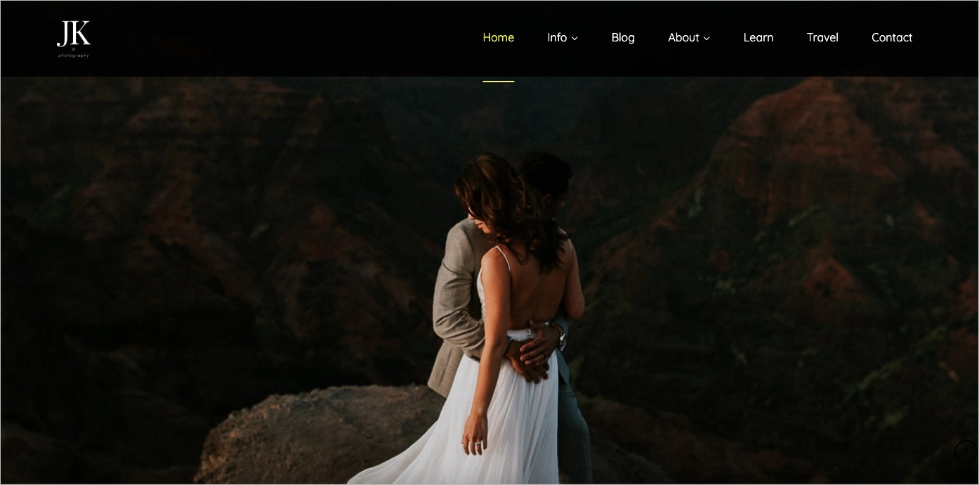
Why this site works:
The tone is warm and conversational, which makes the booking process feel less intimidating. The service details are all laid out upfront, and it’s obvious that client comfort is a top priority.
What could make it stronger:
The site would benefit from showcasing more standout visuals or galleries upfront—especially for first-time visitors looking to fall in love with his style.
#9 San Pixs Photographie
The San Pixs Photographie landing page engages visitors, making a perfect first impression, thanks to choosing an immersive hero picture, using a monochromatic theme, and eye-catching headlines. This landing page was created with a simple layout, without overwhelming elements, to maintain intuitiveness.

The page showcases the portfolio, photographer’s note with storytelling narrative, contact section, and detailed service descriptions. The contact section includes an extensive form with 5 fields, although not all of them are required to send the message. Alternatively, visitors can find a phone number and e-mail address next to social media buttons in the page footer.
Key takeaways to learn from this example:
- Simple layout,
- Attention-grabbing hero section,
- Storytelling narrative,
- Detailed service descriptions,
- Contact section,
- Social media buttons.
Improvement areas:
- Video – adding a short video content showcasing the photographer’s work would enhance visitor engagement and increase conversion rate.
Choose a template that enables you to promote your work effectively – with Landingi customization takes minutes!

#10 Mango Studios
For a polished, full-service wedding photography site that covers it all (and looks good doing it), check out mangostudios.com. Based in Toronto with a second home in Miami, Mango Studios has been photographing weddings, portraits, and events since 2004. Their team blends modern, photojournalistic, traditional, and portrait styles—so no matter what vibe you’re going for, they’ve got you covered.
The website is super easy to navigate. You can explore dreamy wedding galleries, get details on everything from engagement shoots to corporate headshots, and read real client reviews that speak to both the experience and the final product. They also include a solid FAQ section and blog filled with planning tips and visual inspiration—which makes the site a great resource, not just a portfolio.

What works really well:
Mango’s range of services is laid out clearly, and their navigation makes it easy to jump between galleries, service info, and contact details. Plus, the call-to-actions are spot on—clear, visible, and placed exactly where you’d expect them.
Where there’s room to grow:
The site could level up with more interactive touches—like behind-the-scenes reels or quick video intros to their team. Also, tightening up mobile performance would help ensure all that stunning content loads seamlessly for users scrolling on their phones.
#11 Norte Image Studio
The Norte Image Studio landing page engages from the first point, reminding high-end magazines or technical photography tool options. The page unusually showcases pictures – they are grouped and marked by color theme strips, all signed with project details.

Animated elements and various picture sizes make this page come alive, boosting visitors’ engagement. Users can change the background theme, which is a value – colorful pictures look incredible on a white background, and changing it to black draws a totally different impression. Despite the page’s immersive design, its written content is barely readable. Still, it involves an “About” note and contact details.
Key takeaways to learn from this example:
- Immersive page design,
- Attractive visuals and animations,
- Project details,
- Minimal written content,
- Contact details,
- Social media links.
Improvement areas:
- CTA – even though it’s a portfolio landing page type, it should include an outstanding CTA button, indicating an action visitors can take.
Highlight your portfolio—design a beautiful photographer landing page with Landingi!
#12 Luke Brennan
Based in Nottingham, Luke Brennan is a music photographer, videographer, and designer who’s shot everything from gritty underground gigs to big-name acts—landing features in NME, Ticketmaster, and The Guardian along the way.
His landing page is sleek and focused, just like his visuals. You can jump between stills, video projects, and design work with ease. Whether it’s the energy of a packed venue or the quiet intensity of a moody press shot, Luke’s work has a signature vibe: raw, real, and totally in the moment. Testimonials from artists (like Joey Collins) add a human touch, showing how much trust clients put in his creative direction.

Why this site works:
Luke tells a story—his own and his clients’. His site mixes strong personal branding with a versatile portfolio that makes it easy for musicians and managers to imagine working with him. The layout is clear, and the contact form is easy to find, making the next step feel simple.
Where could it go next?
While the typewriter-style font fits the edgy, analog vibe perfectly, it can be a bit hard to read at times—you really have to focus, especially on smaller screens. A slightly clearer typeface could keep the aesthetic without sacrificing legibility.
#13 Tiny Sparrow Photography
If you’re into photography that feels like a warm hug, Tiny Sparrow Photography is worth a visit. Vanessa, a Sydney-based photographer, specializes in capturing heartfelt moments between families, expectant parents, tiny newborns, and even dancers mid-motion. Her work is gentle, story-driven, and clearly built on real human connection.
The site itself reflects that softness—it’s clean, calming, and easy to browse. You can move between galleries, session info, and testimonials without getting lost. Vanessa also does a great job prepping potential clients with helpful details on what to expect, pricing, and FAQs, which keeps things transparent and stress-free.

What stands out:
The storytelling is front and center, both in the photos and the copy. You feel the emotions in every frame, and the tone throughout the site matches that: warm, thoughtful, and inviting. Plus, the session breakdowns are super helpful for families who might be booking for the first time.
Where there’s room to refine:
Some of the call-to-action buttons like “Contact Me” or “Book a Session” could use a bit more visual emphasis—they’re there, but they don’t quite pop. And while the font choice suits the delicate aesthetic, some of the text feels a little small, which might make reading harder for visitors on smaller screens. Slightly larger fonts and stronger contrast would go a long way in making everything easier to read without losing the vibe.
#14 Elena Walsh
If you’re drawn to photography that feels calm, natural, and full of heart, Little Manly Photography is a lovely place to land. This site gently introduces a lifestyle-focused brand built around capturing quiet, meaningful family moments in soft and natural light.
The homepage feels like a breath of fresh sea air—clean, relaxed, beautifully paced. There’s no overwhelm here. Just honest images, a soothing color palette, and thoughtful copy that speaks directly to young families looking for timeless portraits. It’s clear from the first scroll that storytelling comes first, and the connection between photographer and client is just as important as the final gallery.

What stands out:
The visual tone is consistent and full of feeling—you can tell this photographer knows exactly who she’s talking to. The layout is simple and intuitive, letting the images shine without distraction.
Where there’s room to refine:
The second half of the homepage starts to feel a little visually flat—black-and-white imagery adds elegance, but a subtle shift in layout or tone could help re-energize the scroll. And while the call-to-actions are there, they could stand out more to guide visitors clearly toward the next step.
#15 Icelandic Explorer
The landing page for projects featured on Icelandic Explorer’s website is another example of a perfect photography page promoting unique photographer skills. Firstly, visitors see the stunning, unusual pictures from the photographer’s hand, inviting them to explore the page further. This page isn’t a simple photographer landing page, as it combines the shots with immersive storytelling content, making visitors dive into the Icelandic atmosphere.

The page includes alternative CTAs, allowing visitors to dive into the projects the photographer took and read stories about them. The primary purpose is selling prints, and a click-through landing page for the photographer’s projects allows visitors to meet his philosophy and engage in his mission. The page also involves a contact section with a clear form, including two required fields, and a few social media buttons for those who want to be updated with the latest shots. This is a clear example of sharing your passion with the world and changing it into a well-prospering business with one webpage.
Key takeaways to learn from this example:
- Stunning design,
- Compelling headlines,
- Immersive shots and video,
- Storytelling yet informative content,
- Clear contact form,
- Social media buttons.
Improvement areas:
- Page load speed – although this page is unique in its design, the load speed is high, which may increase bounce rates.
Don’t forget about a Thank You page, appearing after completing a contact form. It’s a great idea to build engagement among customers at each selling stage and affect their loyalty!

#16 Flavio Roberto Fotografo
The portfolio landing page featured on Flavio Roberto Fotografo’s page is one of the best examples of how to use the power of landing pages. The page is simple with its layout, featuring clickable miniatures of best shots that efficiently engage visitors. Each picture leads to a full project portfolio, where every picture has a social media sharing button, enabling visitors to spread the message about these high-quality picture shots taken by the photographer.

A side navigation bar makes the page look like a photo album, providing a great user experience. The page is short but allows visitors to discover photographers’ work. It includes a contact section with a phone number and social media icons leading to photographer channels. A WhatsApp icon in the strategic bottom right corner allows for immediate contact if visitors request a session.
Key takeaways to learn from this example:
- Simple but effective layout,
- Side navigation bar,
- Visually appealing high-quality pictures,
- Social media sharing icons,
- WhatsApp icon,
- Contact section,
- Social media buttons.
Improvement areas:
- Testimonials – adding testimonials from previous clients would build trust among page visitors and increase the brand’s credibility, leading to higher conversions.
Showcase your portfolio and engage visitors efficiently – choose a template from the Landingi Gallery to create a powerful photographer landing page.
#17 Erik Johansson Surreal Photography
The landing page of Erik Johansson Surreal Photography serves as an invitation to the world of unusual photography. Its minimal layout welcomes visitors with an animated background, showcasing immersive photography artwork. The CTA button is outstanding, with straightforward messaging indicating what to do next.

The page is supplemented with social media buttons leading to the photographer’s channels. The page hidden under the entry button involves the portfolio, store point with prints, event calendar, and a contact section, allowing visitors to engage in his work or ask for collaboration.
Key takeaways to learn from this example:
- Minimal layout,
- Immersive animated background,
- Clear CTA button,
- Social media buttons.
Improvement areas:
- Mobile responsiveness – the page should be better optimized for mobile devices to ensure a seamless experience for visitors using smartphones.
To create a simple landing page, choose a minimal Mosaic Splash Page Template and customize it with Landingi editor by adding your picture shots, changing written content, and making a single opt-in form a powerful lead generation tool.

3 Photographer Landing Page Best Practices
To craft an exceptional photographer landing page, incorporate the 3 best practices that enable you to attract clients, immerse visitors in your photographic journey, and achieve outstanding conversion rates. These practices are tailored to refine your landing page’s effectiveness, turning casual viewers into enthusiastic clients or followers.
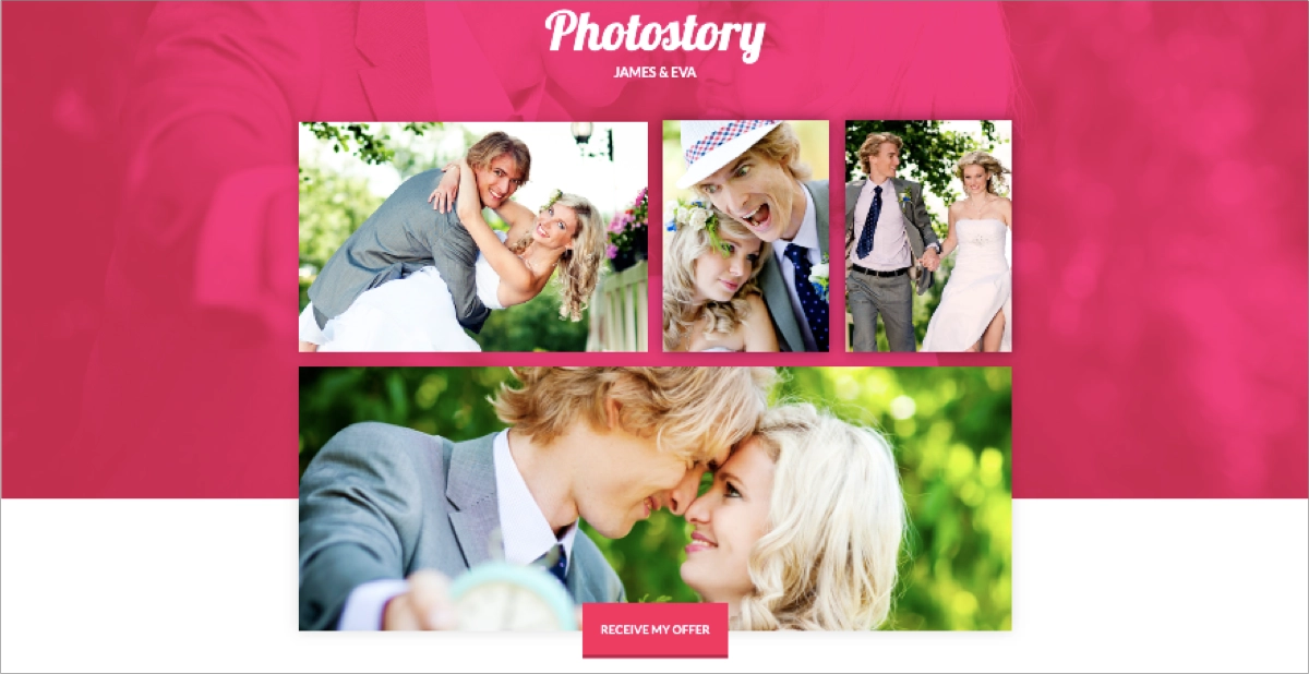
#1 Add social media sharing buttons
The first best practice for a photographer landing page is to add social media sharing buttons for every single picture you show on your page. Thanks to this, you can efficiently use the power of social media and let visitors spread the message about your artwork.
Take a look at the example below:

This powerful strategy can help you leverage the viral potential of social media and significantly increase your artwork’s visibility. It facilitates easy sharing but also serves as a form of endorsement, as visitors who share your images are essentially recommending your work to their followers.
Ready to grow your photography business? Build your landing page with Landingi!
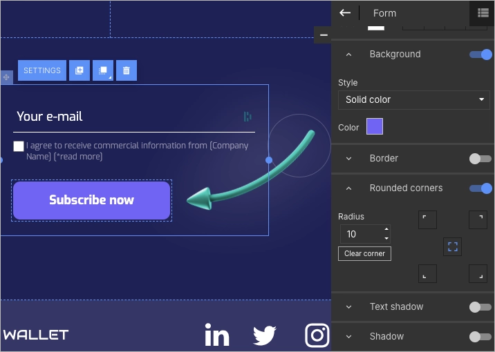
#2 Use simple form
The second best practice for a photographer landing page is to use a simple contact form. Ensure form fields don’t require any sensitive data, and avoid asking for a phone number, as it decreases the likelihood of completing the form among visitors.
Take a look at the example below:

Keep your form’s design simple, require only essential data, like name and e-mail address, and add an outstanding CTA button. The shorter form you use, the higher conversion rates you gain – it’s proven!
Create a professional photographer landing page—get started with Landingi now!
#3 Include clickable miniatures
The third best practice for a photographer landing page is to include clickable miniatures of your pictures and videos to showcase more without overwhelming visitors. Clickable miniatures are a great idea when you create your portfolio landing page or want to showcase more picture samples, but pay attention to the user experience at the same time.
Take a look at the example below:

Including clickable miniatures is not only about aesthetics but also about optimizing your page for fast loading and providing a seamless experience for mobile users.
A webpage loading delay of just two seconds can cause your bounce rate to increase by 103%, according to Akamai statistics – use clickable thumbnail pictures to improve landing page loading speed.
How Can I Optimize My Photographer Landing Page for Higher Conversion Rates?
To optimize your photographer landing page for higher conversion rates, focus on showcasing your value proposition with visual content, pay attention to SEO practices, utilize A/B testing to experiment with different page elements, and ensure mobile responsiveness. Check out the 7 optimization areas and change your landing page into a high-converting, powerful digital marketing tool:
1. Implement responsive design
Firstly, implement responsive design. Your landing page must look great and function seamlessly across all devices, especially mobiles and tablets. A responsive design ensures that visitors have a positive experience regardless of how they access your site, improving the chances of conversion.
2. Optimize CTAs
Secondly, optimize CTA buttons. They should stand out and be placed strategically throughout your landing page. Whether you want visitors to book a session, contact you for more information, or sign up for your newsletter, make sure your CTAs are clear, compelling, and easy to find.
3. Simplify Navigation
Thirdly, simplify navigation. Too many options can overwhelm visitors and detract from your main conversion goals, so keep the navigation intuitive and remember that a landing page should showcase a single focus. A clean, straightforward layout helps guide visitors to take the desired action.
4. Optimize for SEO
Fourthly, optimize your landing page for SEO. Use relevant keywords throughout your landing page content, in alt tags for images, and in meta descriptions to improve your search engine ranking. This makes it easier for potential clients to find you online. Remember about local SEO, as it helps to boost your page’s visibility in local search.
5. Use A/B testing
Fifthly, use A/B testing and experiment with different versions of your landing page to see what works best. Test variations in images, headline copy, CTA button colors, and layouts to optimize conversion rates. Platforms like Landingi provide built-in A/B testing solutions that can help you run these tests effectively.
6. Optimize for fast loading
Sixthly, optimize your page for fast loading. Ensure it loads quickly by optimizing image sizes, leveraging browser caching, and minimizing the use of heavy scripts. A fast-loading page improves user experience and SEO, both of which can lead to higher conversion rates.
7. Monitor and analyze visitor behavior
Seventhly, monitor and analyze visitor behavior. Use analytics tools to track how visitors interact with your landing page, or choose the Landingi platform with a built-in EventTracker tool that simplifies the process. Look at metrics like bounce rate, time on the page, and the paths visitors take. This data can provide insights into what’s working and what needs improvement.
By implementing these strategies, you can create a more effective photographer landing page that not only attracts visitors but also converts them into clients or engaged followers.
Follow the best photographer landing page examples—design yours with Landingi!
What Are the Key Elements of an Effective Photographer Landing Page?
An effective photographer landing page perfectly combines key elements, like stunning visuals, catchy headlines with storytelling content, and a well–designed layout, all showcasing a unique value proposition, leading to an irresistible CTA.
Check out key elements that make up a photographer landing page:
1. Stunning visual content
The first key element of a photographer landing page is stunning visual content. High-quality, captivating images that showcase your best work are essential, representing the variety and style of your photography, drawing visitors in, and encouraging them to explore further.
2. Clear, catchy headline
The second key element of a photographer landing page is a clear, catchy headline. It should grab attention and clearly convey the unique value you offer as a photographer. It’s the first piece of text visitors will read, so make it count by making it descriptive and engaging.
3. Engaging copy
The third key element of a photographer landing page is engaging copy. While images are key, the text on your landing page helps to tell your story and convey information about your services. Your copy should be concise, easy to read, and crafted to appeal to your target audience, highlighting what sets you apart from other photographers.
4. Strong CTA
The fourth key element of a photographer landing page is a well-defined CTA button. It’s crucial for guiding visitors toward the next step, whether it’s booking a session, viewing your portfolio, or contacting you for more information. Your CTA should be visually prominent and use persuasive language that encourages action.
5. Social proof
The fifth key element of a photographer landing page is social proof. Including testimonials from satisfied clients or mentions in the press can greatly enhance your credibility. Social proof helps to build trust with potential clients by showing that others have had positive experiences with your services.
6. Easy navigation
The sixth key element of a photographer landing page is easy navigation. Your landing page should be intuitive, allowing visitors to find the information they need without confusion. A simple layout ensures a seamless experience that can lead to higher engagement and conversion rates.
7. Contact information and form
The seventh key element of a photographer landing page is contact information and form. By including contact details or a simple form, you make it easy for potential clients to reach out. Providing multiple contact options (email, phone, contact form) can cater to different preferences, enhancing conversion rates.
With these essential elements, you can create a visually appealing, high-converting photographer landing page that not only serves as your portfolio but allows you to expand your business.
What Is the Best Photographer Landing Page Builder?
The best photographer landing page builder is Landingi, a platform tailored to meet the unique needs of photographers seeking to showcase their work and attract clients. Renowned for its intuitive landing page builder and comprehensive digital marketing toolkit, Landingi stands out as the ideal solution for both photography enthusiasts embarking on their digital presence and seasoned professionals aiming to enhance their online visibility.
Landingi sets the stage for your photographic showcase by offering an extensive selection of templates specifically designed to highlight visual content and drive engagement. Each template is engineered to maximize viewer interaction and conversions, allowing you to focus on personalizing the aesthetic elements and populating your page with captivating content that speaks directly to your target audience.

But creating your page is merely the first step in a process that, with Landingi’s suite of tools, transforms a simple landing page into a dynamic portfolio that engages and converts. The platform’s A/B testing capabilities enable you to refine your presentation, comparing different page versions to determine what resonates most effectively with your audience. The EventTracker functionality provides insightful analytics on visitor behavior, enabling data-driven decisions to optimize your page for peak performance further. Additionally, Landingi’s AI Assistance, alongside various forms, popups, and widgets, empowers you to tailor your landing page for optimal search engine ranking, meet user expectations, and generate leads to fuel your growth.
With Landingi, photographers gain access to an all-encompassing toolset that combines ease of use with powerful features for ongoing optimization. This makes the platform budget-friendly and a comprehensive choice for individuals. However, its advanced capabilities, designed to support in-depth digital marketing strategies, also make Landingi the top selection among professional landing page builders in photography.
Boost your brand with a professionally designed landing page tailored to your needs.
Craft Photographer Landing Page in Landingi
As photography moves us with its ability to capture moments, your photographer landing page should showcase your work’s artistry and emotion. Yet, creating an attractive page is not enough; ongoing optimization is the key to success – from stunning visuals and engaging narratives to strategic SEO efforts – enabling you to curate digital showcases that not only reflect the soul of your photography brand but also engage viewers and convert them into loyal clients.
With the right tools at your disposal and valuable insights into visitor behavior, you can elevate a simple landing page into a high-performing digital portfolio. Knowing the theoretical part, and inspired by the best examples, take the opportunity to craft your photographer landing page today – explore Landingi now, and transform a standard page into an expressive platform that captivates and converts.