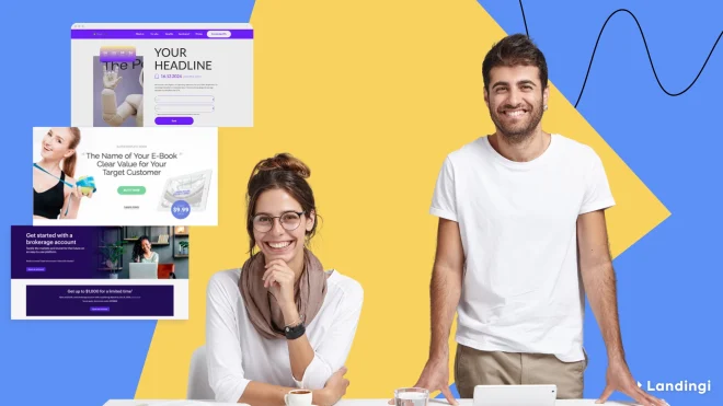
A dentist landing page is a webpage designed to attract and acquire new patients and drive service bookings with a clear call to action, such as scheduling appointments. However, some pages in the dentistry sector have different purposes, like promoting live events or sharing educational resources. According to Unbounce’s Conversion Benchmark Report, the average conversion rate for health–related landing pages, including dental services, is 7.4%. This highlights the importance of optimized design, trust signals, and user-centric messaging.
If you’re seeking inspiration for an effective dentist landing page, look no further. We analyze top-performing landing page examples in the dental industry, providing you with insights into their successful elements and describing what is important on dentist landing pages. Learn what sets them apart and how to apply these concepts to your own landing page.
- Always Smile DC
- DC Dental Spa
- Smile California
- North Texas Dental
- Fusion Dental
- Endodontics Northwest
- Dental Minds
- SF Dentistry
- Pearl Dentistry
- DRAKE Dental Lab
- Invisalign
- Tessin Dental
- Dr. Rhona
- Dentologie
- NORIS Medical
- Bulletproof Summit
- DEO
- Smile Clinic
- OP Dental Care
- Smileboston

What Is a Dentist Landing Page?
A dentist landing page is a targeted web page on a dental clinic’s website specifically designed to attract potential patients. Its main aim is to guide these visitors to take a specific action, such as booking an appointment. Simply put, it serves as a bridge connecting potential patients to the dental services they need.
This specialized page has to follow the rules equivalent to serious health services. Such a landing page has to be crafted precisely, employing psychological triggers, engaging visuals, and compelling copy to create a sense of urgency and need.
By highlighting the benefits of the clinic’s services, showcasing the expertise of the dental team, and providing a seamless navigation experience, a dentist landing page can significantly reduce the time it takes for a visitor to become a booked appointment – it’s a powerful tool in a dental clinic’s marketing kit, aiming to convert interested visitors into loyal patients with just a few clicks.
A well-designed dentist landing page can boost not only patient acquisition but also improve Google Ads campaign performance, thereby fostering the growth of a dental business through effective dental landing pages.
Attract more patients—build a professional dentist landing page with Landingi!
What Are the Key Elements of an Effective Dentist Landing Page?
An effective dentist landing page is more than meets the eye; it’s built on key elements that work harmoniously to capture the visitor’s attention and lead them toward the desired action, including the following:
- Clear and concise headline, immediately communicating the leading service or value proposition.
- Easy navigation with a user-friendly layout that guides visitors through the webpage.
- Compelling CTA buttons like “Book Appointment” or “Contact Us” that simplify scheduling appointments.
- Trust-building elements, such as credentials, awards, or affiliations, which establish credibility.
- Patient testimonials that boost engagement, including real stories or reviews from satisfied patients.
- Detailed service descriptions to inform on dental offers.
- Contact information, including easily accessible phone numbers, email, and physical address.
- Responsive design for accessibility on various devices.
- SEO optimization that improves search engine rankings.
- Social proof and links to social media profiles.
- Online appointment scheduling feature for booking appointments directly from the webpage.
Grow your dental practice—create a high-converting landing page with Landingi!
How Do I Create a Dentist Landing Page?
To create a landing page for a dental clinic, determine your target audience, design the page‘s layout, implement trust signals, create strong CTAs, provide payment information, and add high–quality visuals. Start by choosing the best toolkit that allows you to build a visually appealing and functional page, like Landingi builder, and follow the short instructions:
#1 Determine the Target Audience
Firstly, gain a thorough understanding of your target audience to tailor the landing page to their needs and preferences. It’s crucial to delve into the demographics, behaviors, and pain points of your audience.
Research their common dental issues, the type of information they seek, and what motivates them to choose a dental service. This knowledge will enable you to create a landing page that resonates with them personally, addressing their concerns and highlighting the solutions your clinic provides that specifically cater to their unique requirements.
Increase dental appointments—design your landing page with Landingi today!
#2 Design the Layout
Secondly, design the layout of your page, focusing on user experience and conversion optimization. This involves creating a visually appealing interface that guides the user towards your goal – whether it’s to book an appointment, subscribe to a newsletter, or download an oral health guide.
Landingi gives you multiple options to craft your page. Click Create new landing page and choose the way you’ll build your page. You can use a drag-and-drop builder to craft your page from scratch, select one from over 400 pre-designed templates and customize it in a user-friendly builder, leverage Composer to generate a relevant page based on your requirements or import your design from Figma.

The layout of your dentist landing page should be intuitive, eliminating any unnecessary complexity that could detract from the main message or action you want the visitor to take. Use of whitespace, strategic placement of images and call-to-action buttons, and a coherent color scheme that aligns with your brand identity are all critical factors in the design process.
In addition to aesthetics, the functionality of the landing page is paramount. Ensure that the page loads quickly, is free from technical errors, and is accessible to users with disabilities. Remember, a well-designed landing page not only looks good but also provides a frictionless journey for the visitor, culminating in the ultimate goal of converting leads into patients.
Showcase your dental services—build a compelling landing page with Landingi!
#3 Implement Trust Signals
Thirdly, decide on the elements to include, such as trust signals (customer testimonials, qualifications) to build credibility, as well as engaging multimedia elements like informative videos and interactive before-and-after sliders that demonstrate the results of dental treatments.
Add a new section by dragging and dropping the Section widget. Find the right template for the testimonials section, and tailor it to your page’s layout.

Consider adding a FAQ section to address common patient questions and concerns, which can also help reduce any anxieties about dental procedures. Additionally, ensure that your landing page includes clear, benefit-driven descriptions of each service offered, highlighting how your clinic addresses pain points and improves dental health.
Turn visitors into patients—create your dental landing page with Landingi!
#4 Create Strong CTAs
Fourthly, ensure a call-to-action (CTA) is clear and prominently displayed. This CTA should be the centerpiece of the landing page, drawing the visitor’s eye and compelling them to take action. Use persuasive language that creates a sense of urgency, such as “Schedule Your Appointment Today” or “Get Your Free Consultation Now!”

Make sure the CTA stands out with a contrasting color or a unique design element that doesn’t blend in with the rest of the landing page. The positioning of the CTA is also crucial; it should be placed above the fold so that visitors don’t have to scroll to find it, and if the landing page is longer, consider repeating the CTA at strategic points to capture attention as the visitor reads through the content.
Promote your dental practice online—build a professional landing page with Landingi!
#5 Provide Payment Information
Fifthly, provide clear insurance and payment information to address potential patient concerns, ensuring transparency and easing any worries about affordability. Highlight the various insurance plans the clinic accepts and detail the available payment options, such as credit cards, payment plans, and online transactions.
Include information on financing for more extensive dental work, which can make treatments more accessible to those on a tight budget. It’s also beneficial to provide a cost breakdown for common procedures so patients can understand what to expect financially. This clarity is another trust-building element and can be a deciding factor for patients choosing your dental practice.
Get more patient inquiries—design a custom dentist landing page with Landingi!
#6 Display High-quality Visuals
Sixthly, implement patient photos to help visitors relate to your brand and build trust. It’s important to use authentic, high-resolution images that reflect your patients’ positive experiences. Use Landingi’s background removal feature to enhance your visuals and create an attractive yet distraction-free page.

Make your practice stand out—build a unique landing page with Landingi!
Visuals on your page testify to the quality of care provided and can significantly influence a visitor’s decision to choose your dental practice over others. You can create a welcoming and reassuring atmosphere on your landing page by showcasing genuine smiles and satisfied patients.
Additionally, consider including images or videos of your clinic’s interior to give potential patients a virtual tour of the environment they will be entering. This level of transparency can further enhance the trust factor and make visitors feel more at ease about the prospect of visiting your dental practice.
The work on a dentist landing page doesn’t stop at creation. Regular testing and optimization are necessary to ensure it keeps meeting your goals. A/B testing is crucial for optimizing the landing page, where different versions are tested to see which elements lead to higher conversion rates. A landing page should be a living, breathing part of your marketing strategy, evolving as your practice grows and as you gain a deeper understanding of your target audience’s online habits.

20 Examples of Dentist Landing Pages
The 9 examples of high-converting dentist landing pages below will give you an idea of what an effective dental practice landing page entails. These examples showcase different dental clinics and approaches to attracting new patients, providing a source of inspiration for your own landing page design.
1. Always Smile DC – General Dental Care Landing Page
Always Smile DC’s website’s homepage serves as a general dental care landing page that stands out with its clear navigation and descriptions, making it easy for visitors to find what they want. The webpage also features visible contact information and patient testimonials, building credibility and encouraging visitors to make an appointment.

A key element that builds trust is the inclusion of dentist credentials, patient testimonials, and professional affiliations. With an appointment booking form readily available, visitors can easily schedule a visit, making the conversion process a breeze. Elements that make the user experience seamless are also the map plugin and working hours table. To gather more leads, they implemented a newsletter sign-up form, which can be a great option to inform about special programs or discounts and keep happy clients loyal to their brand.
The improvement area involves the navigation bar – while the landing page is longer, it’s crucial to implement a sticky navigation bar, especially for mobile users.
Key takeaways you can learn from this example are the following:
- Clear appointment scheduling button leading to a clear request form.
- Trust elements,
- Social proof that enhances credibility,
- Contact information and map plugin,
- Concise but informative descriptions,
- High-quality visuals.
Overall, these elements work together to create an effective and engaging webpage for Always Smile DC’s dental service.
Book more appointments—create an effective dentist landing page with Landingi!
2. DC Dental Spa – Emergency Dental Care Landing Page
DC Dental Spa’s emergency dentistry landing page is a lighthouse in the storm for individuals in urgent need of dental care. Their page offers comprehensive information on emergency dental services and clear contact details for immediate assistance. Besides, the landing page highlights patient-centric features like flexible payment options and same-day emergency help, enabling the clinic to cater to its target audience’s needs effectively.

A key element that ensures visitors are on their way to get immediate help is the hero section with a clear, outstanding heading. Huge CTA buttons placed above the fold ensure a seamless user experience, simplifying the appointment request. Clear layout, easy navigation, and well-matched messaging make the page a useful tool for users in urgent emergencies.
The area for improvement is the text section – it’s long and difficult to read. The better option would be to break it into smaller sections.
Key takeaways you can learn from this example are the following:
- The “Call Now” button, which simplifies quick appointment requests,
- Informative headline, ensuring users they have found the right place,
- Trust elements that build credibility,
- Working hours table,
- Professional imagery.
By implementing these elements, DC Dental Spa’s emergency care created a well-designed, user-friendly page that stands as a real help tool.

Choose the template and create a landing page that meets your patient’s needs. Create an informative offer and simplify contact with your clinic.
3. Smile California – Infants and Children Dentist Care Landing Page
Smile California’s dental landing page, specifically focusing on dental care for babies and kids, is a vital resource for parents and guardians. With its educational content about children’s oral health and a navigation tool for finding pediatric dentists accepting Medi-Cal (a public health insurance program), it is a perfect example of a landing page that caters to the specific needs of its target audience.

The site’s design may seem overloaded, but the overall navigation is clear, including a simple, outstanding CTA button leading to the dentist search feature. An informative approach with concise but informative text sections increases conversions, providing all necessary information to new visitors. Video content and vivid colors boost engagement, which encourages visitors to take action.
Key takeaways you can learn from this example are the following:
- Outstanding CTA color and well-matched messaging make it visible,
- Compelling headlines that encourage to learn more,
- Video content, which boosts engagement,
- Vivid colors that show a children-friendly approach.
Smile California’s infants and children dentistry landing page achieves the desired conversion goal by implementing a great page design that is convincing about a children-friendly attitude.
Promote your dental services—design a landing page with Landingi today!
4. North Texas Dental – Cosmetic Dentistry Landing Page
North Texas Dental’s cosmetic dentistry landing page effectively informs visitors about various cosmetic dental treatments available. The page’s strengths lie in its detailed service descriptions, contact details for appointments, and information about the dental team, giving potential patients a comprehensive overview of what to expect.

Their dedicated webpage involves a “Call Now” button and an appointment request button that simplifies contact. Social media buttons boost the social proof factor, and professional visuals boost engagement. The text section includes links to dedicated web pages with full descriptions of cosmetic dentistry services offered.
Key takeaways you can learn from this example are the following:
- Outstanding CTA leading to an appointment request form,
- The “Call Now” button placed in the strategic top right corner,
- Informative headlines and content.
North Texas Dental’s simple landing page for cosmetic dentistry increases conversions by using outstanding colors.
Engage more patients—build a high-converting dental landing page with Landingi!
5. Fusion Dental – Oral Surgery Landing Page
Fusion Dental’s oral surgery webpage is a shining example of how detailed and accessible information can empower patients. The page provides detailed information on oral surgery services and appointment booking options, giving visitors all the information they need to make a decision.

The new landing page also highlights patient testimonials to build trust, making it more likely for visitors to convert. They used a clear template, which is a great way to provide information. The strategic top right corner serves as the location button, leading to the map. CTA with straightforward messaging leads to the contact form. The clear navigation bar allows users to gain additional information about dentists or payment options.
Key takeaways you can learn from this example are the following:
- Informative headlines and content providing necessary surgery details,
- Outstanding CTA leading to an appointment request form,
- Map button leading to Google Maps,
- Clear layout without distracting pictures.
The Fusion Dental’s oral surgery webpage stands out with a clear template, without stock photos, and keeps the reader’s attention on important information.

Create a distraction-free, informative landing page for treatment descriptions. Don’t forget about forms – use the Landingi platform to implement a user-friendly, clear form that converts.
6. Endodontics Northwest – Endodontic Care Landing Page
Endodontics Northwest’s endodontic care webpage is a perfect example of a clear yet visually appealing dentist landing page. The page is designed to appease visitors seeking specialized endodontic care, providing a detailed explanation of the procedure and its benefits.

The direct contact options for scheduling appointments make it easy for potential patients to take the next step. The “Meet the doctors” section is a great trust-building element, and a map plugin simplifies finding the location. Their killer CTA includes a small calendar icon, which facilitates finding the appointment request form. The sticky navigation bar also ensures a seamless user experience on mobile devices.
Key takeaways you can learn from this example are the following:
- Clear layout and mobile-friendly navigation,
- CTA with calendar icon,
- Doctors’ note section allowing to gather information about dentists,
- Map plugin that simplifies finding the clinic’s location.
Endodontics Northwest’s homepage is visually appealing and highly intuitive, which boosts conversions.
Convert visitors into loyal patients—design your landing page with Landingi!
7. Dental Minds – Dental Exam & Cleaning Landing Page
Dental Minds’ landing page for dental exams and cleaning services effectively promotes dental hygiene care. The page outlines their thorough dental exams and cleaning procedures, which include a full dental exam, gum health evaluation, and X-rays when needed. They also promote a valuable discount that comes out against the belief that similar treatments involve spending big bucks – a $149 new patient special offer, which includes a full treatment plan, making it more appealing for new patients to book an appointment.

The page’s layout is clear – the hero section includes a compelling headline, a well-designed CTA with straightforward messaging, and a “Call Now” button. The green theme is a good choice, as it refers to health and trust. The navigation bar is user-friendly, keeping the primary CTA placed in the top right corner.
Although the page is highly intuitive and well-designed, it could include patient reviews to increase user trust.
Key takeaways you can learn from this example are the following:
- Attractive headlines,
- Clear CTA leading to an appointment request form,
- Badges showcasing accepted insurance,
- Special offer that encourages new patients.
By implementing these elements, Dental Minds’ webpage is user-friendly and easy to navigate, which boosts conversions.

Simplify appointment booking with a clear form – choose the best dental landing page template and customize it with Landingi builder to achieve higher conversions.
Ready to grow your dental practice? Build a landing page with Landingi today!
8. SF Dentistry – Bruxism Treatment Landing Page
SF Dentistry’s bruxism treatment landing page focuses on providing information about the botox treatment for teeth grinding and clenching. Their webpage is well-structured, showcasing details of the procedure and its benefits. The page provides direct contact options for those ready to book a consultation, making it easy for potential patients to reach out.

The clear design with high-quality visuals and concise content makes the page visually attractive yet informative. The page includes concise, well-written procedure descriptions, video content that boosts users’ interest, and clear CTAs with straightforward messaging. Strategic white space makes the page’s layout intuitive, simplifying information gathering. All elements implemented on the webpage showcase the quality, encouraging visitors to complete CTA.
Key takeaways you can learn from this example are the following:
- Attractive headlines,
- Clear layout with visible CTA,
- Social proof – patient reviews,
- Video content that increases user engagement,
- Pictures of interiors and professional images visualizing the treatment procedure.
Behind the SF Dentistry landing page success stands the well-matched layout with user-friendly navigation and clarity of content.

Create a stunning landing page and promote your dental clinic with the Landingi template – it’s easily customizable within a drag-and-drop editor.
Build trust with new patients—create a professional landing page with Landingi!
9. Pearl Dentistry – Teeth Whitening Care Landing Page
Pearl Dentistry’s teeth whitening care landing page shines with its showcase of before-and-after images and patient testimonials, effectively demonstrating the dramatic results that can be achieved with their services. These visuals are a powerful testament to the transformative power of professional teeth whitening, giving potential patients a clear and compelling visual narrative of what they can expect.

The page effectively markets its teeth whitening services by providing a detailed description of teeth whitening procedures, showcasing the transformational results through images, and reinforcing their credibility with patient testimonials. With direct contact information provided, potential patients can easily schedule an appointment to brighten their smiles.
Key takeaways you can learn from this example are the following:
- Compelling headlines to engage potential patients,
- High-quality, engaging visuals to showcase the procedure and its results,
- Outstanding CTAs in a shape that catches attention immediately,
- Sticky navigation bar with contact buttons,
- “Call Now” button and map button to simplify actions,
- Social media buttons to implement social proof elements.
The visually appealing landing page of Pearl Dentistry owes its success to the well-structured, intuitive layout with clear contact sections and outstanding CTA buttons.

To achieve stunning results, check out Landingi’s template gallery and choose the best pattern to promote your dental clinic.
10. DRAKE Dental Lab – Dental Solutions Page
The landing page for Drake Dental Lab effectively presents dental solutions online. It begins with a professional, modern design that emphasizes clarity and visual hierarchy. From the bold headline to the well-organized content sections, the site makes it easy for dentists to navigate, learn, and take action. CTA buttons are strategically placed to guide users toward conversion while offering support and onboarding.

This page showcases a comprehensive range of offerings – each service is paired with a brief, benefit-driven description, ensuring visitors can quickly access deeper information without being overwhelmed. The aesthetic is polished and professional, with custom visuals and icons reinforcing the lab’s brand credibility.
Key takeaways you can learn from this example are the following:
- Strong headline hierarchy with clear value proposition presented immediately,
- Effective, alternative CTA buttons that guide user interaction,
- High-quality images and icons that drive visual engagement,
- Mobile responsiveness,
- Service-specific sections,
- Easy contact access.
The success of Drake Dental Lab’s landing page lies in its seamless blend of clear messaging, professional design, and strategically placed calls-to-action that guide visitors effortlessly toward engagement and conversion.
11. Invisalign – Personal Orthodontic Products Page
The Invisalign personal orthodontic products page stands out as a prime example of a modern, user-focused page. The hero section welcomes users with high-quality visuals, engaging headline, and a strong CTA highlighting a discount. Scrolling down you can see this page delivers a seamless e-commerce experience by offering a curated selection of Invisalign accessories and oral care tools. The design is minimalistic, clean, and geared toward ease of use, making it easy for customers to find what they need to support their orthodontic treatment.

From strong product visuals to intuitive navigation, the page ensures users are never more than a click away from completing a purchase. The product names, descriptions, and prices are clearly displayed, and the checkout process is smooth and mobile-optimized. Combined with trust signals like secure payment icons and a professional aesthetic, the page is built for conversion and brand loyalty.
Key takeaways you can learn from this example are the following:
- Clean and minimal layout that creates a premium feel and matches Invisalign’s brand,
- Mobile-first design,
- Strong product imagery ensuring each item is visually showcased,
- E-commerce optimization ensuring a smooth checkout experience,
- Simple navigation thanks to highlighted categories,
- SEO-friendly structure,
- Consistent branding.
This page excels by blending e-commerce functionality with the clean, clinical aesthetic expected from a high-trust dental brand, ensuring users can shop confidently and effortlessly.
12. Tessin Dental – Dental Clinic’s Page
The Tessin Dental’s page is a standout example of a localized, patient-first dentist website done right. The page immediately positions the clinic as a trusted provider in Stockholm’s Östermalm district, highlighting services such as emergency dental care, dental hygiene, and implants with clear icons, bold headlines, and inviting visuals. The layout is responsive and mobile-friendly, with a booking button placed intuitively for fast access.
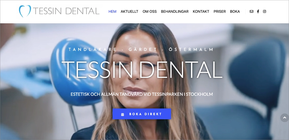
The page reinforces trust with high-quality photography, concise service descriptions, and strong calls to action. Social proof is built through the integration of social media, patient testimonials, and a strong local brand presence, while multilingual accessibility adds to its inclusive appeal.
Key takeaways you can learn from this example are the following:
- Localized branding that builds community trust,
- Professional design with high-end imagery,
- Strong CTAs for booking,
- Multi-service clarity,
- Trust-building content with an authentic tone, testimonials, and local references.
Tessin Dental creates a welcoming online experience for patients, blending local connection with modern design and straightforward service descriptions to build trust.

Focus on the informative part of your dental landing page – use the perfect Landingi template and engage your audience in your message.
13. Dr. Rhona – Dentist’s Page
The landing page for Dr. Rhona Eskander’s cosmetic dentistry practice is a masterclass in branding, storytelling, and conversion-focused design. From the moment you land, the bold declaration of “#TheChelseaLook®” and an elegant video hero section instantly capture attention. This page builds immediate trust with high-quality imagery, powerful social proof (awards, press mentions, celebrity endorsements), and emotionally compelling copy that positions Dr. Rhona as both an authority and a trendsetter in cosmetic dentistry.

The site beautifully blends education and aspiration, highlighting a wide range of services, including cosmetic bonding, veneers, and general dentistry. Each service is introduced with concise descriptions, stylish icons, and clear CTAs. Her vibrant social presence is spotlighted with stats and visuals, while testimonial visuals and “smile stories” bring real results to life. The cohesive color palette, modern typefaces, and sleek layout make for a high-end experience that’s both inspirational and conversion-friendly.
Key takeaways you can learn from this example are the following:
- Brand-driven headline that offers a memorable, unique value proposition,
- Video hero section that creates immediate engagement,
- Strong social proof,
- Emotional storytelling with persuasive copy that humanizes the brand,
- Prominent CTAs,
- Visual consistency.
This page perfectly fuses premium aesthetic, personal branding, and user-focused design to create a high-converting experience that turns curiosity into patient trust and action.
Boost your dental practice’s online presence—build your landing page with Landingi!
14. Dentologie – Dental Care Service Page
The Dentologie emergency dental care landing page is a standout example of user-focused, design-driven healthcare communication. With a bright and inviting aesthetic, it makes what could be a stressful experience feel approachable and even calming. Clear, empathetic copy immediately addresses patient concerns while establishing trust. Prominent CTA buttons appear early and often, making it easy to act fast in a dental crisis.

What sets this page apart is its step-by-step care walkthrough – Booking, Initial Exam, and Treatment – each presented in visually distinct cards that are scrollable and mobile-friendly. The page balances visual appeal and function with ease, pairing icon-driven symptom checklists with engaging headlines and a strong FAQ section that addresses patient questions directly. Insurance logos, membership plan details, and intuitive booking features round out a page optimized for both accessibility and reassurance.
Key takeaways you can learn from this example are the following:
- Empathetic headline that speaks directly to emergency concerns in a calm, confident tone,
- Color scheme and layout that ease patient anxiety,
- Step-by-step breakdown,
- High-converting CTAs,
- Visual hierarchy that guides users through the page,
- Comprehensive FAQ addressing real patient questions in plain language,
- Trust-building elements, including insurance partners and testimonials,
- Pain-point checklist that simplifies symptoms and invites action.
Dentologie effectively delivers emergency dental care with warmth and clarity, transforming urgency into trust through strong visuals, easy booking, and crystal-clear information.

Show your dental clinic’s offer in a user-friendly way and choose the Health Center landing page template – with Landingi, you can effortlessly customize it for your purposes.
15. NORIS Medical – Dentistry Webinar Page
The Noris Medical webinar landing page for “Introduction to Implant Dentistry” is a leading example of promoting a professional dental event with clarity, trust, and visual polish. The page showcases Dr. Simon Oh as the lecturer and provides all the essential event details – date, time zones, and registration options – right at the top. The CTA “Register Now” is repeated in multiple strategic spots, ensuring no user has to search to sign up.

Its clean layout uses a hero image and branded color scheme to maintain consistency and authority. It also includes a dedicated “about” section, which clearly outlines the benefits of attending, from learning implant biomaterials to placement techniques. The overall experience is user-friendly and mobile-responsive, helping convert curious professionals into active participants.
Key takeaways you can learn from this example are the following:
- Event details presented immediately,
- Prominent, strategically placed CTAs,
- Professional lecturer bio that builds credibility,
- Minimalistic layout that keeps focus on the webinar offer,
- Timezone-friendly scheduling,
- Visual branding.
The page combines structured, need-to-know webinar info with a sleek and professional design, removing all friction for users looking to learn and register quickly.
16. Bulletproof Summit – Event Page
The Bulletproof Summit 2025 landing page is a gold standard in event marketing for dental professionals. With a dynamic hero section, a video background, and a powerful headline, the page immediately captures attention. Designed for conversion, it includes compelling CTAs, countdown timers, and clear details about location, dates, and speaker highlights. The event promise is emphasized throughout, paired with testimonials and speaker bios that lend major credibility.

This page also shines in storytelling. It presents the summit as more than an event – it’s a movement. From motivational copy to bold typographic statements, every element fuels excitement. Visual consistency, engaging videos, and rich bios for a long list of expert speakers keep users engaged and inspired to take action.
Key takeaways you can learn from this example are the following:
- Bold hero message with immersive video,
- High-energy copywriting that builds anticipation,
- Conversion-focused layout with CTAs, countdown timer, and registration links,
- Event storytelling that promotes a transformational journey,
- Bios and photos of diverse experts from all areas of dentistry,
- Visual consistency,
- Social proof via testimonials and video clips.
The Bulletproof Summit’s page masterfully blends motivation, clarity, and design to sell not just tickets but the vision of a better, more successful dental career.
17. DEO – On-Demand Webinar Page
The DEO (Dentist Entrepreneur Organization) on-demand webinar landing page is a benchmark example of value-driven lead generation in the dental industry. Right from the start, it delivers a bold headline, strong positioning (“Free On-Demand Training”), and a compelling subheader focused on growth and scalability – ideal for entrepreneurial dentists. The design uses a streamlined layout with a high-converting registration form, trust-building elements, and benefit-oriented copy.

What really makes this page effective is its clarity and conversion optimization. The registration CTA is prominently featured, reinforced by clear bullet points detailing what attendees will learn, such as mastering leadership and building a top-performing team. Clean visuals, testimonial quotes, and minimal distractions keep users focused on signing up. The mobile-responsive design and fast load time add to the experience, making it easy for busy professionals to take action.
Key takeaways you can learn from this example are the following:
- Clear headline and value proposition,
- Conversion-optimized layout,
- Trust-building testimonials,
- Benefit-focused bullet points,
- Minimal navigation that keeps attention on the offer,
- Visual consistency.
DEO’s on-demand webinar page converts interest into action with razor-sharp messaging and a streamlined, benefit-packed layout that speaks directly to growth-minded dental professionals.

Pick the Webinar template, add details, describe benefits, and capture leads effortlessly! A countdown timer and clear CTA button create a sense of urgency and direct visitors to register, ensuring a high conversion rate and a successful webinar launch.
18. Smile Clinic – Dental Practice’s Page
The Smile Clinic dental practice landing page is a refined example of luxury branding blended with clinical credibility. Right away, visitors are greeted by a minimalist yet striking black-and-gold palette, elegant typography, and full-screen visuals that reflect sophistication and trust. The headline is straightforward yet classy, emphasizing the clinic’s commitment to both general and aesthetic dental care.

What sets the page apart is its high-end layout and immersive scroll experience. Each section flows effortlessly, with featured services like implantology, esthetic dentistry, and smile makeovers displayed in stylish content blocks, each featuring vibrant imagery, soft overlays, and well-placed CTAs. Testimonials, team profiles, and visual storytelling all reinforce expertise and elevate the patient experience from the very first click.
Key takeaways you can learn from this example are the following:
- Elegant visual identity,
- Service-focused design,
- Scroll-friendly layout,
- Multilingual accessibility,
- Localized relevance,
- Conversion-centric structure.
Through luxury design, multilingual access, and refined visual storytelling, the page delivers a high-end patient experience – making it feel more like a boutique hotel than a dental practice.
Boost your patient bookings—design your dental landing page with Landingi!
19. OP Dental Care – Clinic’s Page
The OP Dental Care clinic landing page delivers an excellent patient-first digital experience, positioning itself as one of the best dentist clinics in Phoenix. Right from the hero slider, users are greeted with warm headlines, complemented by inviting alternative CTA buttons for scheduling appointments or learning more about the practice. The page effortlessly combines a welcoming tone with clear, structured service information, helping patients feel at ease while navigating options for general, cosmetic, emergency, and preventive dentistry.

What elevates this page is the strong personal touch. Profiles of Dr. Prokopets, emphasis on a spa-like environment, and multilingual accessibility reflect a commitment to community and comfort. The layout is professional, showcasing the clinic’s expertise, yet friendly, featuring icons, testimonials, and visuals that create an atmosphere of trust and warmth. The navigation is intuitive, and mobile optimization ensures seamless access on any device.
Key takeaways you can learn from this example are the following:
- Hero slideshow with CTAs,
- Multilingual support,
- Detailed service list,
- Online forms for new patients,
- Trust signals,
- Content optimized for local SEO.
The page blends warmth, professionalism, and ease of access to create a trust-building, community-centered experience that turns visitors into lifelong patients.

Implement the doctor’s note section with social media buttons to boost the trust among potential patients – use the medical Landingi template and be ready for higher conversions!
20. Smileboston – Dental Prosthodontist Page
The Smileboston prosthodontist page is a strong example of how to welcome new dental patients with professionalism, clarity, and warmth. The hero section invites potential patients and encourages them to take action – book an appointment. Key contact info and location details are easily accessible, and the layout encourages patients to get started smoothly through outstanding CTAs and a clean user interface.

This page’s balance of credibility and simplicity makes it effective. SEO-friendly elements, such as structured metatags and social preview support, increase discoverability. The page’s inviting language, modern layout, and accessible design work together to convert first-time visitors into scheduled patients.
Key takeaways you can learn from this example are the following:
- Clear headline and location focus,
- User-friendly layout with minimal clutter,
- Quick contact options,
- Clean brand visuals,
- Navigation simplicity.
Smileboston’s page combines professionalism with emotional ease, making new patients feel confident, informed, and ready to book – all in a single, well-optimized scroll.
Highlight your dental expertise—create your landing page with Landingi!
5 Dentist Landing Page Best Practices
After analyzing some examples, consider the 5 best practices to improve your dentist landing page, focusing on the design and functionality of your landing page and aiming to provide a seamless and engaging user experience.
1. Responsive Design
As people use various devices to access the internet in this digital age, adopting a responsive design for your landing page has become indispensable. This means that whether someone is browsing on a desktop computer, a laptop, a tablet, or a smartphone, your website will maintain its usability and aesthetic appeal.
Take a look at the sample below:

Ensuring that your landing page adapts to each device’s screen size and orientation not only enhances the user experience but also caters to the modern consumer’s expectations for accessible and convenient online browsing. A responsive design also contributes to better SEO rankings, as search engines favor websites that are mobile-friendly. This improves the user experience and increases the likelihood of conversions.
2. Clear Appointment Request Form
Another important feature of a high-converting dentist landing page is a clear contact form. It simplifies the appointment booking process, providing a convenient way for potential clients to connect with your clinic. The fewer the barriers there are to taking the desired action, the higher the likelihood of conversion.
Take a look at the sample below:

The appointment request form can be user-friendly as in the example – a clear layout and minimized user effort translate into higher conversions and have a positive impact on the user experience factor, which is one of the elements building your brand’s success.
3. “Call Now” Button
A “Call Now” button is a powerful call-to-action that encourages immediate action from visitors. By providing a clear, easy way for potential clients to contact your clinic, you increase the chances of converting these visitors into booked appointments.
Take a look at the sample below:

The “Call Now” button in the contact section is crucial to shortening the user path to convert into a customer. As every second counts in the digital world, making it easier for users to take action can significantly boost your conversion rates. People immediately notice how user-friendly your website is, so focus on that aspect to improve their experience.
4. Doctor’s Note Section
Adding a personal touch to your dentist page can go a long way in building trust with potential clients. Here are some ways to do it:
- Include a doctor’s note section where the dentist shares a personal message or introduces themselves
- Use photos of the dentist and their team to show the human side of your practice
- Share personal stories or testimonials from satisfied clients
Take a look at the sample below:

These personal touches can help establish a connection with the visitors, making them feel more comfortable and confident in choosing your dental services.
5. Interactive Map Plugin
For dental clinics with multiple locations, an interactive map plugin can be a helpful addition to your landing page. It helps users locate your dental practice easily, providing a visual representation of all your clinic locations.
Take a look at the sample below:

By integrating such a plugin, you offer a user-friendly tool that allows patients to find the nearest clinic with ease, see the exact distance from their current location, and even get directions. This feature is particularly useful for new patients who may be unfamiliar with the area or for existing ones looking to visit a different location.
Furthermore, an interactive map can also display the hours of operation for each location, making it convenient for users to plan their visits accordingly. Overall, an interactive map plugin is not just a practical tool for navigation but also an effective way to improve engagement and serve the needs of your clients better.
How Can I Optimize My Dentist Landing Page for Higher Conversion Rates?
To optimize a dentist landing page for higher conversion rates, you need to focus on the following:
- Design
- Content
- User experience
- Testing
The journey begins with defining the primary objective of your landing page. This objective, whether it’s scheduling appointments or promoting a service, should guide the design and content of your landing page. Your landing page should also feature a clean and professional design that aligns with your brand’s color scheme and includes high-quality images of your dental practice and treatments offered.
The content of your landing page should include:
- A compelling headline
- Clear information using bullet points and short paragraphs
- A strong and visible call to action
- Testimonials and social proof to build credibility and trust
Lastly, always be open to improvements. Here are some tips to optimize your landing page:
- Regularly test and optimize your landing page through A/B testing of elements like headlines, CTAs, and color schemes to determine what resonates best with your target audience.
- Integrate your page with analytics tools to track visitor behavior and conversions.
- Use the data gathered to refine your marketing strategies and enhance landing page effectiveness.
It’s easier when you choose the right tool, which provides all the necessary features to create your dental landing page, effortlessly run and create A/B testing cases and realize them, track user behavior, and gather essential insights that help choose the most effective versions. The best option for small businesses, like your dental practice, is Landingi – a multifunctional platform that helps achieve the best conversions with minimal effort.
Create a Perfect Dentist Page with Landingi
As you’ve explored in this post, you know that a well-crafted dentist website plays a vital role in attracting users and inspiring them to take action.
To sum it up, a high-converting dentist landing page:
- Goes beyond a mere appealing design.
- Effectively showcases the clinic’s value proposition, differentiating it from competitors.
- Focuses on a single conversion goal, such as booking a free consultation or claiming a discount.
- Minimizes distractions that divert users from the main call-to-action.
By focusing on a single conversion goal, incorporating key design elements, and optimizing for user experience, you can create a landing page that not only attracts visitors but also converts them into patients. Remember, your landing page is an extension of your dental practice and should reflect the quality of care and professionalism that patients can expect to receive.
Choose the best landing page platform and create a stunning landing page that really converts – try Landingi now for free!