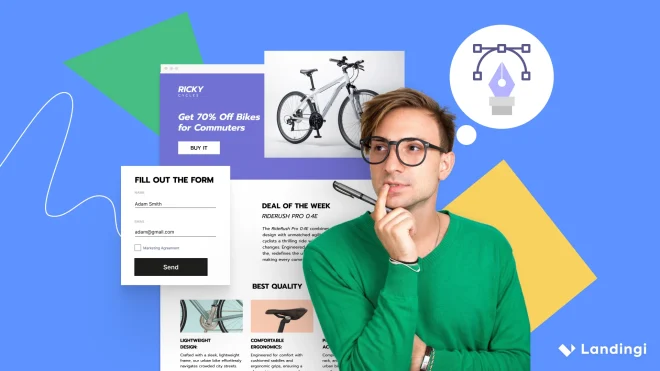
Landing page examples show that the difference between a casual visitor and a paying customer often comes down to smart design and strategic messaging. When built right, a landing page isn’t just a digital brochure; it’s a conversion tool. From compelling CTAs to seamless navigation, every element plays a role in turning clicks into action.
Data doesn’t lie: a well-optimized landing page can boost conversion rates by up to 300%, as seen in Crazy Egg’s case study with Conversion Rate Experts. This proves that design, content, and usability are just as important as traffic.
In this guide, you’ll find the best landing page examples for 2025, why they work, and how to apply their winning strategies to your own campaigns. Whether you’re building product pages, lead generation forms, or crafting high-impact CTAs, these insights will help you optimize smarter and convert better.

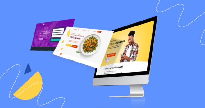
56 Top Landing Page Examples for Inspiration
56 landing page examples cover a wide range of industries like tech, law, med etc. From tech giants like Apple to niche event venues like the Julia Morgan Ballroom.
- iPhone 15 Pro (Product Page: Consumer Electronics)
- Affiliate Summit West (Event Page: Marketing Conference)
- Julia Morgan Ballroom (Lead Gen: Event Venue)
- Amie App (App Page: Productivity)
- Beazer (Lead Gen: Real Estate)
- Goodiebox (Ecommerce: Beauty Subscription)
- Plenaire’s Violet Paste (Ecommerce: Skincare Product)
- Astrid Lindgren – Alla vi barn i Bullerbyn (Ecommerce: Children’s Books)
- Smarter Marketer (Ebook Page: Marketing Education)
- The Biggest SEO Opportunity of 2024 (Webinar: Digital Marketing)
- Presenc App (Mobile App: Community Platform)
- Tala Pineapple (Product Page: Natural Food)
- Williams-Sonoma B2B (B2B Page: Home & Kitchen)
- Whiteclaw Age Gate (Splash Page: Beverage Alcohol)
- Zoho Bookings (SaaS: Scheduling & Appointments)
- Potis (SaaS: HR Tech)
- Resend (SaaS: Email Infrastructure)
- GoRetro (SaaS: Agile Project Management)
- Awsmd (Agency: Software Development)
- Google Account (Signup Page: Email Services)
- Smith-Corcoran Burial Service (Service Page: Funeral Services)
- Way to Go (Squeeze Page: Travel Newsletter)
- Codesphere (SaaS: Cloud Development)
- Toasting Good (Newsletter Page: Ethical Fashion)
- Graphite (Click-through Page: Dev Tools)
- Camp Leaders (Recruitment Page: Seasonal Jobs)
- Zitsticka (Coming Soon: Skincare Product)
- Advocate Consulting Legal Group (Consulting: Aviation Law)
- MB Coaching (Service Page: Personal Coaching)
- Philips Sonicare (Product Page: Oral Care)
- Bupa (Lead Gen: Private Health Insurance)
- Warsaw Aesthetic (Medical: Cosmetic Surgery)
- MriaLAX by Bayer (Pharmacy: Digestive Health)
- Hevy App (App Page: Fitness Tracker)
- Porsche Cayman (Automotive: Luxury Sports Car)
- UNFPA Mama Kit (Non-Profit: Maternal Health)
- UiT Arctic University (Education: Student Exchange)
- Tootbus London by Night (Tourism: City Tours)
- Panorama SPA (Wellness: Hotel Spa Services)
- Noma (Restaurant: Fine Dining)
- Fit Food Service (Food Delivery: Meal Plans)
- Sky Adventure (Entertainment: Balloon Flights)
- Puget Law Group (Legal Services: Criminal Defense)
- Russel Brand (Portfolio: Public Figure & Influencer)
- Xiaomi Night Light 2 (Product Page: Smart Gadgets)
- Tesla Solar Roof (SaaS: Sustainable Energy)
- HBO Max (Subscription Page: Entertainment Streaming)
- Robin Hood Foundation (Crowdfunding: Anti-Poverty Campaign)
- Refrakt (Platform: Photography Community)
- Fotografiska (Art Gallery: Photography Exhibitions)
- Son Lux (Music: Artist Promotion)
- Black Rabbit (Agency: Video Production)
- Koa (Ecommerce: Sustainable Skincare)
- Marie Forleo (Influencer: Self-Development & Training)
- Red Dead Redemption 2 (Gaming: AAA Game Promotion)
- Vaayu (SaaS: Carbon Tracking for Retail)
1. iPhone 15 Pro (Product Landing Page: Consumer Electronics)
The most inspiring landing page example is the iPhone 15 Pro landing page, featured on Apple’s official website. This page stands out as high-converting due to its focus on presenting the product’s advanced features and encouraging potential customers to purchase. The primary call to action on this page is to buy the product, a clear indication that the primary purpose of the landing page is to drive sales.
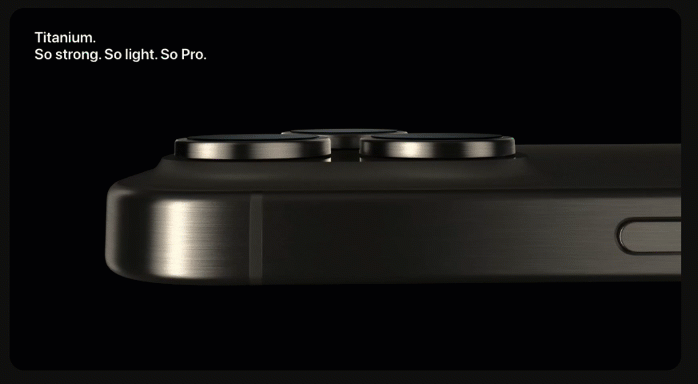
The Apple brand is known for its clear and simple yet stunning design, and the landing page showcases the same attitude, which works on plus. They focus on short content, compelling visuals, and strong contrast, not forgetting the critical element – outstanding CTA. This could be a pattern for modern, innovative brands that want to catch visitors’ attention and sell not the product or service but the quality standing behind it.

Purpose: Drive sales by highlighting premium features and innovation.
Target Audience: Tech enthusiasts, brand loyalists, and high-end seekers.
Power Features: Eye-catching visuals, compelling headlines, seamless UX, and a strong yet natural CTA.
Intuitiveness: Clean, easy-to-navigate layout with key details upfront.
Content Type: Short, impactful text + interactive elements, graphics, and videos.
CTA Type: Bold, purchase-focused, and impossible to miss.
Get inspired by the best—create your own stunning landing page with Landingi!i!
2. Affiliate Summit West (Event Landing Page: Marketing Conference)
One of the best event landing page examples is the Affiliate Summit West, which is prime in high-converting pages. Their landing page was designed to promote one of the biggest affiliate marketing events in the world and attract a wide range of participants, including affiliates, advertisers, e-commerce sellers, networks, and tech suppliers.

This event landing page showcases the best practices for generating conversions, including implementing a visually appealing design and adding all the essential elements of an event landing page, such as agenda, speakers, sneak peeks from past events, and alternative CTAs.

Purpose: Facilitate sign-ups and capture leads.
Target Audience: Digital marketers, influencers, brand reps, and affiliate pros.
Power Features: Event agenda, speaker highlights, networking perks, stunning visuals, responsive design, and multiple CTAs.
Intuitiveness: Clear, easy-to-navigate layout with all key event details.
Content Type: Informative text, interactive elements, and engaging visuals.
CTA Type: Dual CTAs for attendee or exhibitor registration.
See what works—explore top landing page examples and build yours with Landingi!
3. Julia Morgan Ballroom (Lead Gen Landing Page: Event Venue)
One of the best lead generation landing page examples is the Julia Morgan Ballroom’s landing page, standing out as a sophisticated lead generation tool targeting individuals and organizations seeking a premier event venue in San Francisco. Their landing page has to encourage visitors to book a venue tour, aiming to convert them into clients for weddings, meetings, conferences, and other events.

What’s characteristic of this landing page is an implementation of high-quality visuals, including whole galleries of pictures and well-written informative content. In addition to alternative CTAs, an online form allows the collection of essential information about the visitor, which is helpful in subsequent marketing strategy steps.
Purpose: Lead gathering.
Target Audience: Individuals and businesses looking for event venues.
Power Features: Venue showcase, service details, client testimonials, opt-in form, and persuasive CTAs.
Intuitiveness: Clear layout, smooth navigation, and well-structured form fields.
Content Type: Informative text, essential info tables, and striking visuals.
CTA Type: Lead capture-focused.
Ready to build a high-converting landing page? Start with the best examples and Landingi!
4. Amie app (App Landing Page: Productivity)
One of the best app landing page examples is a page created for the Amie app. Its design stands out from other landing pages but hits the visitor’s expectations with creativeness and information delivery mixed up to encourage app downloads. The landing page promotes an all-in-one calendar, email, and task management solution.
The animated landing page of Amie showcases essential elements of an app web page, including high-quality visuals, a description of the main features, a well-designed layout, and, most importantly, download buttons for alternative devices.
Purpose: Drive app downloads and sign-ups.
Target Audience: Professionals and individuals looking for an all-in-one task, email, and calendar manager.
Power Features: Animated visuals, responsive design, intuitive UI, clear value proposition, and multi-platform download buttons.
Intuitiveness: Smooth navigation, but CTAs could be more prominent.
Content Type: Clear benefit-driven copy, high-quality visuals, and interactive elements.
CTA Type: App download buttons.
Learn from the best landing page designs—create yours today with Landingi!
5. Beazer (Lead Gen Landing Page: Real Estate)
One of the best real estate landing page examples is Beazer. Their page showcases attractive and straightforward design, which effectively serves its purpose as a lead generation tool. A clear headline shows visitors what they can expect. The page is designed to engage potential buyers and guide them smoothly through the process of finding a new home.
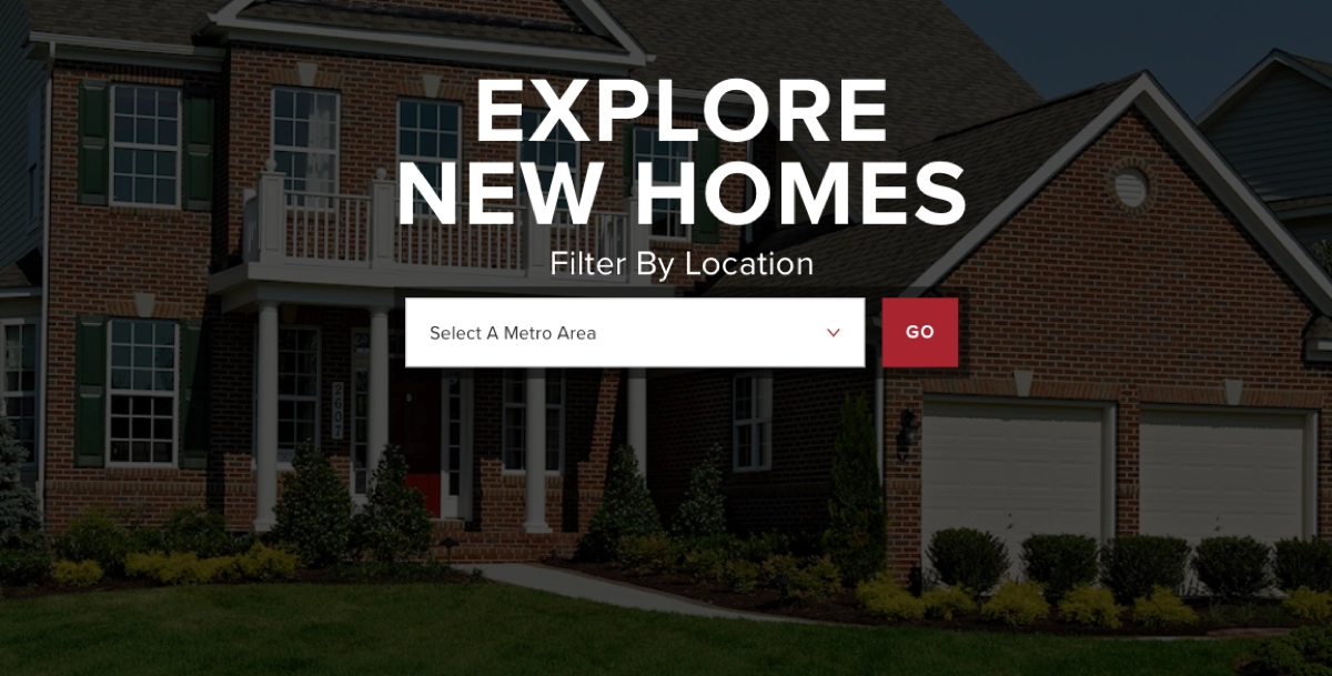
The landing page of Beazer includes the key elements of a real estate landing page, such as high-quality images and visuals, search functionality, maps, and clear CTAs. Excellent navigation and simple layout make their landing page user-friendly, translating to higher conversion rates.
Purpose: Help homebuyers discover properties and drive inquiries or direct contacts for sales.
Target Audience: Homebuyers searching for new properties.
Power Features: Location-based search, intuitive UI, easy navigation, responsive design, engaging visuals, trust signals, and interactive maps.
Intuitiveness: Straightforward navigation with a clear layout.
Content Type: Concise, informative text and high-quality visuals.
CTA Type: Guides users through the home selection process.
Discover top landing page examples—design your own with Landingi!
6. Goodiebox (Ecommerce Landing Page: Beauty Subscription)
One of the best e-commerce landing page examples is a page of Goodiebox. Sales pages often seem overloaded, but their landing page effectively combines visual appeal with practical information, making it an effective tool for attracting potential subscribers. Strong CTAs and popups with an opt-in form drive high conversions – it works well thanks to a great technique of message matching.

The landing page of Goodiebox showcases the essentials of an e-commerce landing page, including attractive visuals of products, captivating and clear headlines highlighting the main value proposition, special offers, trust signals, a FAQ section, a sign-up form, and strong, persuading CTAs. Its design and messaging attract website visitors, but the layout is clear without distracting elements.
Purpose: Attract new subscribers and drive sales.
Target Audience: Beauty enthusiasts looking for a subscription service.
Power Features: Product showcase, transparent pricing, compelling headlines, testimonials, press mentions, responsive design, sign-up popup, and “How it works” & past projects sections.
Intuitiveness: Simple navigation with a user-friendly layout.
Content Type: Concise, engaging text paired with high-quality visuals.
CTA Type: Subscription and purchase-focused.
If you want to create your own e-commerce landing page, try Landingi for free – choose from hundreds of landing page templates, customize your page, and get ready to succeed!
7. Plenaire’s Violet Paste (Ecommerce Landing Page: Skincare Product)
One of the best sales landing page examples is Plenaire’s Violet Paste landing page, designed to promote and sell a specific skincare product. Well-matched colors and simplicity of layout convince visitors to purchase the product.

Purpose: Promote the product and drive sales.
Target Audience: Beauty and skincare enthusiasts seeking high-quality, effective solutions.
Power Features: Striking visuals, compelling headlines, detailed product info, usage instructions, testimonials from top sources, and a strong USP.
Intuitiveness: Smooth user experience with a clear layout, but CTAs lack prominence.
Content Type: Concise, well-crafted text with product and benefit visuals.
CTA Type: Purchase-focused, but needs better visibility to boost conversions.
Create a landing page that stands out—get started with Landingi’s examples and tools!
8. Astrid Lindgren (Ecommerce Landing Page: Children’s Books)
One of the best book landing page examples is the one featured on Astrid Lindgren’s website, showcasing Alla vi barn i Bullerbyn’s book with all the details. The greatest role plays compelling book cover visualization, which illustrates a product and its quality.

As for each book landing page this one includes several key elements next to the book cover image, such as complete information about the book with its short description, short author note, price, and outstanding purchasing button.
Purpose: Promote the book and drive direct sales.
Target Audience: Author’s fans, children’s literature enthusiasts, and new readers.
Power Features: Eye-catching book cover, compelling description, clear pricing, responsive design, and a strong CTA.
Intuitiveness: Clean layout with intuitive navigation.
Content Type: Concise, well-crafted text with engaging visuals.
CTA Type: Purchase-focused—well-placed with standout color and design.
Unlock the secrets of successful landing pages—design yours with Landingi!
9. Smarter Marketer (Ebook Landing Page: Marketing Education)
One of the best ebook landing page examples is the Smarter Marketer book page, which is particularly successful in its clear and direct approach. It is designed to immediately capture the interest of its target audience – marketing professionals and enthusiasts. The page features a strong call to action, encouraging visitors to purchase the book in various formats.

It also utilizes testimonials and endorsements effectively, which adds credibility and trustworthiness to the book. The content is well-structured and written in a way that highlights the value and insights offered by the book, making it a compelling resource for anyone looking to enhance their digital marketing skills.
Purpose: Drive book sales and establish authority in digital marketing.
Target Audience: Marketing professionals and those looking to sharpen their digital marketing skills.
Power Features: Eye-catching book visuals, structured descriptions, benefits section, industry testimonials, clear pricing, responsive design, and standout CTAs.
Intuitiveness: User-friendly layout with seamless navigation.
Content Type: Engaging text paired with compelling visuals.
CTA Type: Well-designed alternative purchase buttons for physical and Kindle versions with clear messaging.
Need landing page inspiration? Explore the best examples and start building with Landingi!
10. The Biggest SEO Opportunity of 2024 (Webinar Landing Page: Digital Marketing)
One of the best webinar landing page examples is The Biggest SEO Opportunity of 2024 webinar’s page by Neil Patel, a marketing expert on a global scale. The entire page is short but full of essential information. Landing page visitors stay focused on a date thanks to a little yet powerful element – an orange flashing dot. What drives conversions is the signup button in the same, well-known for Neil’s fans, outstanding orange color.

The page includes elements that should consist of a good webinar landing page, including the live event date, a highlighted title in a headline, a short description and speakers list, high-quality visuals, and, in the end, a visible and encouraging signup button.
Purpose: Gather leads, boost sales, and drive webinar sign-ups.
Target Audience: Marketers, business owners, and digital marketing enthusiasts.
Power Features: Webinar date, event details, speaker lineup, and a standout CTA.
Intuitiveness: Clear layout with simple navigation.
Content Type: Concise yet engaging text, detailed info sections, and speaker photos.
CTA Type: Signup—well-designed with strong messaging and compelling color choice.
See what top-performing landing pages look like—create yours with Landingi!
11. Presenc (Mobile App Landing Page: Community Platform)
One of the best mobile landing page examples is Presence, which showcases its digital product – a community app. Its perfection goes with carefully matched web design, white space, which makes the layout clear, and its responsiveness, delivering seamless experience on various devices.

The Presence’s mobile landing page also includes a sticky bar with the main CTA, simplifying mobile users’ navigation and improving conversions. Two alternative download buttons for Android and iOS shorten the path to conversion. Effective visuals are also lightweight and mobile responsive, so they don’t affect loading speed.
ChatGPT powiedział:
Purpose: Encourage app downloads.
Target Audience: Creatives and like-minded individuals seeking local and global connections.
Power Features: Catchy headlines, engaging mobile-friendly visuals, sticky CTA bar, trust signals (app store links), and alternative download buttons.
Intuitiveness: User-friendly layout with simple navigation.
Content Type: Concise, well-crafted text with engaging visuals.
CTA Type: Standout alternative download buttons in the top section and a sticky bar for the main CTA.
Turn ideas into action—create a powerful landing page with Landingi’s tools!
12. Tala Pineapple (Product Landing Page: Natural Food)
One of the best product landing page examples is Tala’s Pineapple page, which showcases all elements of a successful landing page for a single product. The top of their page is reserved for the product’s name, and they have used the opportunity to catch visitor’s attention – a huge, black headline looks great with the bright, juicy colors of the product in the background. Even though the page is quite simple, the product’s visualization lets visitors feel the vibe.

A further part of the page explains the product’s value, pointing out the catchy horizontal animation of the text “zero added sugar” and the ingredient list, including only pineapple. The power of a landing page lies with product correlation – simplicity and fruity colors make the true value here.
Purpose: Drive product sales.
Target Audience: Health-conscious consumers seeking natural, sugar-free snacks.
Power Features: Detailed product info, high-quality images, nutritional facts, user reviews, pricing, and a clear CTA.
Intuitiveness: User-friendly layout with seamless navigation.
Content Type: Short, impactful text with stunning visuals.
CTA Type: Purchase-focused—clear and well-integrated, though it could stand out more.
Run A/B tests and track user behavior to find the best version of your landing page with Landingi – try now for free!
13. Williams-Sonoma (B2B Landing Page: Home & Kitchen)
One of the best PPC landing page examples is the Williams-Sonoma, Inc. B2B Program landing page, which is a well-executed marketing tool designed with a professional aesthetic that aligns with its high-end brand image. It is structured to effectively communicate the benefits and features of its B2B program, appealing directly to businesses involved in trade, contracts, corporate gifting, and other related areas.

The page balances informative content with engaging visuals to showcase their products and services, while the responsive design ensures a seamless experience across all devices. This approach makes the page stand out in engaging and converting its target business audience.
Purpose: Attract businesses to join the B2B program and make purchases.
Target Audience: Businesses in trade, contract, corporate gifting, and more.
Power Features: Detailed service descriptions, engaging visuals, contact section, responsive design, and a clear CTA.
Intuitiveness: Clean, user-friendly layout.
Content Type: Concise, informative text paired with attractive visuals.
CTA Type: Well-placed purchase button with clear, strategic messaging.
Learn from successful landing pages—apply the best practices with Landingi!
14. Whiteclaw (Splash Landing Page: Beverage Alcohol)
One of the best splash landing page examples is Whiteclaw’s popup form, which blocks juvenile entry. The splash minimal landing page is well-matched to the main landing page design and showcases an important purpose. This content is dedicated to adults only, so age verification is primary. The simplicity of the form grabs the attention at this formal stage. Moreover, visitors can choose their location to enter the landing page in their language.

The key elements of this splash page include the brand logo, direct instructions in the form of a question that affects engagement, clear form fields without unnecessary text, a CTA button for confirmation, and a drop-down menu with optional language changes.

As their web page is kept in a black and white theme, the splash page’s design is perfectly matched to the main page’s layout.
Purpose: Confirm age and select language.
Target Audience: Users meeting legal age requirements for restricted content or products.
Power Features: Brand logo, clear instructions, minimalistic form, confirmation button, country selection menu, and responsive design.
Intuitiveness: Simple, hassle-free user experience.
Content Type: Encouraging logo and direct messaging.
CTA Type: Clear, straightforward confirmation button.
Follow in the footsteps of successful landing pages—create yours with Landingi!
15. Zoho Bookings (SaaS Landing Page: Scheduling & Appointments)
One of the best B2B landing page examples is Zoho Bookings, which presents an online appointment scheduling software designed to streamline the booking process for businesses. Their landing page stands out with a clear layout and eye-catching animations. There is no shortage of feature descriptions, great visuals, and compelling alternative CTAs, including download and signup buttons.

What encourages visitors are outstanding CTAs, also in the form of a flashing “play” icon, a free trial offer in the top section, and detailed descriptions with compelling software visuals.
Purpose: Convert visitors into users by driving free trial sign-ups.
Target Audience: Businesses and professionals seeking scheduling software.
Power Features: Standout CTAs, user testimonials, engaging visuals, trust signals (app integrations), feature descriptions, and responsive design.
Intuitiveness: Clear, user-friendly layout, though multiple CTAs may feel overwhelming.
Content Type: Detailed descriptions, high-quality visuals, and videos.
CTA Type: Signup, free trial, and download buttons—well-placed, visible, and effective.
Want a high-converting landing page? Explore examples and build with Landingi!
16. Potis (SaaS Landing Page: HR Tech)
One of the best landing page examples that stand out with their effectiveness is the Potis solution’s web page. Visitors start their journey with attention-grabbing animated questions, which clear out the purpose of the product, explaining it with compelling headlines below. Critical CTA is placed in the top right corner, as in most landing pages. More boosting the user experience details shows up while scrolling down – all sections are condensed in smaller shapes, including high-quality visuals and feature descriptions.

CTAs placed in strategic points lead to the signup form. The page keeps visitors engaged with animated elements and showcases available plans in an unusual but well-designed way. The consistent layout and clear messaging improve conversions.
Purpose: Gather leads and drive sign-ups.
Target Audience: HR managers, recruiters, and businesses seeking talent acquisition solutions.
Power Features: Compelling headlines, feature breakdowns, pricing, client testimonials, high-quality visuals, and responsive design.
Intuitiveness: Clear, user-friendly layout with intuitive navigation.
Content Type: Concise yet detailed descriptions, engaging animations, and product visualization.
CTA Type: Standout free trial signup buttons, strategically placed.
17. Resend (SaaS Landing Page: Email Infrastructure)
One of the best SaaS landing page examples is Resend’s, showcasing not only usability but also simply beautiful and stunning page design. What effectively catches the user’s attention is the spinning black Rubik’s cube placed next to the main headline, but it’s just the beginning. This landing page effectively combines user testimonials, clear CTAs, and detailed product information to engage its target audience and generate leads.

The key elements that build this perfect SaaS landing page are product features presented in an attractive way, straightforward messaging, an animated testimonial section, and a current customer section with renowned brands. This landing page is a high-converting masterpiece, particularly thanks to detail-oriented design mixed up with great information delivery.
Purpose: Gather leads and drive sign-ups.
Target Audience: Developers and startups seeking email solutions.
Power Features: Customer testimonials, engaging headlines, feature descriptions, high-quality visuals, stunning animations, and responsive design.
Intuitiveness: Intuitive, user-friendly layout.
Content Type: Concise, informative text with product visuals.
CTA Type: Signup and lead capture—clearly visible, strategically placed, and direct.
Take inspiration from top landing pages—create your high-converting page with Landingi!
18. GoRetro (SaaS Landing Page: Agile Project Management)
One of the best sign-up landing page examples is GoRetro, which stands out from average landing pages with its excellent CTA choice. Their call to action encourages visitors to the registration process with a few techniques: firstly, the main CTA button showcases how pointing out the action can increase conversions – they have used an icon with their primary color theme, included in a classical “Start now” button. Secondly, they use a straightforward CTA on their sticky navigation bar, so users can decide to sign up at every moment of scrolling.

This signup landing page showcases a clear layout, social proof sections, social media icons as trust elements, customer reviews, and informative descriptions. They deliver a straight path to convert, which actually works.
Purpose: Drive sign-ups and free trial conversions to boost sales.
Target Audience: Agile teams, scrum masters, and project managers.
Power Features: Tool visuals, in-depth feature breakdowns, professional testimonials, responsive design, and standout CTAs.
Intuitiveness: User-friendly layout with a sticky navigation bar.
Content Type: Detailed feature descriptions, engaging tool visuals, and videos.
CTA Type: Signup and free trial buttons—well-designed, clearly messaged, and visually highlighted.
19. Awsmd (Agency Landing Page: Software Development)
One of the best software landing page examples is the Awsmd webpage. It’s a prime example of a software development agency’s landing page that effectively communicates its strengths and offerings. The sleek and modern design captures the essence of their technical prowess and creative approach to software solutions. It is laid out to clearly highlight their portfolio, emphasizing their experience and success in delivering diverse projects.

The inclusion of client testimonials adds a layer of trust and credibility. The website’s responsive design and user-friendly interface make it easy for potential clients to navigate and understand the services offered, enhancing the chances of engagement and conversion.
Purpose: Attract potential clients for software development and design services.
Target Audience: Businesses seeking custom software, mobile app development, and design solutions.
Power Features: Engaging visuals, informative descriptions, portfolio showcases, client testimonials, interactive elements, and responsive design.
Intuitiveness: Clear and user-friendly layout, though content density may feel overwhelming.
Content Type: Informative text paired with compelling visuals.
CTA Type: Well-placed request button—excellent messaging and standout design in the top right corner.
20. Google Account (Signup Landing Page: Email Services)
One of the best email landing page examples is the Google Account sign-up page, which epitomizes efficiency and user-friendliness in its design, offering a seamless process for users to create a new account. The page focuses on simplicity, with a clean layout that guides users through the necessary steps without any distractions.

This approach ensures a straightforward and hassle-free experience for anyone accessing Google’s wide range of services. The combination of minimalistic design and clear instructions reflects Google’s emphasis on accessibility and ease of use, making it an exemplary email service landing page.
Purpose: Facilitate new user sign-ups for Google services.
Target Audience: Individuals looking to create a Google account.
Power Features: Clean layout, ample white space, simple form, brand logo, language selection menu, and responsive design.
Intuitiveness: Highly intuitive, user-friendly experience.
Content Type: Short, clear instructions.
CTA Type: Well-placed signup button guiding users seamlessly to the next step.
21. Burial (Service Landing Page: Funeral Services)
One of the best service landing page examples is the Burial Service page featured by Smith-Corcoran. Their page is kept in a simple, clear design, showcasing one of their funeral services in detail. The top of the page includes a user-friendly navigation bar, a simple headline, and a video with a service description, which is the right choice for delivering information to people in difficult situations.

The rest of the page involves informative text sections describing the service and other available services presentation with click-through CTAs, leading to different landing pages. This example showcases the perfection in delivering trouble-solving services, simplifying the customer path.
Purpose: Gather leads by encouraging contact or information requests about burial services.
Target Audience: Individuals pre-planning their own funeral or arranging one for a loved one.
Power Features: Informative video content, detailed service descriptions, customer testimonials, contact options (including “Call Now” button), and responsive design.
Intuitiveness: Highly intuitive layout with easy navigation and immediate call access.
Content Type: Concise, well-crafted text paired with informative videos.
CTA Type: Well-placed “Call Now” and “Contact” buttons with clear, compelling messaging.
22. Way to Go (Squeeze Landing Page: Travel Newsletter)
One of the best squeeze landing page examples is the subscription popup page featured by Way to Go. Their squeeze landing page showcases simplicity, clear messaging, and a single opt-in form kept in outstanding design. They shortly describe what is the purpose of the subscription and require only one piece of information, which increases the chances of gathering leads.

As with every squeeze page, this example was created to gather data for further marketing steps. Its simplicity doesn’t make it useless. Conversely, it helps to focus on the message. The element that encourages visitors to leave their emails is short information about current subscribers’ amounts.
Purpose: Gather leads and boost subscriptions.
Target Audience: Travel enthusiasts seeking unique stories and insights.
Power Features: Brand logo, concise yet informative messaging, single opt-in form, and a standout CTA.
Intuitiveness: Simple, intuitive design for quick decisions.
Content Type: Brand logo and brief, impactful text.
CTA Type: Well-designed subscription button with strong color contrast and clear messaging.
23. Codesphere (SaaS Landing Page: Cloud Development)
One of the best creative landing page examples is Codesphere, with its overall design and the way it promotes a product. At first, visitors can watch a short video showcasing the registration process and the tool features. What makes their page really attractive is quite a tasteful sense of humor that captivates the target audience.

Behind stunning design stand essential elements that drive conversions, such as high-quality tool visualizations, concise but detailed feature descriptions, and a “how it works” attitude. Outstanding CTAs are placed in strategic sections, so page visitors have multiple occasions to test the tool effortlessly.
Purpose: Drive sign-ups and boost engagement with development tools.
Target Audience: Developers and tech startups.
Power Features: Catchy headlines, engaging videos, sleek responsive design, user reviews, and clear CTAs.
Intuitiveness: User-friendly navigation with a clear, structured layout.
Content Type: Informative text, tool visuals, and videos.
CTA Type: Free trial and sign-up buttons—simple yet standout, strategically placed.
24. Toasting Good (Newsletter Landing Page: Ethical Fashion)
One of the best newsletter landing page examples is Toasting Good, which keeps it plain but well-designed. A single opt-in form and subscription button do their job – nothing distracts users from the main action. This lead capture page is effective also thanks to the engaging picture with a blue background, encouraging visitors to take the desired action. The color matters as this particular one represents a strong psychological impact associated with trust, security, and professionalism.

The most important component of a newsletter landing page is the form – in this case, it’s clear, with straightforward messaging. A single form field makes the process easy and user-friendly. The further section of the page also showcases short and concise content explaining the benefits of a subscription. All these components make the page effectively invite users to stay informed about ethical fashion and social enterprise news and help drive higher conversion rates.
Purpose: Gather leads through newsletter sign-ups.
Target Audience: Individuals interested in ethical fashion and social enterprise.
Power Features: Engaging background image, single opt-in form, concise yet informative content, responsive design, and clear CTA.
Intuitiveness: User-friendly, minimal clicks required.
Content Type: Plain, impactful messaging with a compelling background image.
CTA Type: Subscription button—clear, straightforward, and repeated for emphasis.
Change your forms into high-converting tools to generate more leads and collect strategic data with Landingi.
25. Graphite (Click-through Landing Page: Dev Tools)
One of the best click-through landing page examples is Graphite, showcasing the model of CTAs that don’t convert visitors right away but redirect them to the page (e.g. lead capture one) where a main conversion happens within completing a form. Graphite does it well, using compelling headlines, informative content, and a blue-themed background to raise trust among visitors.

They use alternative CTAs with opposite colors to mark the one that leads to the desired action – the free trial button with an arrow looks engaging and represents clear messaging. It showcases easy access to the tool’s trial version, making the click-through intuitive.
Purpose: Drive sign-ups for Graphite’s developer tools.
Target Audience: Software developers and engineering teams.
Power Features: Bold headline, compelling feature descriptions, social proof, irresistible offer, strong CTAs, optimized click-throughs, and responsive design.
Intuitiveness: Clear layout with an intuitive, sticky navigation bar.
Content Type: Concise, developer-focused text paired with engaging tool visuals.
CTA Type: Alternative engaging CTAs and a standout free trial button.
26. Camp Leaders (Recruitment Landing Page: Seasonal Jobs)
One of the best recruitment landing page examples is Camp Leaders, showcasing a straightforward, intuitive layout with an engaging messaging style. White space is conducive to concentration, and the lack of a hero image is a positive aspect in this case, as visitors can focus on the survey.

The high-converting landing page for recruitment purposes needs perfectly crafted forms to facilitate the process. Camp Leaders do this well – they break the recruitment survey into minor phases, each with a separate headline encouraging users to leave information. CTA buttons are well matched; for each part of the survey, there is an adequate button message. The further part of the page consists of engaging headlines, social media buttons, and trust elements.
Purpose: Gather leads and drive sign-ups for camp leader positions.
Target Audience: Aspiring camp leaders and young adults seeking summer jobs.
Power Features: Eye-catching headlines, clear layout, structured survey form, responsive design, and engaging CTAs.
Intuitiveness: Simple, distraction-free navigation for a seamless user experience.
Content Type: Concise, well-crafted text with engaging visuals.
CTA Type: Registration buttons—each survey section features standout, well-matched CTAs with clear messaging.
27. Zitsticka (Coming Soon Landing Page: Skincare Product)
One of the best coming-soon landing page examples is Zitsticka, promoting a new product’s reveal. They use catchy headlines with an irresistible offer. The bluish-green background theme builds trust and enthusiasm among visitors, as much as the product’s visualization. CTA is outstanding but not overwhelming – great messaging makes the visitor’s choice obvious and affects higher conversions.

An essential part of a coming-soon landing page is the CTA button, which can be a challenging part of the page design process. The value proposition has to hit the expectations to engage traffic maximally. Zitsticka uses enticing content but doesn’t clear the proposition – this type of teaser can be effective, as it brings a surprise element.
Purpose: Gather leads for a new product launch.
Target Audience: Skincare enthusiasts looking for innovative solutions.
Power Features: Catchy headlines, strong value proposition, product visuals, standout CTA, and responsive design.
Intuitiveness: Easy-to-navigate, user-friendly layout.
Content Type: Concise, compelling headline with a clear value proposition and engaging visuals.
CTA Type: Sign-up button with well-matched messaging.
28. Advocate Consulting Legal Group (Consulting Landing Page: Aviation Law)
One of the best consulting landing page examples is Advocate Consulting Legal Group, which mixes informative content, usability, and great landing page design. They point out the main consulting areas within a huge headline in the center, so the page visitors immediately know what they can expect. The CTA button placed in the middle encourages potential customers to take the desired action.

The key element worth consideration is a “Call Now” button in the most strategic section – the top right corner, usually used for the classic CTA button (which is also included, but this time a bit lower, in the navigation bar). This solution allows mobile users to contact the company immediately. The rest of the page is typical and includes a services description, a team members section, and a contact form.
Purpose: Inform and attract clients for aviation legal services.
Target Audience: Individuals and businesses in aviation needing legal and tax support.
Power Features: Engaging headlines, detailed service descriptions, contact form, social proof, “Call Now” button, and responsive design.
Intuitiveness: Clear, user-friendly layout with simple navigation; a sticky nav bar could improve mobile UX.
Content Type: Concise, informative text with high-quality visuals.
CTA Type: Contact and “Call Now” buttons—straightforward and action-driven.
29. MB Coaching (Service Landing Page: Personal Coaching)
One of the best coaching landing page examples is MB Coaching, which showcases clarity and straightforwardness within its design. This winning landing page stands out with its great contact form and contact buttons in the strategic section. The green background boosts trust among website visitors, as its psychology is associated with growth, renewal, and health – these words perfectly describe the coaching primary traits.

This coaching landing page includes essential elements, such as an offer description, a coach note with a qualifications section, and outstanding CTAs. Its power lies in simplicity, which is a clean sheet of development opportunities without suggestive elements – this means that everyone can get personalized help that is a real value.
Purpose: Attract clients for personal and career coaching.
Target Audience: Individuals seeking personal or professional growth.
Power Features: Clear contact buttons, concise offer descriptions, coach note, contact form, and responsive design.
Intuitiveness: Highly intuitive layout with easy-to-find contact options.
Content Type: Short, informative text paired with high-quality visuals.
CTA Type: Well-placed contact buttons with clear, straightforward messaging.
30. Philips (Product Landing Page: Oral Care)
One of the best advertising landing page examples is this featured by Philips for their Sonicare toothbrushes. They focus on visually appealing elements, such as the new product’s version reveal, keeping the layout clear. CTA buttons lead to specific sales pages, so the navigation is optimized for higher conversion rates.
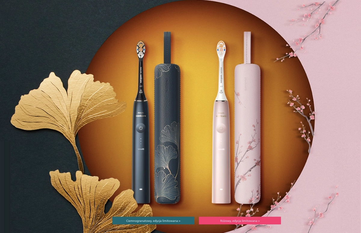
Advertising web pages have to be visually attractive, showcasing products or services. Including videos and high-quality pictures, combined with concise but informative content, leads to conversion success. Philips hits the traffic with an irresistible product value proposition, which makes it one of the best landing pages.
Purpose: Drive sales and promote the product.
Target Audience: Consumers seeking advanced oral healthcare solutions.
Power Features: Stunning product visuals, detailed descriptions, contrasting CTAs, trust elements, user testimonials, and responsive design.
Intuitiveness: Straightforward, user-friendly navigation, though the long format may feel dense.
Content Type: Informative text, model comparison table, and engaging visuals.
CTA Type: Purchase-focused—strong messaging with standout colors.
31. Bupa (Lead Gen Landing Page: Private Health Insurance)
One of the best insurance landing page examples is Bupa, which makes an unforgettable first impression. Promoting serious life services can be challenging, although they remember that simple information is insufficient in today’s digital marketing world. Instead of a popular blue theme, they have used gold CTA buttons, which capture attention but also match the brand colors and highlight the value of their services.

The central word theme – MORE – shows up in all compelling headlines. The content is short but informative, describing all benefits. Using the “Call Now” button on a sticky navigation bar is a good practice to increase user experience and boost conversions. The overall design is complemented with beautiful, eye-catching graphics.
Purpose: Generate leads and inquiries for health insurance plans.
Target Audience: Individuals seeking high-end, comprehensive health coverage.
Power Features: Compelling headlines, standout CTAs, sticky contact buttons, responsive design, and clear benefit descriptions.
Intuitiveness: Highly intuitive navigation with a clear, structured layout.
Content Type: Concise, well-crafted text paired with engaging visuals.
CTA Type: Contact buttons—strong messaging with outstanding design.
32. Warsaw Aesthetic (Medical Landing Page: Cosmetic Surgery)
One of the best health landing page examples is the page featured by Warsaw Aesthetic for Nose Reshaping Surgery. Its clear layout with a straightforward contact section is a strength, the same as the informative content including tables and pricing. The page leaves no guessing for visitors, encouraging them to book an e-consultation.

The example showcases the essential components of a great landing page for the health industry, including surgery descriptions, a benefits section with visualizations, tables of useful information about treatment, and pricing. Using the map with flight time visualization from various locations to the clinic simplifies the decision-making path.
Purpose: Inform about nose reshaping surgery and encourage appointments.
Target Audience: Individuals considering cosmetic nose surgery.
Power Features: Informative content, before/after images, pricing details, FAQ section, contact section, clear CTA, and responsive design.
Intuitiveness: Clear layout with user-friendly navigation.
Content Type: Concise, well-written text paired with high-quality visuals.
CTA Type: Contact buttons and a “Call Now” button (with a popular app alternative)—straightforward messaging and excellent placement.
33. MriaLAX (Pharmacy Landing Page: Digestive Health)
One of the best pharmacy landing page examples is the page for MriaLAX products featured by Bayer company. Web design is simple yet attention-grabbing, thanks to the color choice. Website visitors meet the product from the beginning with its high-quality visuals.

As the best landing pages, the example one uses catchy headlines and outstanding CTA. Its navigation bar simplifies the information-gathering process for visitors, boosting the mobile user experience factor. Product and benefit descriptions are concise and clear. The coupon sticky pop-up increases sales.
Purpose: Provide product information and guide visitors to retail options.
Target Audience: Individuals looking for digestive relief solutions.
Power Features: Informative content, engaging product visuals, sticky coupon pop-up, product list, clear CTAs, and responsive design.
Intuitiveness: Highly intuitive navigation with a clear, user-friendly layout.
Content Type: Concise, informative text paired with engaging visuals.
CTA Type: Purchase-focused—outstanding design with straightforward messaging.
34. Hevy (App Landing Page: Fitness Tracker)
One of the best home landing page examples is Hevy, created to promote their fitness app. The main CTAs are widely recognizable download buttons leading to the alternative app stores – it’s not only a call to action but also a trust-building element. The entry section showcases compelling headlines with short descriptions, great product visualization, and user ratings.

The short product descriptions with visuals, social proof elements, and FAQ section kept in consistent design make it an effective landing page with high conversion rates. Its navigation bar also includes a signup button that helps capture leads. Other click-through buttons allow visitors to gather more information about a product and examine its use cases.
Purpose: Drive app downloads and boost user engagement.
Target Audience: Fitness enthusiasts and workout trackers.
Power Features: Feature descriptions, high-quality visuals, testimonials, trust elements, FAQ section, responsive design, and clear alternative CTAs.
Intuitiveness: Highly intuitive, user-friendly layout.
Content Type: Concise, well-crafted text paired with engaging visuals.
CTA Type: Download and signup buttons—clear messaging with standout design.
35. Cayman Porsche (Automotive Landing Page: Luxury Sports Car)
One of the best automotive landing page examples is the page for the Cayman Porsche model featured by Porsche. This highly interactive landing page includes full product information broken into smaller sections to simplify navigation, visually appealing car presentation, and alternative CTA buttons that catch attention. This click-through page leads to other heating-up pages, such as car creator where interested users can choose all elements of a car to build its personalised version.

The automotive landing page of the Porsche Cayman includes videos that present the car’s characteristics and consist and well-written content describing all advantages. Visitors can also find the CTA button leading to the test drive requests form.
Purpose: Drive sales by attracting potential sports car buyers.
Target Audience: Enthusiasts and buyers of high-end sports cars.
Power Features: Engaging video visuals, detailed product information, extensive navigation bar, responsive design, and clear CTAs.
Intuitiveness: Long-form but user-friendly, thanks to a structured navigation bar and well-placed CTAs.
Content Type: Stunning videos, engaging visualizations, and concise yet informative text.
CTA Type: Click-through and test drive request buttons—clear messaging with standout design.
36. UNFPA (Non-Profit Landing Page: Maternal Health)
One of the best non-profit landing page examples is the Mama Kit donation page featured by UNFPA. A straightforward message, a picture showcasing a problem, and a strong CTA button raise its effectiveness. Website visitors can find full information about the help program and FAQ sections with additional information.

The non-profit landing page includes alternative CTAs to choose from types of help and a clear donation form with proposed amounts to choose from or a field to implement different amounts. This simple but detailed form also includes alternative CTAs for choosing one-time or monthly help. Its straightforwardness and clear message affect high efficiency.
Purpose: Raise funds for mothers and newborns in need.
Target Audience: Donors passionate about maternal health issues.
Power Features: Clear problem description, compelling headline, well-placed CTAs, donation form, FAQ section, and responsive design.
Intuitiveness: Highly intuitive with seamless navigation.
Content Type: Concise, impactful text paired with poignant images.
CTA Type: “Donate Now” button and alternative help form CTAs—clear messaging with standout design.
37. UiT Arctic University of Norway (Education Landing Page: Student Exchange)
One of the best educational landing page examples is the page of UiT Arctic University of Norway’s student exchange. The webpage is vital in connecting UiT with its global network of partner institutions and promoting its unique educational opportunities within the Arctic context. The hero image is attractive, catching potential student’s attention, and a straightforward headline with a short description is a great introduction, leading to the main CTA – application button.

Scrolling the landing page, visitors find structured clickable tails leading to informative landing pages involving all necessary descriptions and instructions. It aims to attract and guide prospective exchange students through the application process, offering insights into academic options, campus life, and practical details necessary for a successful exchange experience.
Purpose: Inform and encourage students to apply for exchange programs.
Target Audience: Students from partner institutions considering an exchange at UiT.
Power Features: Attractive visuals, student testimonials, clear navigation to application details, engaging headlines, trust signals, and responsive design.
Intuitiveness: Highly intuitive, short, and well-structured layout.
Content Type: Well-organized, informative content with engaging visuals.
CTA Type: Alternative application button—strong messaging with standout design.
38. Tootbus London (Tourism Landing Page: City Tours)
One of the best tourism and travel landing page examples is the Tootbus London by Night tour’s page. It’s designed to captivate potential customers with its visually appealing presentation of the city’s iconic landmarks illuminated at night. The page aims to provide a straightforward and engaging booking experience, emphasizing the unique aspects of the nocturnal tour.

The Tootbus landing page includes high-quality visuals, a schedule of tours, informative descriptions, and a tour map. The main CTA button encourages visitors to book a tour with its outstanding color and plain messaging. Still, the element boosting conversions is a sticky form with ticket selection – its clear layout and alternative ticket options with a discount offer facilitate the ticket purchasing process.
Purpose: Drive sales of tour tickets.
Target Audience: Tourists looking to explore London.
Power Features: Engaging visuals, informative descriptions, pricing and discounts, tour schedule, interactive map, sticky form, and responsive design.
Intuitiveness: User-friendly layout with clear navigation.
Content Type: Concise, informative text paired with attractive images.
CTA Type: Booking button—standout design with well-matched messaging.
39. Panorama SPA (Wellness Landing Page: Hotel Spa Services)
One of the best landing page examples for the fitness and wellness industry is the Panorama SPA page featured by Norwegian Panorama Hotell. It promotes relaxing spaces and wellness services showcasing interiors and activities available for their guests. The sticky navigation bar with the booking CTA button is consistent with the website design.

The most important for a wellness landing page is keeping the balance between its usability and attractive and straightforward design. Panorama SPA makes it perfectly, pointing out the services, including attractive visuals and leaving white space, creating a clear, user-friendly layout. The hamburger menu in the strategic top right corner boosts the UX factor, also for mobile users.
Purpose: Promote spa services and drive bookings.
Target Audience: Guests seeking relaxation and wellness experiences.
Power Features: Engaging visuals, detailed facility descriptions, contact info, responsive design, and clear CTA.
Intuitiveness: User-friendly interface with a sticky navigation bar.
Content Type: Well-crafted, engaging text paired with attractive visuals.
CTA Type: Booking button—strategically placed with strong messaging.
40. Noma (Restaurant Landing Page: Fine Dining)
One of the best restaurant landing page examples is the page of Noma, a Danish three Micheline star restaurant. Website visitors can watch the restaurant’s video in the background and find the current weather information right above the reservation CTA button.

As for the effective landing page, the restaurant one should include a menu section, but this page doesn’t use it on purpose. Instead, visitors can dive into a story, see beautiful interiors, and book a table.
Purpose: Facilitate reservations and share dining experience details.
Target Audience: Gourmet diners and food enthusiasts.
Power Features: Stunning visuals, detailed dining descriptions, seasonal event info, social media links, responsive design, and clear CTAs.
Intuitiveness: User-friendly layout with seamless navigation.
Content Type: Well-crafted, informative content paired with engaging visuals.
CTA Type: “Book a Table” and newsletter sign-up buttons—well-designed and highly visible.
Remember about mobile optimization when creating your landing page, to ensure seamless experience for all visitors – it’s easier with Landingi!
41. Fit Food (Food Delivery Landing Page: Meal Plans)
One of the best food service landing page examples is the page of Fit Food Service, offering box diets in various variants. Their landing page is simple, showcasing healthy food choices with green color and attractive visuals.

The page is informative but concise, with short descriptions and attractive headlines, a daily menu, and outstanding CTAs, leading to ordering a diet.
Purpose: Drive sales of specialized meal plans.
Target Audience: Health-conscious individuals, busy professionals, and those with specific dietary needs.
Power Features: Detailed diet options, meal visuals, nutritional benefits, clear navigation, informative sections, responsive design, and standout CTA.
Intuitiveness: Highly intuitive, user-friendly navigation.
Content Type: Well-written, informative text paired with engaging visuals.
CTA Type: Purchase button—well-designed with strong messaging.
42. Sky Adventure (Entertainment Landing Page: Balloon Flights)
One of the best entertainment landing page examples is Sky Adventure, promoting balloon flights. Their webpage showcases the power of visuals – text blocks are minimal because, in entertainment cases, most landing pages’ conversions come from strong visual engagement. Although the page includes all necessary information and FAQ questions, the complete offer section with pricing and contact sections.

The CTAs are outstanding and colorful, which refers to the balloon idea. They included a “Call Now” button in the strategic top right corner and a request form for potential customers wanting to book a flight. The whole landing page showcases a clear layout that encourages visitors to take the desired action and simplifies this process.
Purpose: Promote balloon flights and drive bookings.
Target Audience: Adventure seekers and experience enthusiasts.
Power Features: Stunning flight visuals, compelling descriptions, FAQ section, pricing details, request form, and responsive design.
Intuitiveness: Clear layout with intuitive navigation.
Content Type: Concise text with key details in FAQ sections, paired with engaging visuals.
CTA Type: “Call Now” and click-through buttons—multicolor design reflecting the balloon theme, with clear messaging.
43. Puget Law Group (Legal Services Landing Page: Criminal Defense)
One of the best legal landing page examples is Puget Law Group, showcasing its offer clearly, without any distractions. Simple layout with highly outstanding CTAs, detailed information, and simple form maximize conversion rate. In this case, a “Call Now” button is one of the most profitable elements of the page.
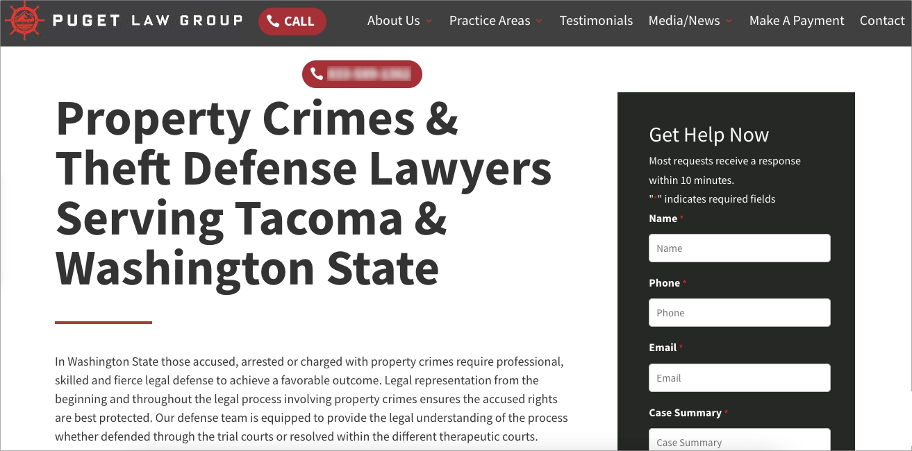
They strongly focus on simplifying contact – in this case, the live chat sticky pop-up, the form placement, and the “Call Now” buttons are key elements for potential customers. The “Get Help Now” title of the form engages and encourages visitors to ask for help, and its clear layout with minimal required form fields boosts conversions.
Purpose: Attract clients seeking legal representation for property crime cases.
Target Audience: Individuals facing property crime charges in Washington State.
Power Features: Detailed service descriptions, client testimonials, storytelling content, encouraging form layout, responsive design, and strong CTAs.
Intuitiveness: Highly intuitive navigation with visible CTAs and a simple, user-friendly form.
Content Type: Informative text, storytelling elements, minimal visuals.
CTA Type: “Call Now” and form submission buttons—visually outstanding with engaging messaging.
44. Russel Brand (Portfolio Landing Page: Public Figure & Influencer)
One of the best portfolio landing page examples is the page of Russel Brand. His own landing page promotes the content he creates and engages visitors to join various platforms where he performs. Its simple layout with much white space and alternative CTAs makes it a successful landing page.

The page involves an introduction with a single high-quality portrait picture, an invitation to join the mailing list, engaging but short content sections, and buttons to convert visitors into followers across various platforms. This great landing page is simple yet powerful, thanks to the overall design and minimal content.
Purpose: Engage fans and promote Russell Brand’s content, including live shows, podcasts, and community interactions.
Target Audience: Fans of Russell Brand and those interested in his comedy and social commentary.
Power Features: Engaging content, high-quality images, simple animations, strong CTAs, social media buttons, and a simple form.
Intuitiveness: Clear layout with user-friendly navigation.
Content Type: Engaging text paired with high-quality visuals.
CTA Type: Newsletter subscription and click-through buttons—outstanding design with clear messaging.
45. Xiaomi (Product Page Landing Page: Smart Gadgets)
One of the best technology and gadgets landing page examples is the page created for Xiaomi Mi Motion-Activated Night Light 2. Its clarity matched the brand’s ideology. Still, the clear layout involves all necessary sections, descriptive content, and engaging product visuals.

CTA leads to the purchasing page and is placed on a sticky navigation bar, ensuring mobile responsiveness. Scrolling through the page, users can find also instructions and technical specifications of products. The footer involves social media buttons and a single opt-in form, encouraging visitors to join a wide community or subscribe newsletter.
Purpose: Inform and generate interest in the product.
Target Audience: Smart home enthusiasts and lighting solution seekers.
Power Features: Engaging product visuals, detailed information, instructions, technical specs, and a highly responsive design.
Intuitiveness: User-friendly layout with a sticky navigation bar for seamless browsing.
Content Type: Concise, well-crafted text paired with stunning visuals.
CTA Type: Purchase button—strategically placed with clear, direct messaging.
46. Tesla (SaaS Landing Page: Sustainable Energy)
One of the best renewable energy and sustainability landing page examples is the page featured by Tesla for Solar Roof technology. The choice of thunder in the background is an exciting way to show the power – most people would expect sunbeams, but the thunders are absolutely fantastic choice. The top of the page also includes the brand logo, an intuitive navigation bar, a simple headline, some essential information, and a well-designed CTA button.

The rest of the page showcases detailed information about the product and its functionalities and engaging yet informative visuals in the form of pictures and animations. The purchasing CTA button is repeated in each section, but the bottom part of the landing page also includes two alternative CTAs for newsletter subscriptions and scheduling virtual consultancy. All these elements make this webpage highly effective in terms of conversion rates.
Purpose: Promote and sell Tesla’s Solar Roof products.
Target Audience: Homeowners seeking sustainable energy solutions.
Power Features: Informative content, striking product visuals, technical specs, responsive design, and clear alternative CTAs.
Intuitiveness: Highly intuitive with a sticky navigation bar and well-structured content sections.
Content Type: Concise, informative text paired with engaging visuals and animations.
CTA Type: Purchase, virtual consultation scheduling, and newsletter subscription—well-designed, strategically placed, and with clear messaging.
47. HBO Max (Subscription Landing Page: Entertainment Streaming)
One of the best membership and subscription landing page examples is the page of HBO Max. Thanks to its outstanding design, visitors first look at the call to action button, but what makes the landing page effective are also stunning visualizations of the content available for subscribers.

This particular landing page works well thanks to its clear layout – despite the dark theme, the content is divided into small, themed sections, showcasing the variety of benefits available. The straightforward price information placed near the CTA button builds trust among visitors and boosts conversions. Overall, page design focuses on big production titles and attention-grabbing visuals that convince visitors to subscribe.
Purpose: Drive sign-ups for the streaming service subscription.
Target Audience: Viewers looking for diverse entertainment, including series, movies, and sports.
Power Features: Eye-catching content visuals, compelling headlines, concise content, pricing details, responsive design, and a clear CTA.
Intuitiveness: User-friendly navigation with a well-structured layout.
Content Type: Engaging visuals and short, impactful headlines.
CTA Type: Subscription button—outstanding design with clear, direct messaging.
48. Robin Hood Foundation (Crowdfunding Landing Page: Anti-Poverty Campaign)
One of the best crowdfunding campaign landing page examples is the page of the Robin Hood Foundation, which fights against poverty. Their plain messaging and engaging headlines work well with outstanding and clear CTAs. The main purpose is to encourage visitors to donate and support campaign goals.

The landing page includes informative content about the foundation, its actions, and its purposes. The neon green color of CTAs captures the visitors’ attention quickly, but it’s not just a coincidence – it’s a well-matched color of the foundation’s logo. The essential element that boosts conversions is a form: clear, visible, with an alternative choice of amount and thoughtout CTA messaging ensuring the payment is secured.
Purpose: Fundraise for anti-poverty programs.
Target Audience: Donors supporting poverty alleviation in New York City.
Power Features: Poignant background video, compelling headlines, concise content, trust signals, well-designed form, and responsive design.
Intuitiveness: Highly intuitive with a clear layout and direct messaging.
Content Type: Concise, impactful text paired with engaging visuals.
CTA Type: Donation button—outstanding design, well-placed, with straightforward messaging.
49. Refrakt (Platform Landing Page: Photography Community)
One of the best photography landing page examples is the page of Refrakt, which offers a social platform for photography enthusiasts and professionals. Their page stands out with its stunning design – once the visitor enters their landing page, the pictures floating on a white background appear, stealing attention for a while.

Scrolling down leads to informative descriptions. The CTA buttons leading to the signup form are well placed – in the strategic top right corner and the bottom of the page. Sections are well crafted to guide visitors from attraction through interest to joining the community.
Purpose: Build a photography community and drive app usage.
Target Audience: Photographers, curators, agencies, collectors, and photography enthusiasts.
Power Features: Minimalist photography showcases, segmented descriptions, compelling headlines, responsive design, and a clear CTA.
Intuitiveness: Visually focused, user-friendly layout.
Content Type: Concise, informative text paired with photography showcases from the app.
CTA Type: Sign-up button—strategically placed with clear, direct messaging.
50. Fotografiska (Art Gallery Landing Page: Photography Exhibitions)
One of the best art gallery landing page examples is the page of the Fotografiska, the most popular art gallery in Sweden. Their main goal is to hit the traffic with visually appealing real-life exhibition presentations captured in animated background video.

The landing page of Fotografiska includes huge, attractive headlines and short descriptions, tiles with gallery locations, as they exist in a few countries, and well-designed CTAs leading to newsletter subscriptions. They also use a sticky popup with a simple form, kept in outstanding design, to capture more leads.
Purpose: Inform visitors about exhibitions and spark interest in photography and art.
Target Audience: Art enthusiasts, photographers, and cultural visitors.
Power Features: Exhibition highlights, engaging headlines, location selection, responsive design, and a sticky newsletter popup.
Intuitiveness: Visually appealing yet simple, with a user-friendly layout.
Content Type: Stunning exhibition visuals, engaging background videos, and well-crafted informative text.
CTA Type: Subscription button—well-designed with strong messaging, though visibility could be improved.
51. Son Lux (Music Landing Page: Artist Promotion)
One of the best musician landing page examples is the page of Son Lux band, showcasing their content and encouraging visitors to follow them on various social media platforms. The informative side of the page is well-written, and the perfectly designed navigation bar leaves no guessing for users.

They included all necessary information about the band and upcoming tours and implemented the contact section and CTA buttons for alternative actions. The newsletter subscription form is clear and simple, with a plain CTA button, but the page’s footer also includes buttons for each band member leading to their own landing pages, each kept in a different design.
Purpose: Engage fans and promote music and tour updates.
Target Audience: Music enthusiasts and Son Lux fans.
Power Features: Music and project showcases, compelling text, newsletter signup, contact section, responsive design, and clear CTAs.
Intuitiveness: User-friendly, visually engaging layout.
Content Type: Well-crafted informative text paired with striking band visuals.
CTA Type: Subscription button and alternative CTAs linking to each band member’s page—strong messaging with standout design.
52. Black Rabbit (Agency Landing Page: Video Production)
One of the best film and video production landing page examples is the page of Black Rabbit, the video storytelling agency. Their webpage captures attention from the start to the end, with stunning background animation of their productions showcases. The page includes video testimonials and their previous project’s full showcases, which helps build visitors’ interest and trust.

The page is built on a simple pattern, but it’s alive thanks to its visual side – animations, videos, and interactive elements. Efficient headlines boost user engagement, but the icing on the cake is the CTA messaging – they use plain but encouraging language, as in their main CTA – “Let’s do this!” – leading to the section with alternative contact ways: the form, or the traditional e-mail.
Purpose: Showcase video storytelling expertise and attract business clients.
Target Audience: Tech companies and businesses looking for video marketing solutions.
Power Features: Stunning video showcases, compelling headlines, minimal yet impactful text, video testimonials, responsive design, and strong CTAs.
Intuitiveness: High user experience with an intuitive, visually engaging layout.
Content Type: Video-driven content with concise, engaging text.
CTA Type: Lead generation buttons directing to the contact section—captivating messaging with standout design.
53. Koa (Ecommerce Landing Page: Sustainable Skincare)
One of the best beauty and cosmetics landing page examples is the page of Koa, promoting eco-friendly products. Their page is simple, but visually appealing pictures make it attractive for visitors. Straightforward headlines and product visualizations encourage visitors to take action and purchase products.

Their page includes a presentation of various collections and a list of their bestsellers. The unique value proposition is designed as an outstanding section with a short description of the main attributes. The page’s footer includes a single opt-in form to become a newsletter subscriber and an enticing discount offer for subscribers, although this section could be more visible.
Purpose: Drive sales and promote skincare products.
Target Audience: Consumers interested in skincare and sustainable products.
Power Features: Engaging product visuals, compelling headlines, bestsellers list, responsive design, and a clear CTA.
Intuitiveness: User-friendly layout for effortless product discovery.
Content Type: Stunning product visuals with minimal text.
CTA Type: Purchase button—minimalist design with straightforward messaging.
54. Marie Forleo (Influencer Landing Page: Self-Development & Training)
One of the best influencer landing page examples is the page of Marie Forleo, the podcast and award-winning MarieTV star who helps people change their dreams into reality, showing them how to wake up productivity. The purpose of her landing page is to encourage visitors to sign up for free training and gather leads for further marketing strategy realization.

The page includes essential elements, such as the influencer story and ideas, a social proof section, trust elements like press mentions, and an explicit opt-in form encouraging to subscribe to a newsletter with exclusive content.
Purpose: Connect with the audience and promote her work, including courses, books, and media appearances.
Target Audience: Individuals seeking personal and professional growth, entrepreneurship insights, and motivational content.
Power Features: Personal story, trust signals (media highlights, success stories), newsletter signup, responsive design, and clear CTA.
Intuitiveness: User-friendly layout with seamless navigation.
Content Type: Expanded yet engaging text sections paired with compelling visuals.
CTA Type: Newsletter subscription—strong messaging, well-placed buttons, and an attractive value proposition.
55. Red Dead Redemption 2 (Gaming Landing Page: AAA Game Promotion)
One of the best game landing page examples is the page of the Red Dead Redemption 2 game by Rockstar Games. Their page excels in presenting the game’s world in a compelling way. Its design immerses visitors in the game’s atmosphere, with captivating visuals showcasing its environment and characters.

The page expertly balances the allure of the game’s narrative and action with practical information about gameplay features and purchase options. It’s tailored to both dedicated fans and newcomers, offering a glimpse into the game’s expansive world. This strategic blend of storytelling, visual appeal, and user accessibility makes it a model in the gaming industry for engaging and informative landing pages.
Purpose: Promote the game and drive sales.
Target Audience: Gamers and action-adventure fans.
Power Features: Immersive visuals, detailed game information, responsive design, and a clear CTA.
Intuitiveness: User-friendly, engaging layout.
Content Type: Concise, engaging story paired with stunning visuals.
CTA Type: Purchase button—strategically placed in the top right corner with clear messaging.
56. Vaayu (SaaS Landing Page: Carbon Tracking for Retail)
One of the best startup landing page examples is the page Vaayu, which effectively communicates its unique value proposition in carbon and impact management for the retail sector. It features a clean, modern design that aligns with its focus on sustainability and technology. The website employs engaging visuals and concise, compelling copy to explain how its software helps retailers reduce their carbon footprint.

Additionally, the inclusion of testimonials adds credibility, while its responsive design ensures a seamless user experience across various devices. This strategic blend of design, content, and functionality positions Vaayu as an innovative solution in the sustainability tech space.
Purpose: Inform about the software and generate leads.
Target Audience: Retail businesses focused on sustainability and carbon footprint reduction.
Power Features: Detailed software descriptions, industry testimonials, interactive elements, animations, responsive design, and a clear CTA.
Intuitiveness: User-friendly, informative layout with clear navigation.
Content Type: Concise yet detailed text sections paired with engaging animations.
CTA Type: Newsletter subscription button—simple messaging, well-designed, and strategically placed.
What is a Landing Page?
A landing page is a focused, goal-driven web page designed to turn visitors into leads or customers (by signing up, making a purchase, downloading a resource, etc.). Its goal is clear: minimizing distractions and maximizing conversions.
What is the Purpose of a Landing Page?
The purpose of a landing page is to guide visitors toward a specific action—signing up, making a purchase, or claiming an offer. By keeping distractions to a minimum, it keeps users focused on one clear goal, making it easier to turn clicks into conversions.
What Makes a Landing Page Effective?
A landing page is effective when it clearly communicates value, builds trust, and drives action with a focused call to action.
To achieve this, the page must speak directly to the visitor’s intent and eliminate distractions.
A strong headline above the fold should reflect the message users saw in the ad or email that led them there.
The copy needs to be concise, benefit-oriented, and structured around a single offer.
Social proof like testimonials or reviews helps reinforce trust, while fast load times and responsive design ensure a smooth experience across all devices.
Visual hierarchy, whitespace, and color contrast should all guide attention toward the CTA
. Finally, testing landing page variations through A/B experiments allows you to optimize performance over time.
Design Landing Pages for Optimal User Engagement using our examples
Within this blog post you met plenty of great landing page examples – if you feel inspired, it’s time to create your own landing page! Remember, that the best landing pages include the following key elements:
- high-quality visuals,
- catchy headlines,
- informative but concise text sections,
- powerful videos or animations,
- clear forms,
- outstanding CTAs.
Don’t forget about mobile responsiveness and continuous optimization for the best results.
With the Landingi platform, the process of landing page creation and optimization goes effortlessly: drag-and-drop editor simplifies page customization making it easy even for inexperienced users, AI Assistance makes the content creation easier than even before, and A/B tests with the EventTracker tool allow you to find the most effective page version.
If you’re ready to dive into the digital marketing world with your own landing page project, try Landingi for free and realize your ideas!